Reports & Dashboards
What are Reports
'Reports' provide the visualisation method for the event data being captured from visitor sessions over a defined period (configurable).
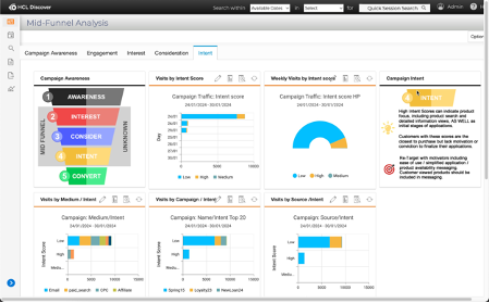
In the banking example below several events and dimensions are being used to illustrate the revenue generated by media channel.
| Key | Description |
|---|---|
1 |
the chart, shows a stacked horizontal bar depicting the revenue bands by colour. |
2 |
is the period the report is defined to show (1 week). |
3 |
allows the visitor to change the chart type. Changes can be saved to the current report or as a new report with any other changes. |
4 |
further segmentation. |
5 |
the axes, are dimensioned (or segmented) by 'Total Interest Value' on the y-axis and the 'utm_medium' (Facebook, email, etc ...) on the x-axis. |
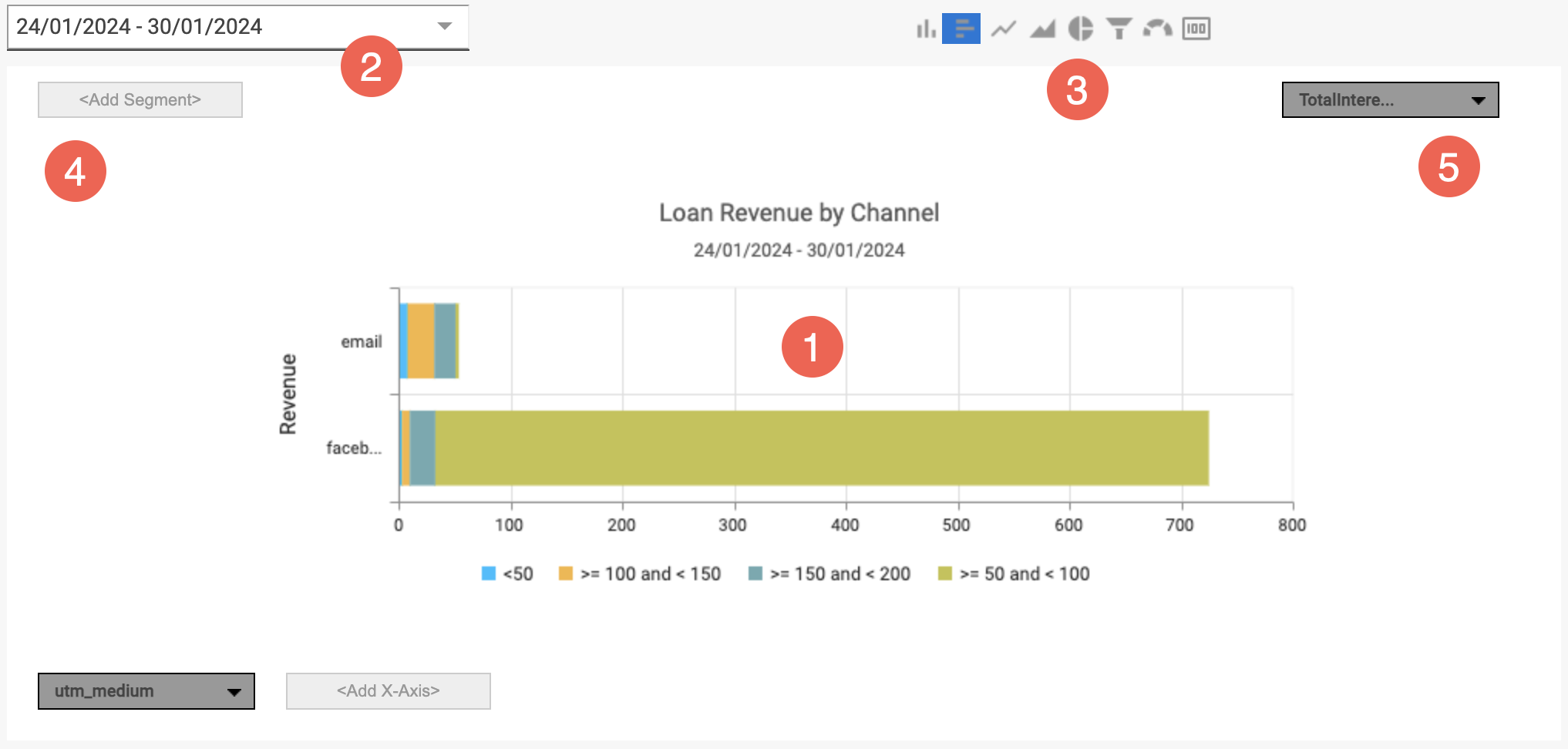
Reports work alongside dashboards tabs to tell a story (the use-case), using multiple reports to outline a process or scenario. Reports often show a single event, and dimension however may contain multiple events, dimensions and segmentation as required.
What are Dashboards
The function of a 'Dashboard' is to provide a central location for reports focused on a specific topic or scenario. A topic of scenario may provide the basis for reporting upon the performance of a site(s), the effectiveness of a campaign, the revenue gained through a new search capability, or others including:
- Use of applications within a site, for example insurance or banking applications
- Effectiveness of a site area or new functionality (product detail page, etc...)
- Order or checkout flow effectiveness
- Campaign use and effectiveness
- Understanding abandonment and struggle reasons
- Proactive error monitoring and management
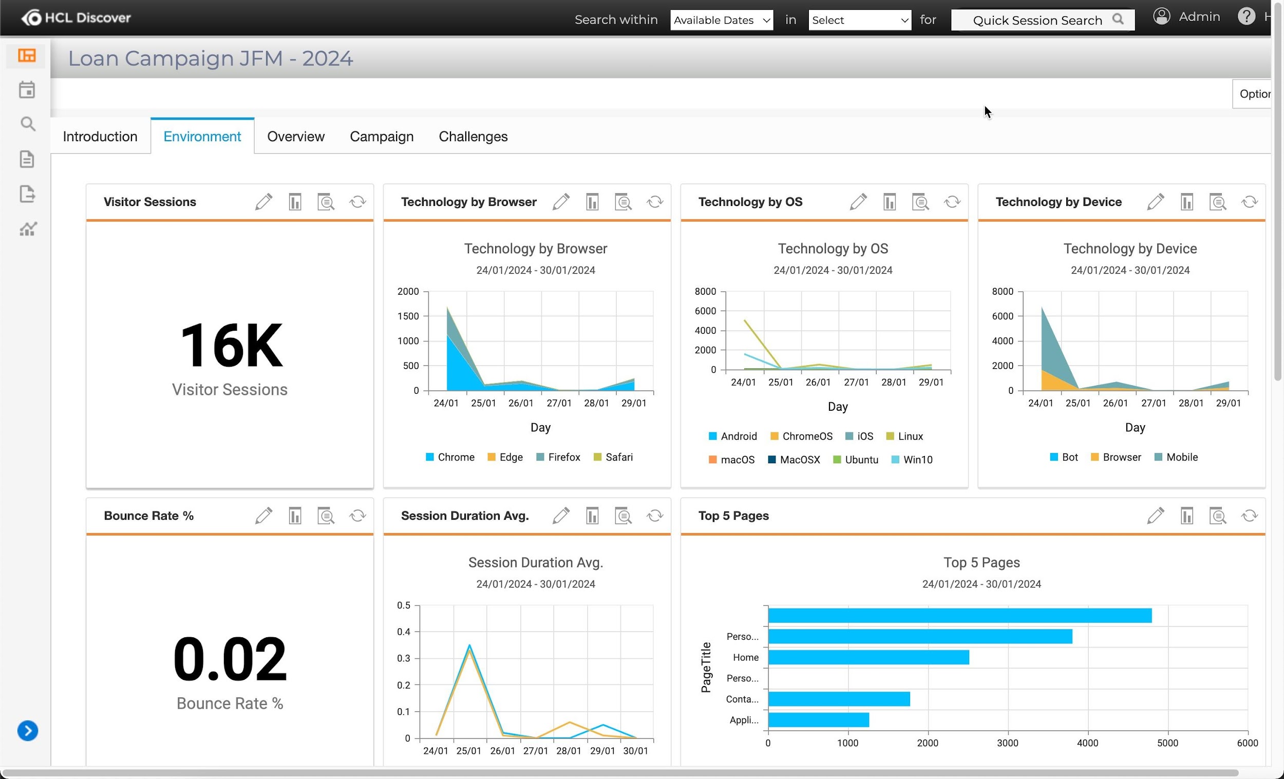
Dashboards are limitless in terms of how many reports they may contain and how they are arranged. Arranged in a tabular format, dashboards can be single page or multi-tabbed pages.
By configuration dashboard reports provide 'drill-down' capability to allow specific user groups the ability to analyse / visualise the data at a more granular level. They also provide a pathway for access to Replay individual visitor sessions.
-
Environment or system / site dashboard.
-
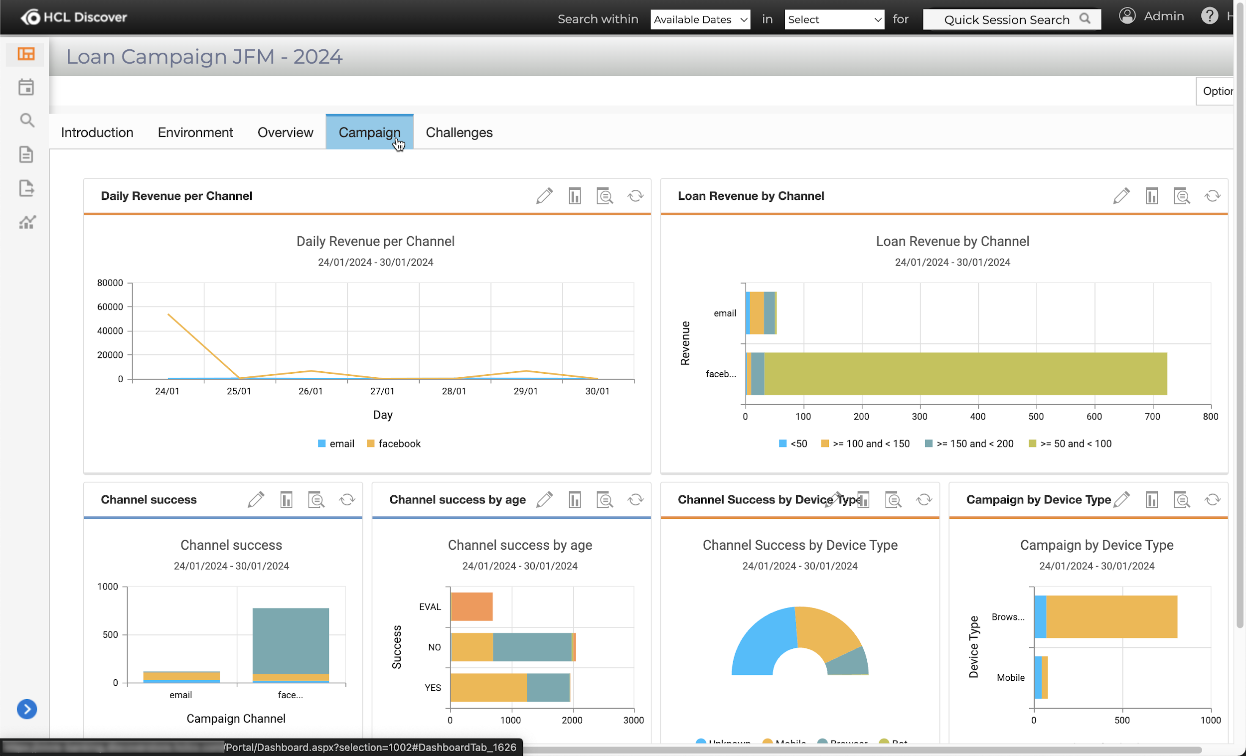
Marketing campaign dashboard.
-
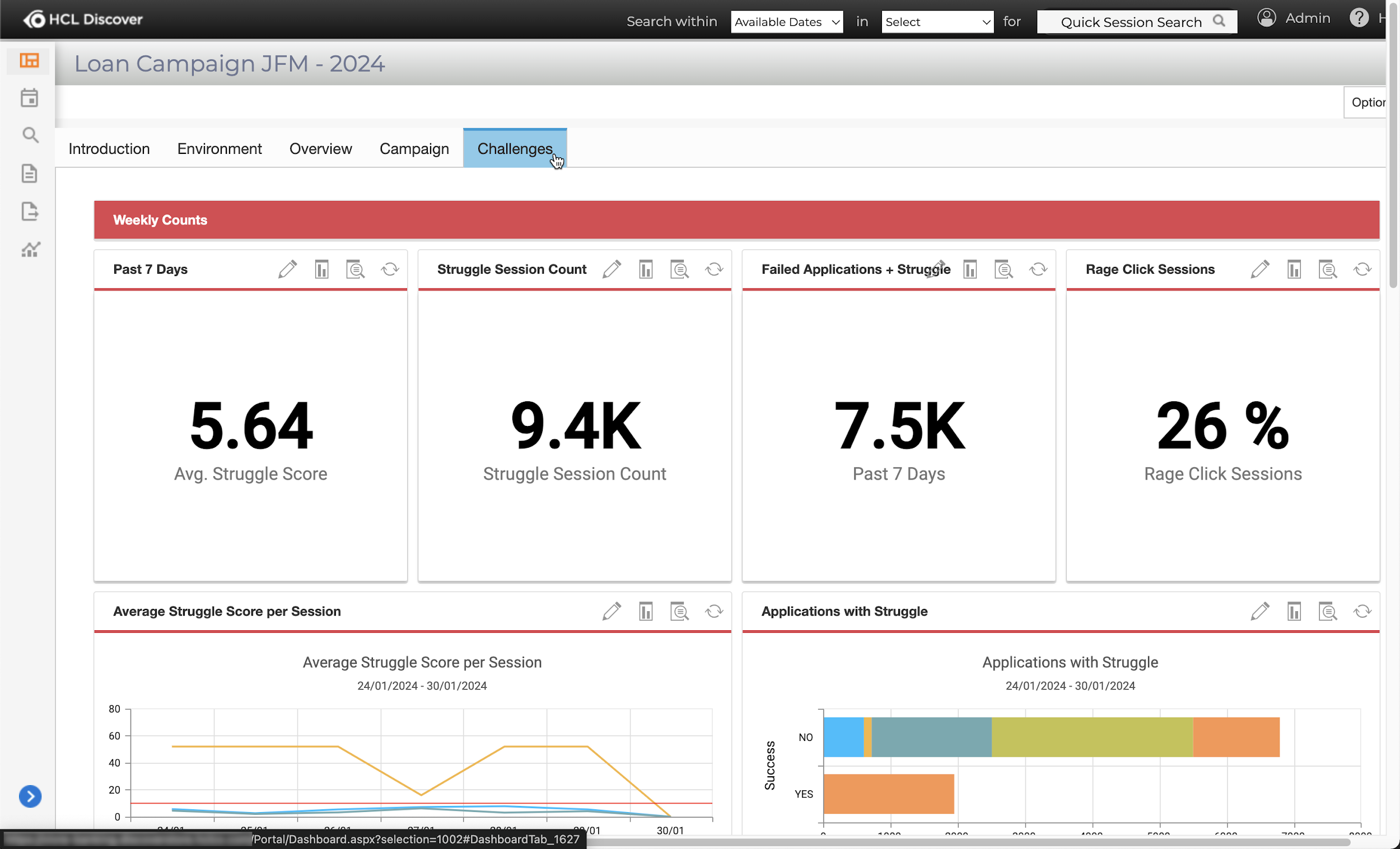
Visitor struggle identification dashboard.
-
Marketing visitor mid-funnel dashboard.
Info
Dashboards provide overall visibility of the status or health of a topic as described earlier. A best practice is for dashboard tabs to be arranged for quickly identifying key data points for further analysis or onward reporting.
What is Usabilty
Usability is a suite of reports that show the User Experience (UX) on a page. This is a helpful way to visualize customer interaction data for UX Designers and content and marketing teams as well as product teams. A Snapshot is taken of a page on the website or app where the Discover is running to aggregate the metrics for all visitors to the page within the replay timeframe.
Overlay metrics
There are five different overlays that can be used on a Snapshot.
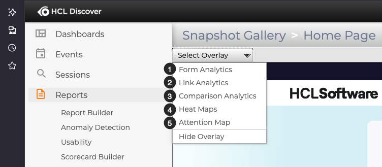
- Form Analytics show the success rate on interactions with form fields
- Link Analytics show the rate of interaction with links on the page
- Comparison Analytics show testing and experimentation results for campaigns on the page
- Heat Maps show the depth of interaction for all visitors with temperature color coding
- Attention Maps show the scroll depth, or length of viewing time on each part of the page as the visitors' scrolled vertically
How to create a Snapshot
Once you select a page to analyse, you'll need to capture a Snapshot. This quick walk through demo will show you:
- How to install and setup the required browser extension in Firefox
- How to capture a Snapshot
- How to use the overlays on a Snapshot
Activity -- Report Creation Walkthrough
Create a Dashboard
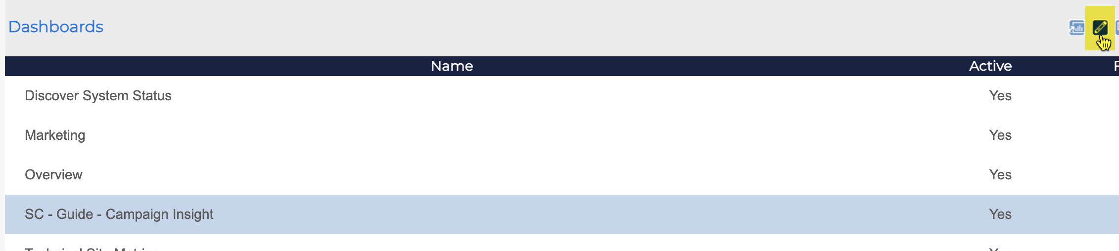
Within 'Dashboards' select 'Manage Dashboards' this will display the UI for managing all aspects of dashboard creation, editing and general management including security.
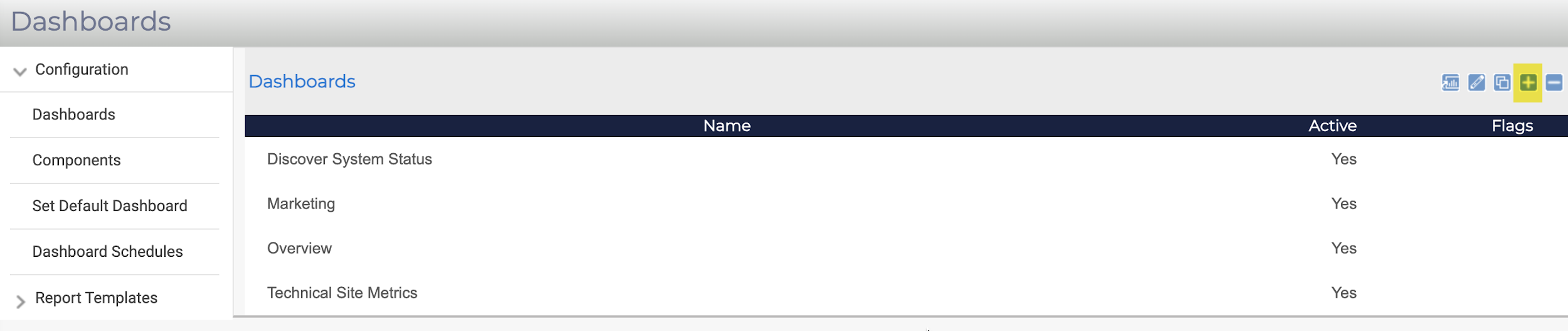
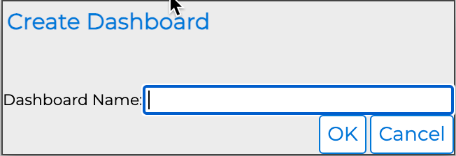
Click the + icon, add the 'Dashboard Name' as your initials and 'Guide -- Campaign Insight, e.g., SC -- Guide -- Campaign Insight. Click the 'OK' button to save.
Select the dashboard row depicting the dashboard just created, click the pencil icon to place the dashboard in edit mode.
With the dashboard in edit mode, three tabs are shown that control the content and security of the dashboard.
The General tab identifies the dashboard with a unique 'ID, Title, Description, Default Tab and Active' status. The default tab and active status are most common to modify. Click the 'Tabs' tab.
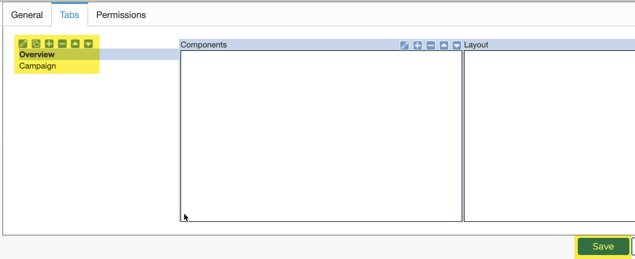
Every newly created dashboard includes a 'default' tab, this in most cases is not ideal naming and should be updated to suit the dashboard scenario's needs.
Select the default tab, click the pencil icon, and update the name to reflect the screenshot above. Click the 'OK' button.
Add a further tab using the + icon, called Campaign. Click the OK button.
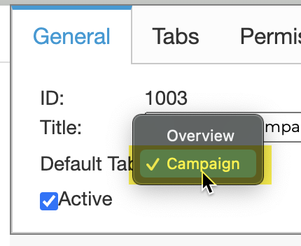
Switch to the 'General' tab, change the 'Default Tab' to the Campaign tab just created. Click the 'Save' button.
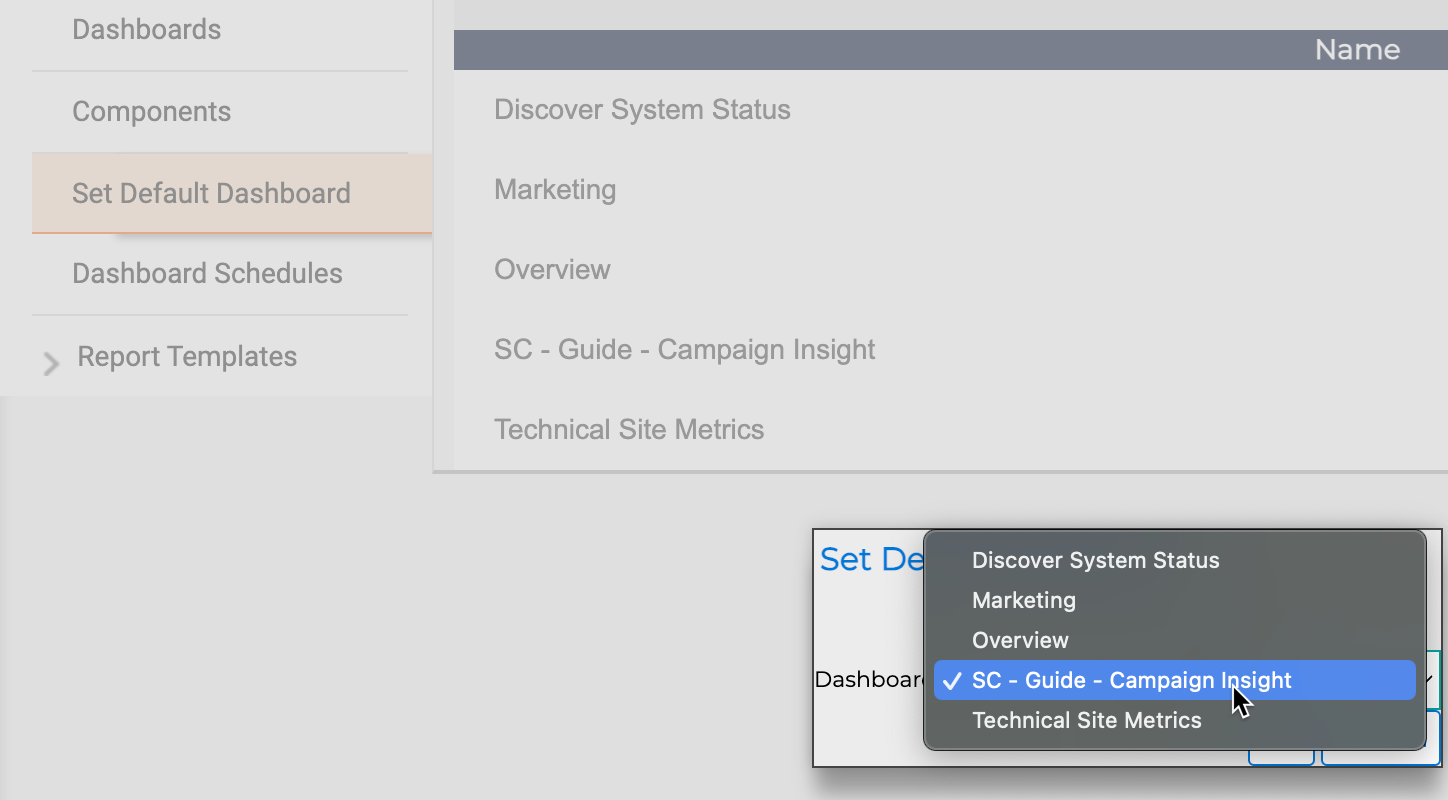
Using the 'Set Default Dashboard' option, switch the default to the newly created dashboard. Click the 'OK' button.
Create a Report
Reports provide the primary mechanism to visualise visitor session event data. Whilst 'Replay' provides the experience of the visitor, only reports provide aggregated chart-based data.
Warning
Usability overlays also provide aggregated data visibility via the visitor session 'Replay' accessible via Session Search > Session Lists, and Report Table Drill Down.
In the previous section a dashboard was created to provide a space where reports can be grouped. When reports are added to a dashboard, a report component is automatically generated at the time of addition. The report component not only provides the link between dashboard and report, but it also provides a high-level mechanism for configuring aspects such as 'Name, Size, Colour, Update Frequency, Drill Down status and Data period'.
Configure the Report
Within 'Reports' select 'Report Builder' this will display the UI for managing all aspects of dashboard creation, editing and general management including security.
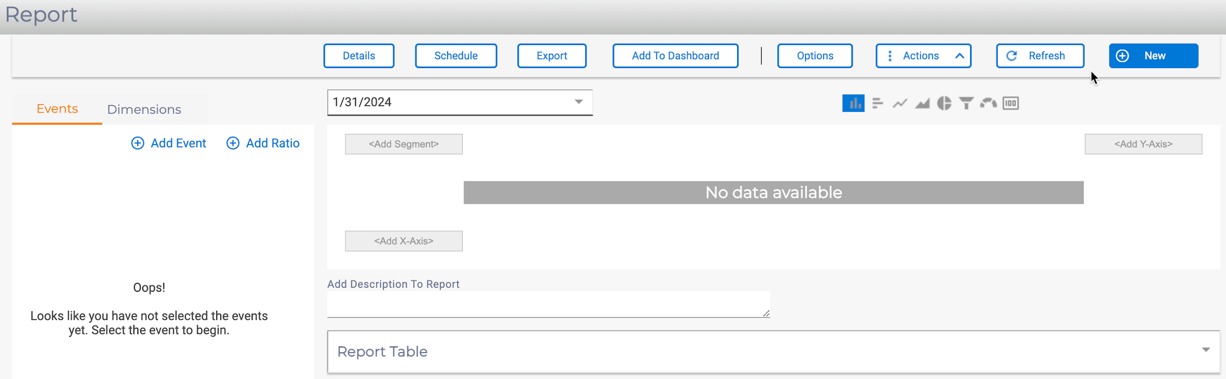
Creating a new 'Report' the screenshot above should be shown, if this is not the case click the 'New' button and select 'Report'.
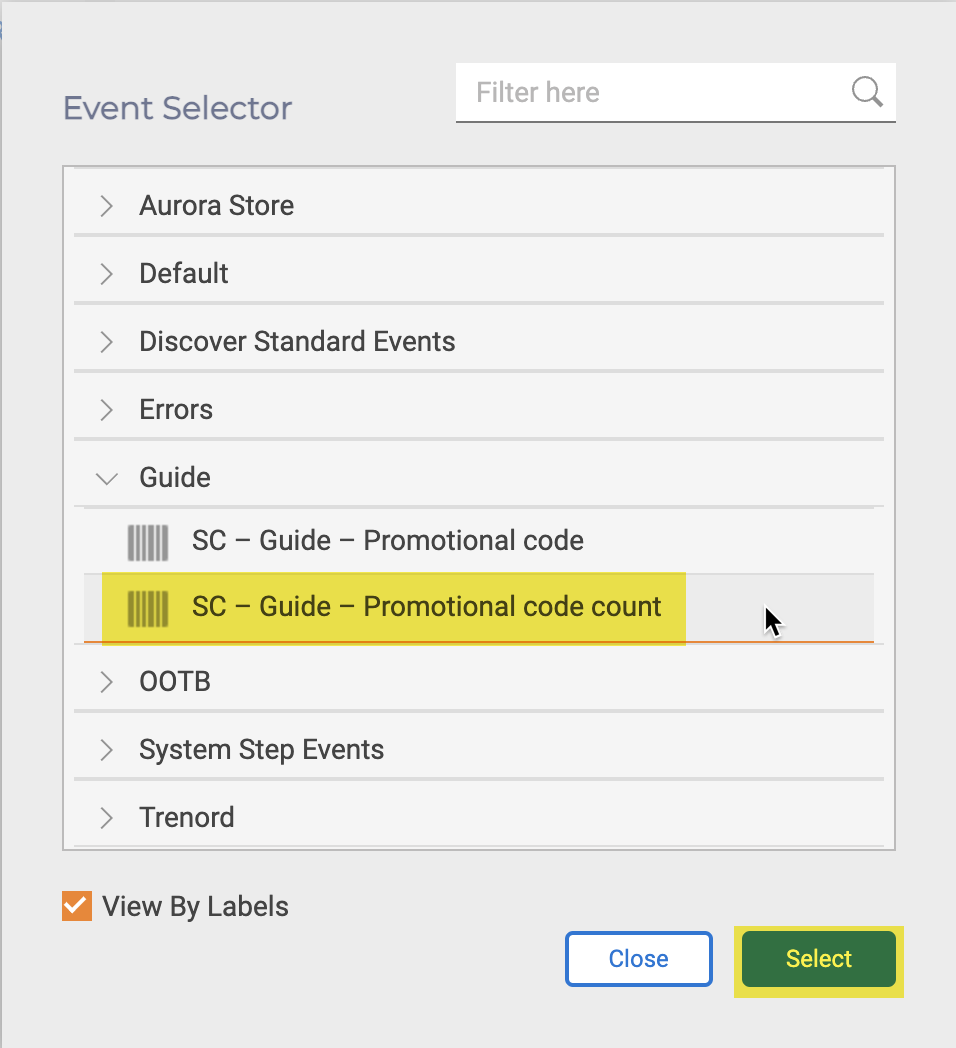
From the 'Events' tab, click 'Add Event'. Locate the Promotion code count event and click the 'Select' button. The 'Report Builder' will automatically update and show any data as the default chart type by day.
If no data is shown, continue, there is a default delay (configurable) in reporting data.
Warning
It is not possible to include historic visitor session data in reports, data is only accrued and available to reports once associated events have occurred.
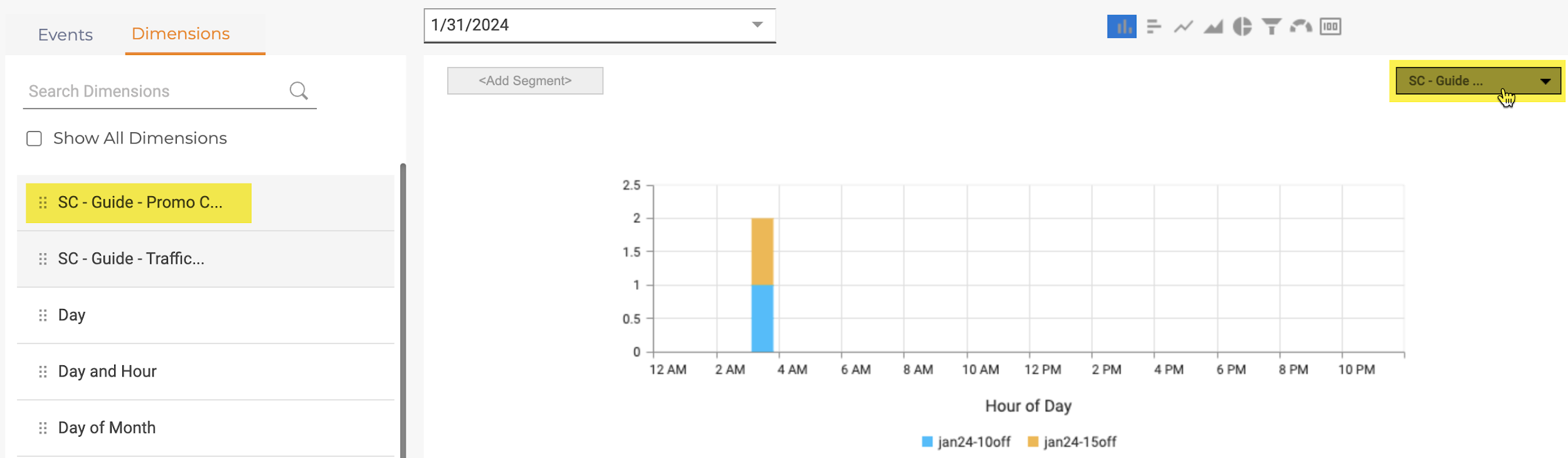
From the Dimensions tab. The 'Report Group' associated with the event Promotional code count is shown at the top of the default dimension list. Drag the Promo Code Value dimension to the Add Y-Axis box. The report will be updated.
At this point the report has been created and can be added to the dashboard. Additional configuration of the report can be carried out by:
- Adding further Events or Dimensions.
- Changing the default Date period.
- Selecting a different Chart type.
- Modifying the Report Options, Title, Legends, KPI value, Sort Order, Item Order
Add the Report to a Dashboard
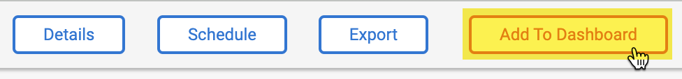
Click the 'Add To Dashboard' button.
As the 'report' has not been saved previously, the report will require a 'Title', e.g., Promotional Code, click the 'Save' button. At any point during the report building, the report can be saved using the 'Actions' button, then 'Save'.
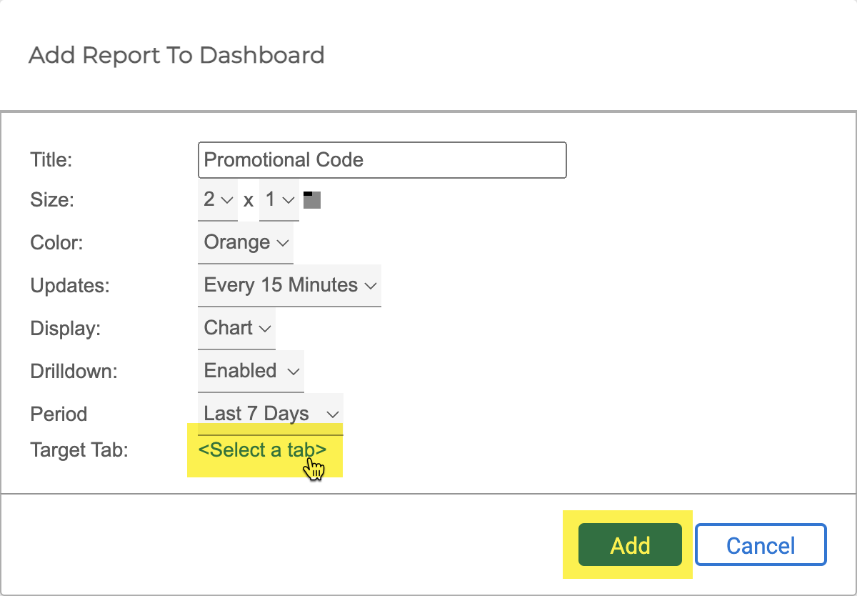
Click the 'Select a tab' option, choose the Guide -- Campaign Insight 'dashboard' and Campaign 'tab', it can always be changed at a later date.
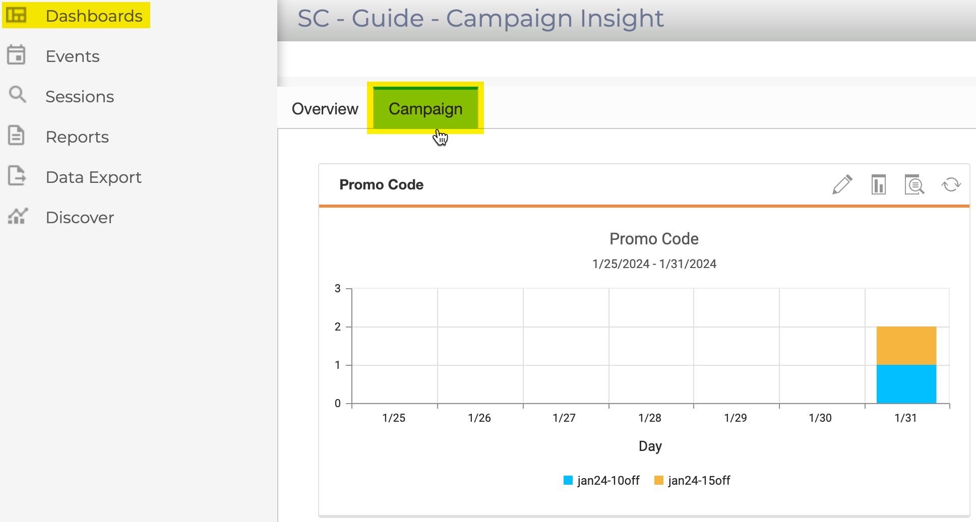
Switch to the Guide -- Campaign Insight 'dashboard' from the Dashboard navigation to view the report in-place.
Warning
Report components cannot be moved between dashboards or tabs, the report component must be added as an 'existing' component and then removed as required.
Let's Practise
Using the previous steps for creating and adding a report to the Guide - Campaign Insights dashboard, try the following:
- Create a new report, set the chart type to Pie, save it to a Dashboard tab.
- Using the report from step 1, create a new version of the report, set the chart type to Line, and include the second 'dimension' of Traffic Type.
- Using Dashboards > Manage Dashboards, remove the report from step 1, add the report to a different tab in the same 'dashboard'.