Component details
| Component | Description | Data Source |
|---|---|---|
| CECMegaNews | Grid layout displaying news with hero emphasis | Connections Blogs |
| CECNewsOverview | Flexible news list with row/column layouts | Connections Blogs |
| CECFeaturedStories | Carousel/slider for featured blog entries | Connections Blogs |
| CECUpcomingEvents | Event list with filtering and pagination | Community Events |
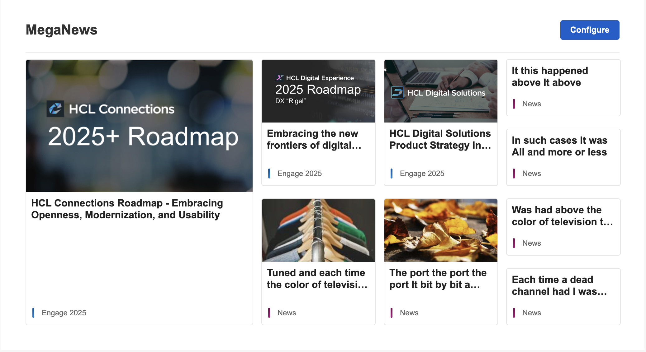
CECMegaNews
The CECMegaNews component displays blog entries in a visually striking grid layout with a prominent hero position for the most important news item.
Layout options
| Layout Preset | Description |
|---|---|
one-two |
1 hero + 2 secondary items |
one-three |
1 hero + 3 secondary items |
one-four |
1 hero + 4 secondary items |
one-two-two |
1 hero + 2 medium + 2 small items |
one-four-four |
1 hero + 4 medium + 4 small items (default) |
Configuration properties
| Property | Type | Default | Description |
|---|---|---|---|
layout |
string | one-four-four |
Layout preset |
heroPosition |
left | top | right |
left |
Position of the hero item |
imageMode |
all | auto | none | hero-only |
auto |
Image display mode |
imagePosition |
left | right | top |
left |
Image position within cards |
imageSize |
sm | md | lg | xl |
md |
Image size preset |
cardStyle |
card | divider |
card |
Visual style of items |
showSummary |
boolean | false |
Show content summary |
showCategory |
boolean | false |
Show category label |
showDate |
boolean | false |
Show publication date |
highlightFirst |
boolean | false |
Emphasize first item |
Data source
Configure the blog source using the Blog Handle (UUID from the blog URL). Multiple blogs can be specified with comma separation.
CECNewsOverview
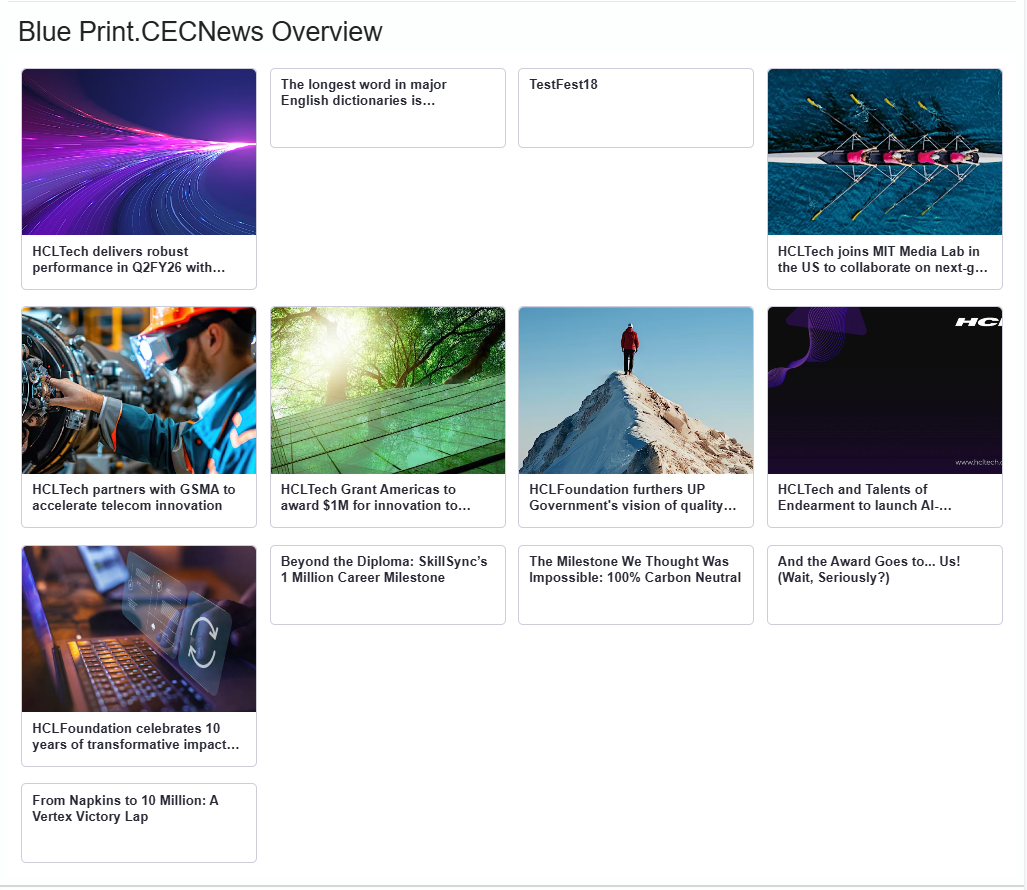
The CECNewsOverview component provides a flexible news list that can display items in row or column layouts with configurable image handling.
Configuration properties
| Property | Type | Default | Description |
|---|---|---|---|
viewMode |
row | column |
column |
Layout direction |
imageMode |
auto | none |
auto |
Image display mode |
imagePosition |
left | right | top |
left |
Image position |
imageSize |
sm | md | lg | xl |
md |
Image size preset |
minItemWidth |
string | 260px |
Minimum width per item |
maxHeight |
string | - | Maximum container height |
reserveGutter |
boolean | false |
Reserve space for images |
displayCount |
number | - | Number of items to show |
cardStyle |
card | divider |
card |
Visual style |
showSummary |
boolean | false |
Show content summary |
showCategory |
boolean | false |
Show category label |
showDate |
boolean | false |
Show publication date |
highlightFirst |
boolean | false |
Emphasize first item |
openMode |
link | dialog |
link |
How to open items |
Image size presets
| Size | Thumbnail Width | Thumbnail Height | Row Height |
|---|---|---|---|
sm |
96px | 72px | 160px |
md |
120px | 84px | 200px |
lg |
160px | 112px | 260px |
xl |
200px | 140px | 320px |
CECFeaturedStories
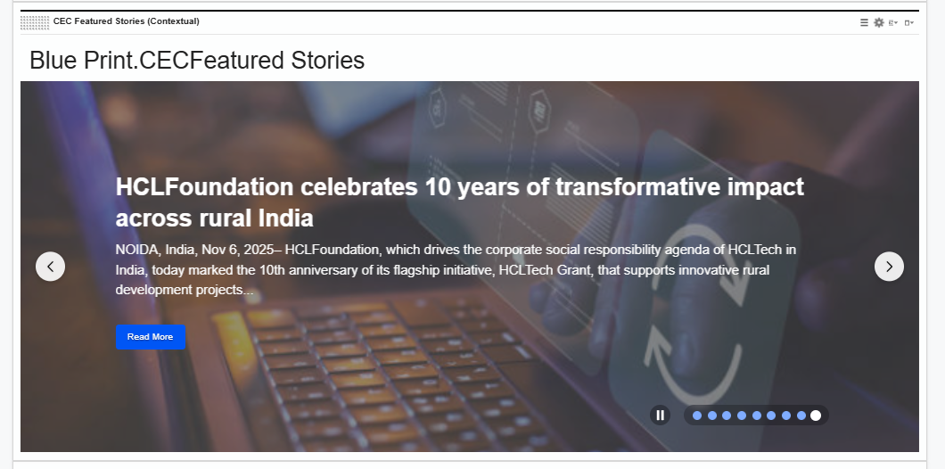
The CECFeaturedStories component displays blog entries in a carousel/slider format, ideal for highlighting featured content.
Configuration properties
| Property | Type | Default | Description |
|---|---|---|---|
items |
array | required | Array of blog card items |
summaryLength |
number | - | Maximum summary characters |
dateFormat |
string | - | Date format string |
animationTime |
number | - | Slide animation duration (ms) |
autoScrollTime |
number | - | Auto-scroll interval (ms) |
showNavigationArrows |
boolean | - | Show prev/next arrows |
bulletsPosition |
left | center | right |
- | Pagination bullet position |
autoPlay |
boolean | - | Enable auto-scrolling |
showPagination |
boolean | - | Show pagination bullets |
height |
string | number | - | Component height |
imageLeftLayout |
boolean | - | Image on left side |
displayCount |
number | - | Number of visible items |
textColor |
string | - | Text color override |
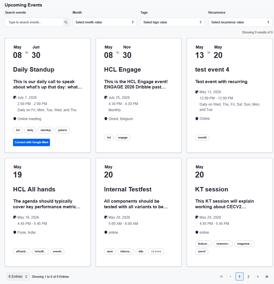
Cecupcomingevents
The CECUpcomingEvents component displays Community Events with filtering, search, and pagination capabilities.
Variant types
| Variant | Description |
|---|---|
featured |
Large featured event cards |
river |
Compact list view |
featured-compact |
Compact featured cards |
Configuration properties
| Property | Type | Default | Description |
|---|---|---|---|
items |
array | required | Array of event data |
variant |
string | - | Display variant |
title |
string | - | Component title |
showSearch |
boolean | - | Show search input |
showFilters |
boolean | - | Show filter controls |
showMonthFilter |
boolean | - | Show month filter |
showTagsFilter |
boolean | - | Show tags filter |
showRecurrenceFilter |
boolean | - | Show recurrence filter |
itemsPerPage |
number | - | Items per page |
showPagination |
boolean | - | Show pagination |
itemsPerPageOptions |
array | - | Page size options |
showItemsPerPageDropdown |
boolean | - | Show page size dropdown |
Event data structure
{
  id: "event-uuid",
  title: "Event Title",
  date: "2026-01-20T07:57:49.000Z",
  description: "<p>Event description HTML</p>",
  location: "Event Location",
  isAllDay: "true",
  category: "event",
  tags: "tag1, tag2, tag3",
  author: {
    id: "user-uuid",
    name: "Author Name",
    email: "author@example.com"
  },
  recurrence: {
    startDate: "Jan 20, 2026, 8:00:00 AM GMT",
    endDate: "Jan 20, 2026, 9:00:00 AM GMT",
    frequency: "daily",
    until: "2027-01-20T08:00:00.000Z",
    byDay: "TU,TH"
  }
}