The users page provides information on the overall users. This
page typically includes the user metric details such as the types
of them and any other user relevant information.
Figure 1. Users
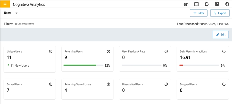
In the first row, there are four cards that have metrics in
number format.
Figure 2. User Dashboard (1st Row)
Unique Users: Count of Unique users who have
initiated at least one session for the period.
Returning Users: Count of returning users who
have returned after their first session. The Progress bar indicates
the percentage of returning users with respect to total
users.
User Feedback: Count of feedback received from
users. Total number of feedback received from the users for a
question/query for which a resolution- has been provided. The
Progress bar indicates the percentage of users who gave feedback
among the total users.
Daily User Interactions: Average count of
interactions in a day by users. Total number of times the users
have interacted by either clicking an option or typing a message.
The Progress indicates the percentage of daily user interactions
with respect to total interactions.
In the second row, there are four cards that have metrics in
number format.
Figure 3. User Dashboard (2nd Row)
Unique users: Count of unique users who had been served with a response.
Returning Served Users: Count of Returning
served users who have returned after getting response in their
first session.
Dissatisfied Users: Count of users who gave
their feedback dissatisfied.
Dropped Users: Count of users who stopped
interacting for some reason and dropped-off.
In the third row, there are three cards that contain different types of graphs for
representing the data.
Figure 4. User Dashboard (3rd Row)
Users: Average count of total users who interacted over a specific period. The graph
represents the total number of users in the last 6 months.
Use Case Engageement by Outcome: Ways that users exit the conversation.
The Human Escalation percentage indicates the number of times that a user's
case has been transferred to a human agent.
The Abandon Rate percentage indicates the number of users who exit the
conversation without providing any feedback.
The Ticket Generation percentage indicates the number of users who created a
ticket due to an unsatisfactory response. The graph shows the total count of each for
the last 6 months.
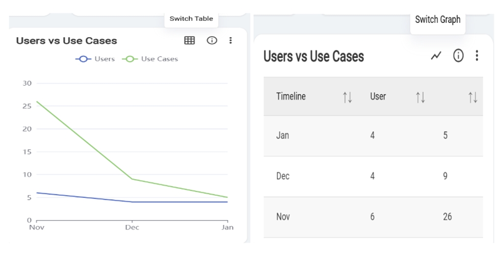
Users/Usecases: The graph shows the comparison between total number of users and the
total number of usecases generated in last 6 months.
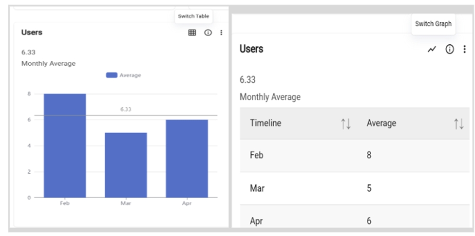
Users:The user can toggle between a graph and a table view. Clicking the
"Switch to Table" button transforms the graph into a table format, and clicking again
switches it back to the original graph display.Figure 5. Switch Table or Switch Graph
Users VS Usecase:The user can toggle between a graph and a table view.
Clicking the "Switch to Table" button transforms the graph into a table format, and
clicking again switches it back to the original graph display.Figure 6. Switch Table or Switch Graph
In the fourth row, there are two cards named “Unique vs Returning Users and Unique vs
Returning Served Users”.Figure 7. User Dashboard (4th Row)
Unique vs Returning Users: Graph represents the comparison between total number of
unique and total number of returning users for specified period.
Served Users Unique and Returning: Graph represents the comparison between total
number of unique users who had been served with a response and total number of returning
users who have returned after getting response in their first session for specified
period.
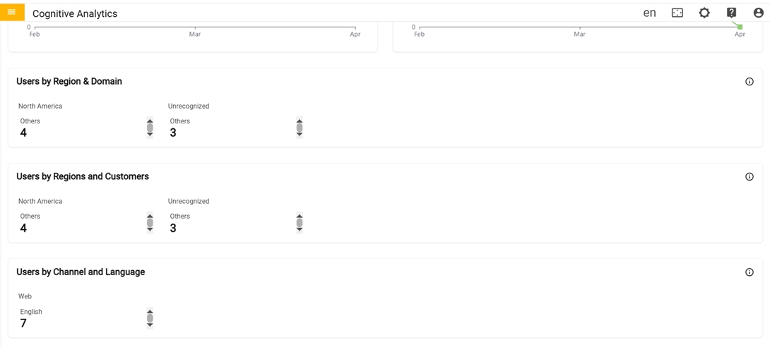
In the fifth row, there is only one card named “Users by
Region & Domain card”.
Users by Region & Domain: Count of users who have raised queries or questions
related to a domain categorized per region.Figure 8. Users by Region & Domain (5th row)
In the sixth row, there is only one card named User by Region and Customer.
User by Region & Customer: Count of users who have raised queries or questions
related to a customer categorized per region.
Figure 9. User by Region Customer (6th row)
In the seventh row there is the Users by Channel and Language
User by Channel and Language: Count of users who have raised queries or questions
related to a language categorized per channel.