Overview
The Overview page is an interactive dashboard that provides a unified view of metrics that we have in all other dashboards of cognitive analytics. This page explains the potential metrics in the form of cards with graphs and tables. The Rate Drivers card has an advanced 'Details' option to view more detailed information about that metric.

-
Sum Total User Sessions
- Count of user sessions Number of times users have initiated a chat session where multiple queries might have been asked that could have resulted in a usecase or an unresolved query. Graph represents the sessions in last 7 days.
-
Usecase Engagement Rate
- Percentage of valid use cases. Number of queries asked by the user that turned into valid usecase. (Number of valid use cases/total queries) gives an engagement rate of %. The graph represents the valid use case in the last 7 days.
-
Usecase Feedback Rate
- Percentage of use cases that received feedback from users. Number of use cases for which the user provided feedback as satisfied or dissatisfied (Number of feedback received as satisfied/total feedback) gives Resolution Rate%. The graph depicts the use cases that have received feedback in the last 7 days.
-
Ticket Escalation Rate
- A percentage of chat transfers happened, and tickets were generated. The number of times that a user has created a ticket or started a chat that has been transferred to a human agent when the user is not satisfied with the response {(number of tickets generated + number of chats transferred) / total valid use cases} gives the escalation rate percent. The graph represents the sum of tickets generated and chat transferred in the last 7 days.
-
Abandonment Rate
- Percentage of use cases that did not receive feedback from users. Number of cases where the user did not provide any feedback and left the chat. {(number of valid use cases – number of use cases received feedback) / total valid use cases)} gives escalation rate percent. The graph represents the use case that didn’t receive feedback in the last 7 days.
-
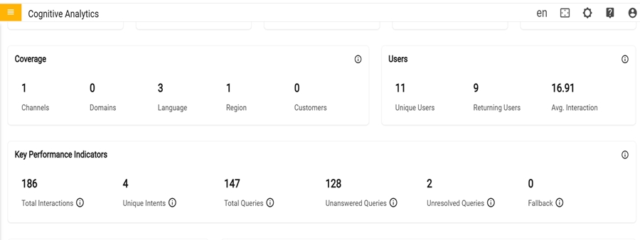
Coverage
- Count of channel, domain, language, region, and customer from which the user has raised their queries.
-
Users
- User metrics that cover unique and returning users along with the average interaction per user
-
Key Performance Indicators
- Performance metrics that includes Total Interactions, Unique Intents, Total Queries, Unanswered queries, Unresolved queries and Fallback count. These metrics offer insights into interactions and effectiveness that allows to fine tune the responses and enhance user satisfaction.

-
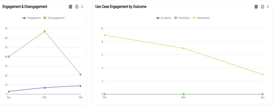
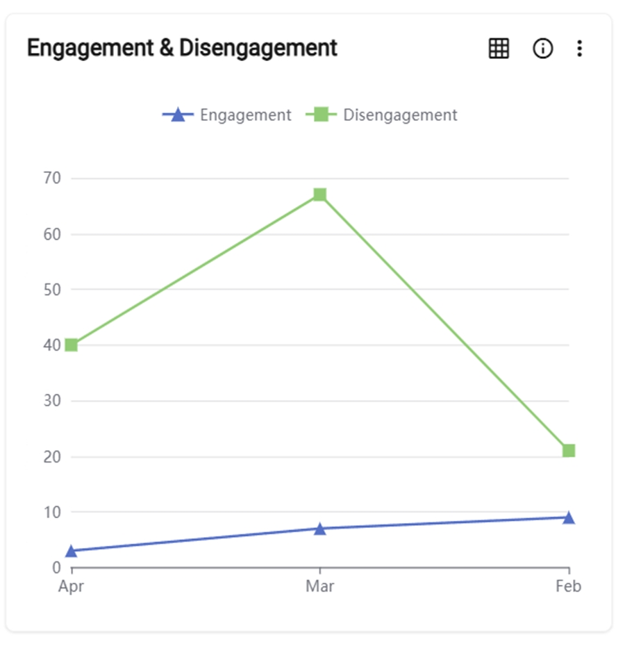
Engagement and Disgagement
- The graph represents the comparison between the total queries asked by the user that turned into a valid usecase (engagement) and the total queries asked by the user that didn’t turn into a valid usecase (Disengagement) for specified period of time.
-
The user can toggle between a graph and a table view. Clicking the "Switch to Table" button transforms the graph into a table format, and clicking again switches it back to the original graph display.
Figure 6. Switch Table or Switch Graph 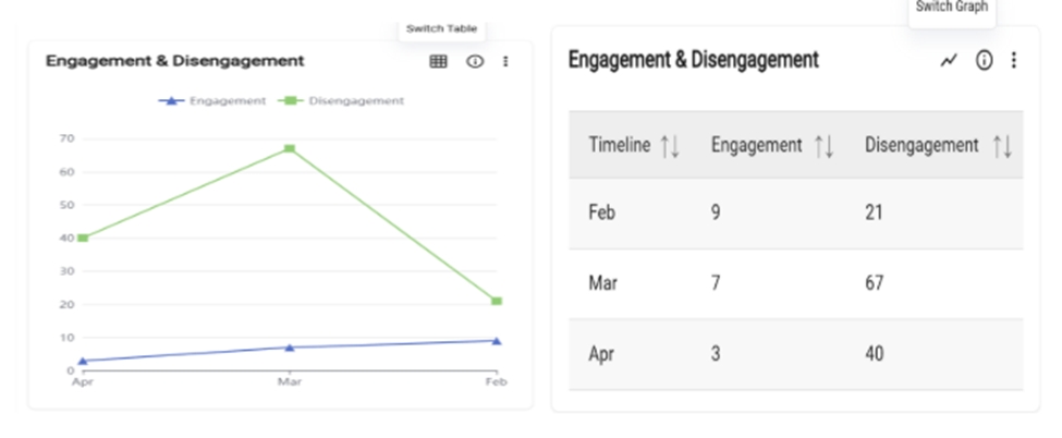
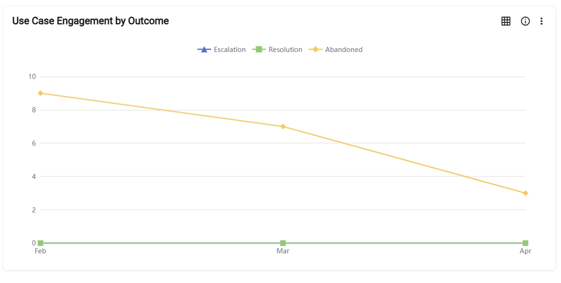
- Use Case Engagement by Outcome
- The graph represents the comparison between the total number of tickets created by the user and chat transferred to a human agent (escalation), and the total valid use cases that received feedback from user (resolution) and the total valid usecases that did not receive feedback from the user (Abandoned) in the for specified period.
- The user can toggle between a graph and a table view. Clicking the "Switch to Table"
button transforms the graph into a table format, and clicking again switches it back to
the original graph display.
Figure 8. Switch Table or Switch Graph 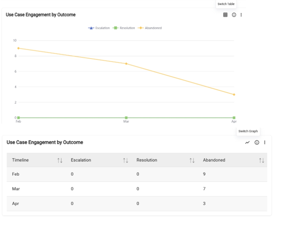
In the fourth row there is a Rate Drivers card in the Overview Dashboard.
- Rate Drivers
- The table represents the list of the top 5 use cases based on the total number of use cases triggered by users during conversations. Rate percentage denotes the number of times that the particular use case has been triggered by the user. Impact / Weighted Avg. denotes the overall impact of that particular use case on a tenant. "Click" the details icon to view additional information about each individual use case.
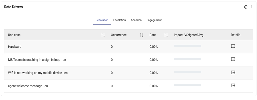
-
Details
- This detailed icon refers to a section that provides additional information or context
about a specific usecase/query. Users usually expect to see more granular data or a more
detailed analysis of the underlying data which helps gain a deeper understanding of what
is driving that usecase/query.
Figure 10. Details 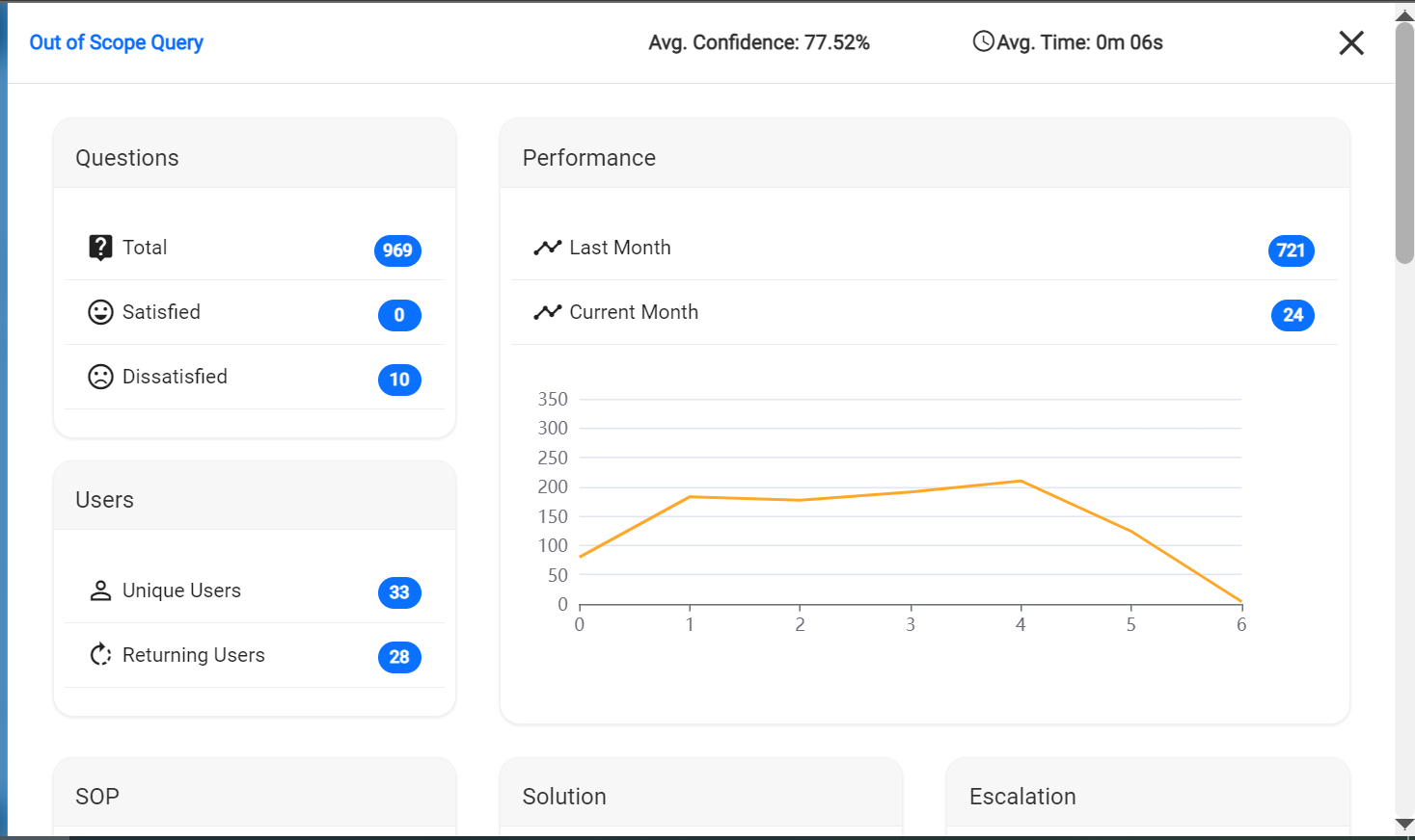
Clicking on the details icon shows the following details of that usecase/query
-
Questions:
- Total indicates the count of valid queries made by users.
- Satisfied indicates the count of valid queries for which positive feedback was provided.
-
Dissatisfied indicates the count of valid queries for which negative
feedback was provided.
Figure 11. Questions 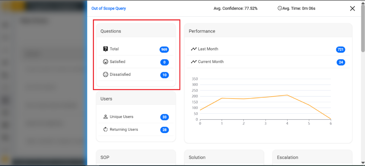
-
Users
- User metrics cover the distinct users (Unique Users) and unique users who have
returned (Returning Users).
Figure 12. Users 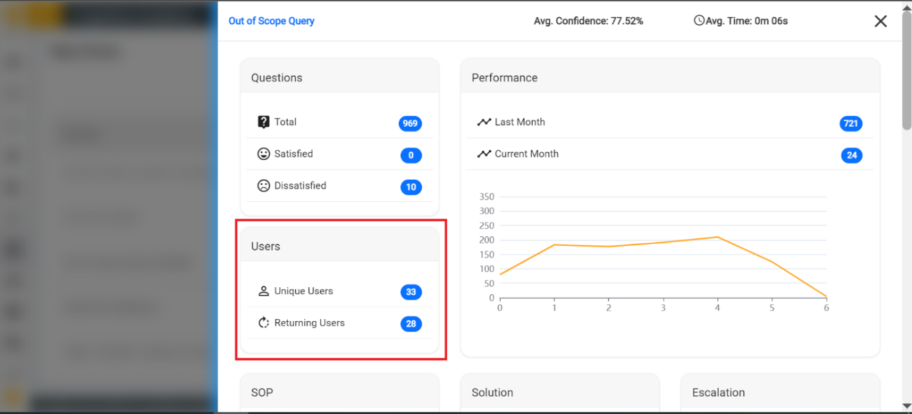
- User metrics cover the distinct users (Unique Users) and unique users who have
returned (Returning Users).
-
Performance
Displays the last and current month count along with a graph that indicates the data for a day of the week.
Figure 13. Performance 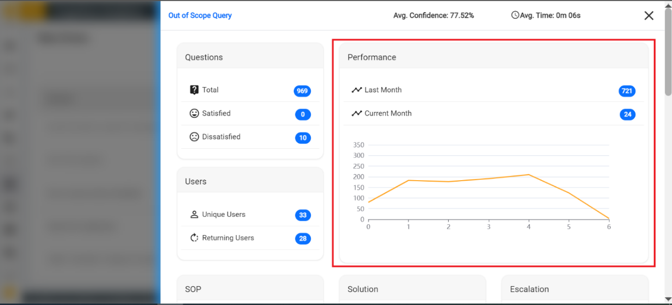
- SOP: Unique count and total number of times when an SOP (Standard Operating Procedure) is triggered in response to users for a specific query.
- Solution: Total count of Article and Script as solutions that were provided for queries.
-
Escalation: Total count of the ticket generated, and chat transferred for
that query.
Figure 14. SOP 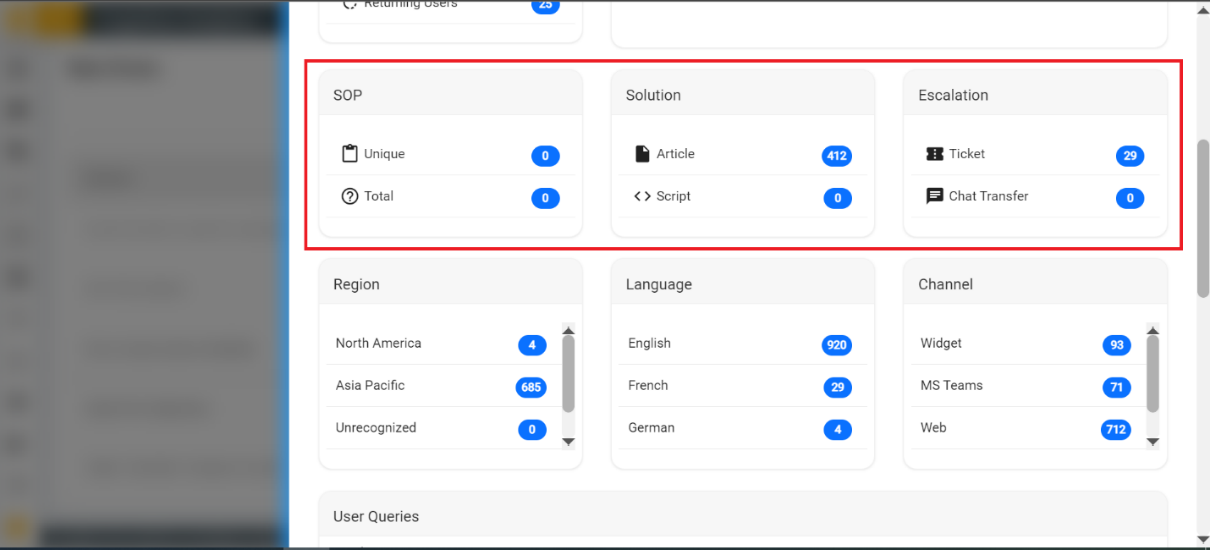
- Region: Count of occurrences from the list of regions.
- Language: Count of occurrences from the list of languages.
-
Channel: Count of occurrences from the list of channels.
Figure 15. Region/Language/Channel 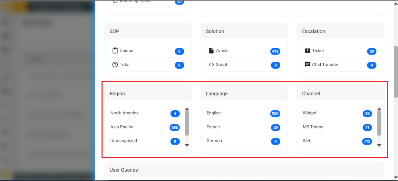
-
User Queries
- The table represents the list of queries, satisfaction result, whether SOP is
provided or not, what type of escalation has happened for that query along with
chat and conversations information including the created time of each query.
Figure 16. User Queries 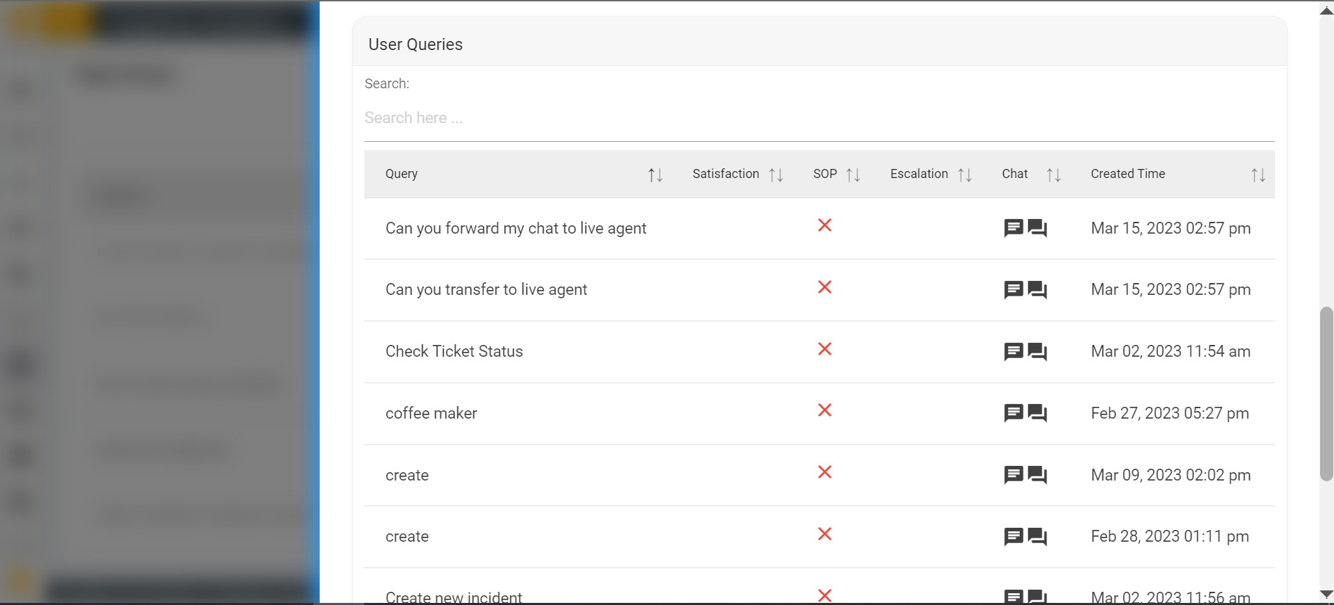
- The table represents the list of queries, satisfaction result, whether SOP is
provided or not, what type of escalation has happened for that query along with
chat and conversations information including the created time of each query.
-
Questions:
- This detailed icon refers to a section that provides additional information or context
about a specific usecase/query. Users usually expect to see more granular data or a more
detailed analysis of the underlying data which helps gain a deeper understanding of what
is driving that usecase/query.