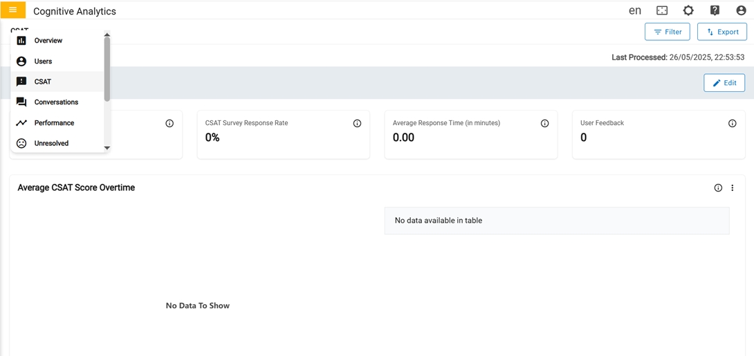
CSAT
The CSAT (customer satisfaction) page displays data and metrics related to customer satisfaction with the service or experience. The CSAT score is measured using a questionnaire that asks users to rate their satisfaction on a scale of 1 to 5, with 1 being the lowest and 5 being the highest. Visualizations, such as a chart or progress bar, show the trend over specific criteria. Satisfaction Drivers cards have an advanced 'Details' option to view more detailed information about that metric.
In the first row, we have four cards.
- Average CSAT score: Average CSAT is calculated based on the total count of CSAT score accumulated for Specified period.
- CSAT Survey response rate: Percentage of CSAT survey response rate in the count on the number of users who gave CSAT score metric in every conversation.
- Average Response time: Average time taken to receive feedback for a chat.
-
User Feedback: Count of distinct or unique users who gave feedback.
Figure 2. 1st row of CSAT 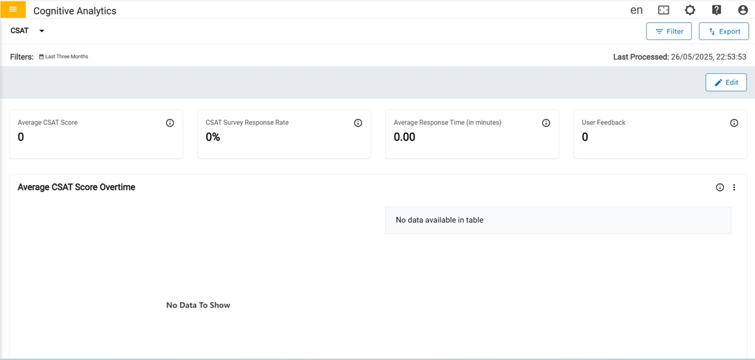
In the second row, we have only one card.
-
CSAT score over time: Customer Satisfaction Score received from users The score
depicts the level of satisfaction that users have measured on a scale of 1 to 5 based on
the implementation, with 1 being the lowest and 5 being the highest. The graph represents
the CSAT score received from users in the last 6 months. Average CSAT is calculated based
on the total count of CSAT scores accumulated for a month. The percentage of the CSAT
Survey Response Rate is the count of the number of users who gave the CSAT score metric in
every conversation.
Figure 3. CSAT score overtime (2nd row) 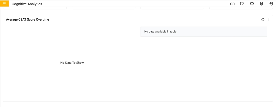
In the third row, we have only one card Top 5 Performance hindering Intents
-
Top 5 Performance hindering Intents : Its shows top 5 intents that have negative
impact.
Figure 4. Top 5 Performance hindering Intents (3rd row) 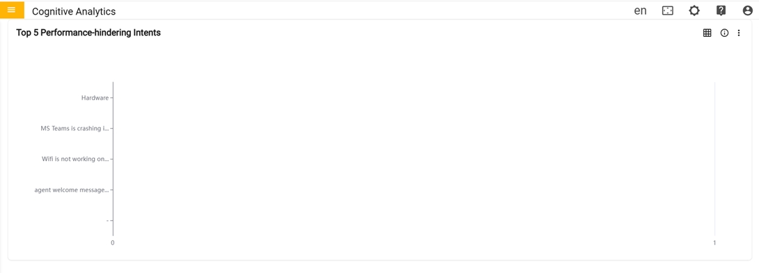
- The user can toggle between a graph and a table view. Clicking the "Switch to Table"
button transforms the graph into a table format, and clicking again switches it back
to the original graph display.
Figure 5. Switch Table or Switch Graph 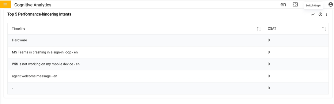
- The user can toggle between a graph and a table view. Clicking the "Switch to Table"
button transforms the graph into a table format, and clicking again switches it back
to the original graph display.
In the fourth row, we have only one card CSAT By
-
CSAT By: Graph represents the CSAT score along with the feedback received for the
combination of mentioned parameters for the specified period.
Figure 6. CSAT By (4th row) 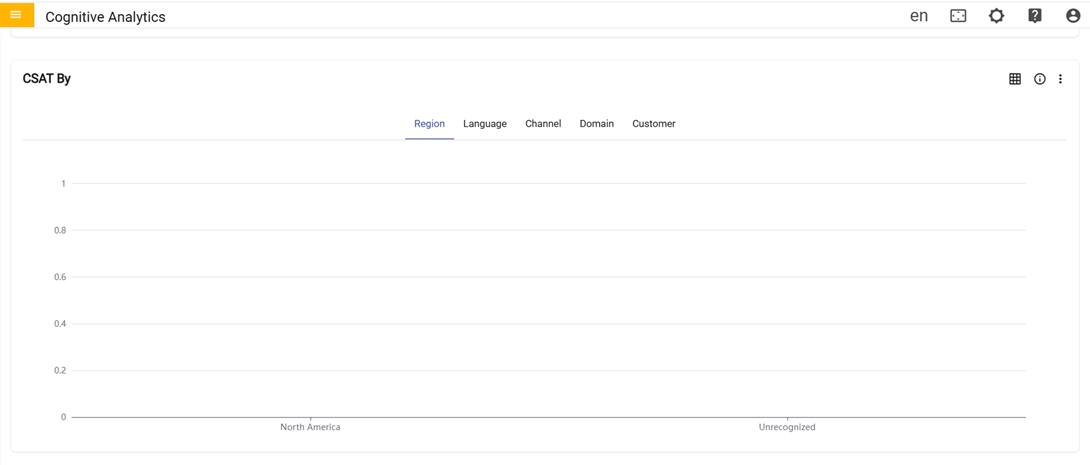
In the fifth row, we have only one card CSAT Monthly By
-
CSAT Monthly By: Graph represents the monthly breakdown of CSAT score received for
the combination of mentioned parameters for the specified period.
Figure 7. CSAT Monthly By (5th row) 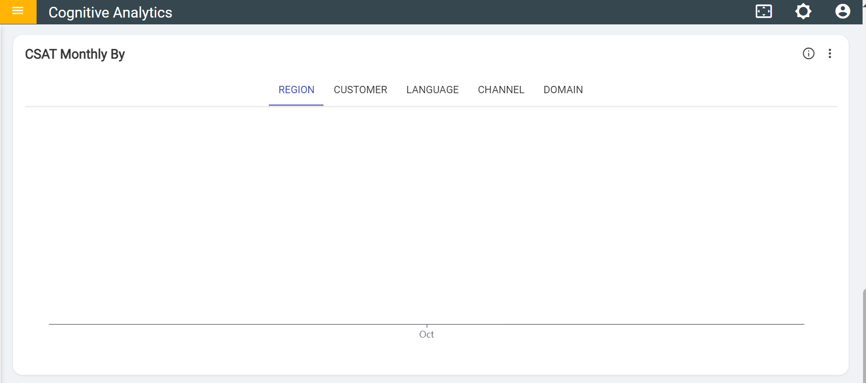
- The user can toggle between a graph and a table view. Clicking the "Switch to Table"
button transforms the graph into a table format, and clicking again switches it back to
the original graph display.
Figure 8. Switch Table or Switch Graph 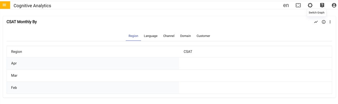
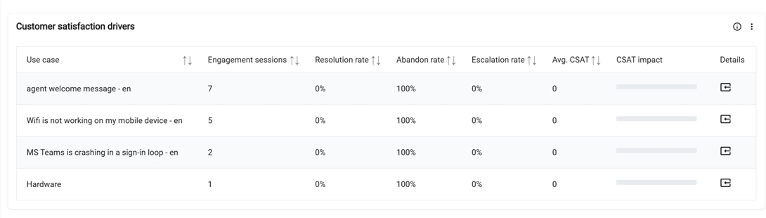
In the sixth row, Customer satisfaction drivers
-
Customer satisfaction drivers: Table provides the detailed information for each
usecase, such as the count of valid usecase sessions, the user's feedback rate, the users
left without feedback rate, the ticket generated or chat transferred rate, the average
CSAT for the top 10 usecases based on the count triggered by users, and the CSAT impact on
overall tenant. 'Click' the details icon to view additional information about each
individual use case.
Figure 9. Customer satisfaction drivers (6th row)