Performance
The Performance page provides an overview of Key Performance Indicators (KPIs). The metrics are displayed visually in both graph and table format.
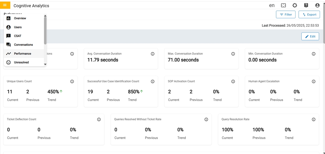
In the first row there are four cards in the Performance Dashboard

- Avg COnversation and Interaction: Average number of messages exchanged, or interaction happened per conversation, which gives insight into user engagement and response complexity.
- Avg Conversation Duration: Average time spent in conversation.
- Max Conversation Duration: Maximum time spent in conversation.
- Min Conversation Duration: Minimum time spent in conversation.
In the second row there are four cards in the Performance Dashboard

- Unique Users Count: Count of Unique Users who have initiated at least one session for the period.
- Successful usecase identification Count: Count of queries asked by the user that turned into a valid usecase.
- SOP Activation Count: Number of times when an SOP (Standard Operating Procedure) is triggered in response to users for a specific query.
- Human Agent Escalation: Percentage of conversations that are transferred to a human agent when the user's needs are not fully addressed with a satisfactory response.
In the third row there are three cards in Performance Dashboard:
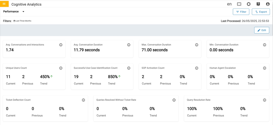
- Ticket Deflection Count: Count of user queries that are resolved by providing a satisfactory solution that otherwise could have resulted in a ticket.
- Queries Resolved W/O Ticket: Percentage of user queries that are resolved without the need for users to open a support ticket.
- W/O Solution: Percentage of user queries that are not resolved and did not result in a solution for the user.
In the fourth row there is Use case Performance by Outcome card:
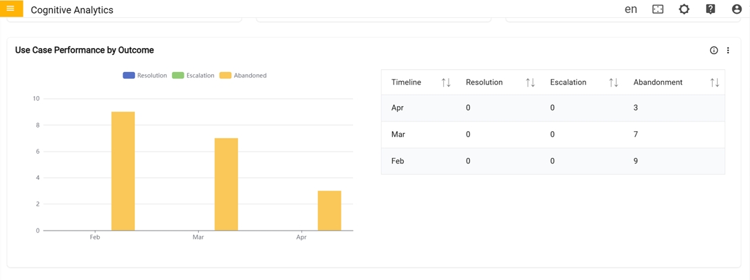
- Use case Performance by Outcome: Graph represents the comparison between total count of usecases that got feedback (Resolution), total count of ticket generated, or chat transferred (Escalation) and usecases that did not get feedback (Abandoned) in the last 7 days.
In the fifth row there is Customer Conversation Breakdown card
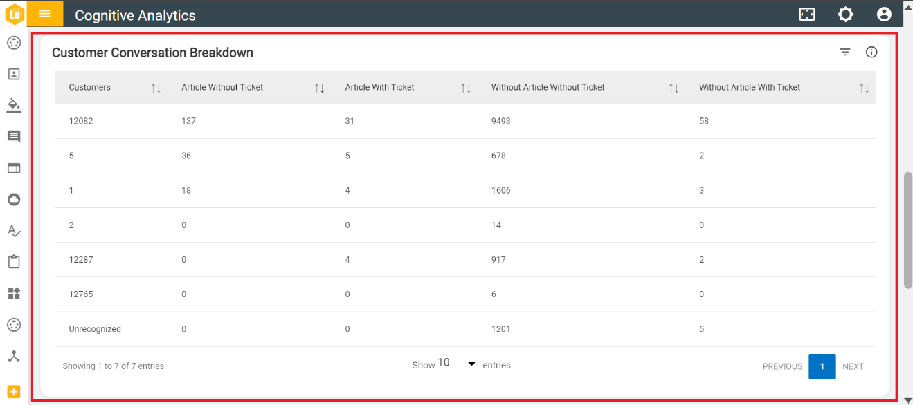
- Customer Conversation Breakdown: Table represents the combination of total article triggered with total tickets generated with respect to customers.
In the sixth row there is Chatbot Effectiveness and Satisfaction by card:

- Chatbot Effectiveness and Satisfaction by: This card represents the total count of feedback given by users (Resolution), total count of ticket generated, and chat transferred (Escalation), total count of no feedback given (Abandonment), total count of satisfied and dissatisfied with respect to Region, Channel, Domain and Language. 'Click' on the icon near graph to swap graphs.
In the seventh row there is Escalation Breakup By card:
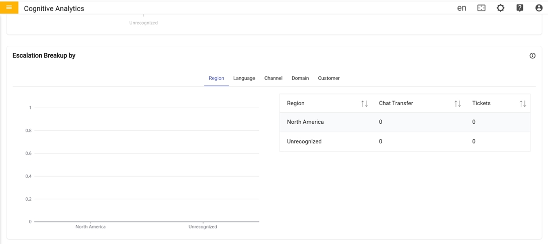
-
Escalation Breakup By:
- Graph represents the comparison between the total number of chats transferred and the total count of support tickets created with respect to region, language, channel and domain for the specified period.