WYSIWYG Use Case Design Console Enhancements
The WYSIWYG (What You See Is What You Get) editor in the Use Case Design Console provides a low-code approach to building conversations and dialogues for BigFix AEX. This provides a simpler point and click editable view to create rich HTML and plain text BigFix AEX responses, which are the same as what the end user would see when using BigFix AEX. This reduces the need for cognitive SMEs to write HTML tags explicitly and makes the use case/response creation easy.
The WYSIWYG editor is the default setting for the Use Case Design console and does not need any configuration. The following part of this section highlights the key functionalities of the editor:
The default editor, present in the earlier versions as shown in the below figure, has been replaced by the new WYSIWYG editor.
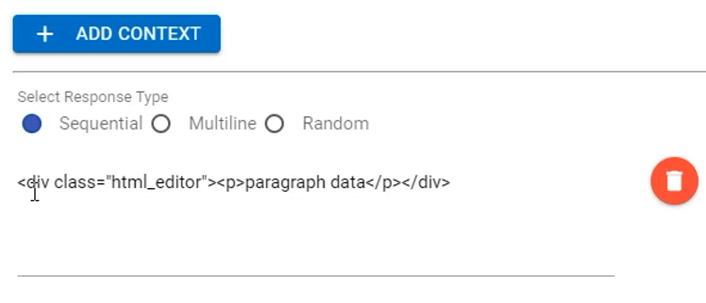
-
Since 6.0, the default editor for any node in the use case design console looks like the following figure (opens in the side navigation bar):
Figure 2. WYSIWYG Editor in all releases after 6.0 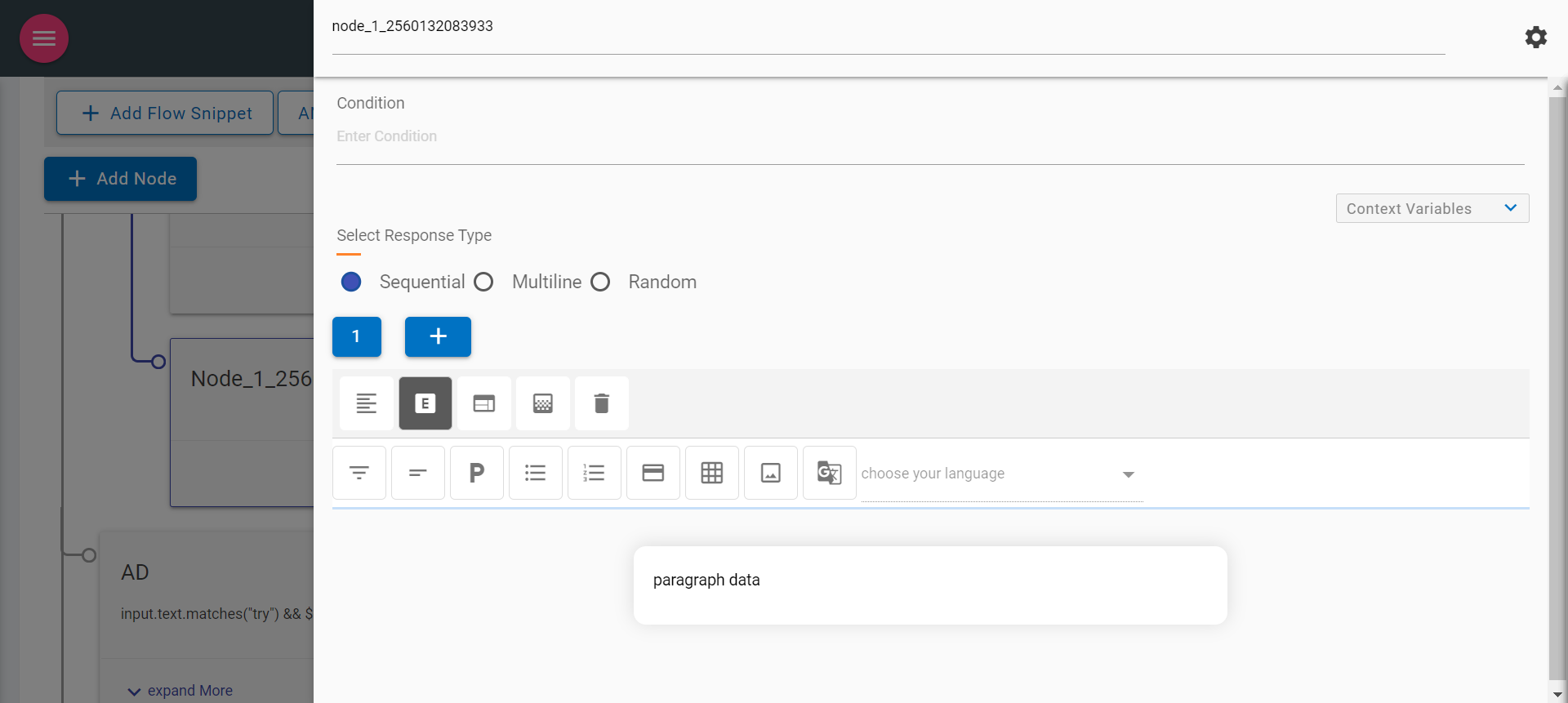
-
The following are the key items in the new response panel:
- Node Title & Settings (Gear icon
 )
) - Context Variables
- Select Response Type
Node Title
Node Title can be edited to provide a meaningful node name.
Figure 3. Node Title 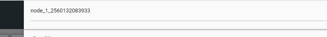
- Node Title & Settings (Gear icon
- Clicking on the Gear icon
.png) on the right side of the node title displays the
following options:
on the right side of the node title displays the
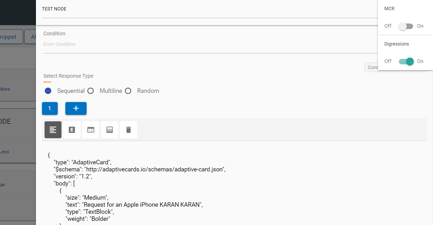
following options:- Multi Condition Response (MCR)
- Digressions
Figure 4. Node Gear Settings 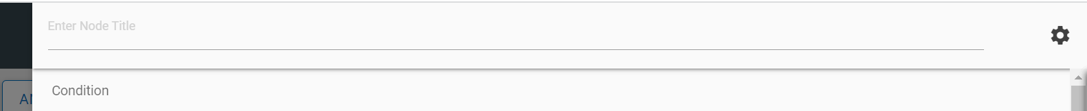
Figure 5. MCR (Multi Condition Response & Digressions) 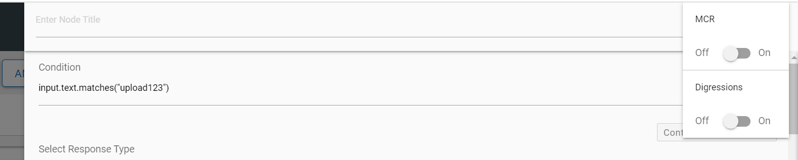
MCR - On enabling (MCR) Multi Condition Response toggle, the editor changes to a multi-condition editor.
Figure 6. Multi Condition Response 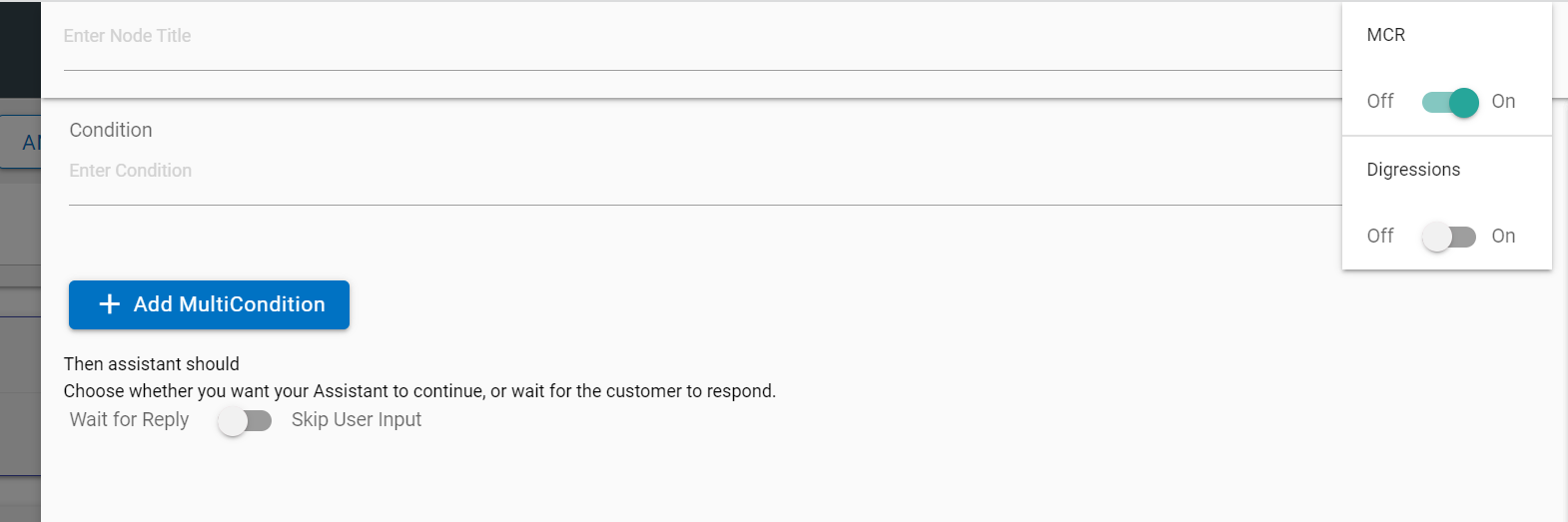
It allows users to add multiple conditions by clicking on the “Add Multi Condition” button. Here, the response editor is like the early versions.
Figure 7. Add Multi Condition Response 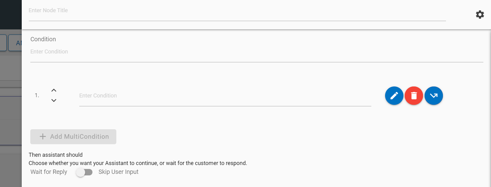
Figure 8. Edit Multi Condition Response 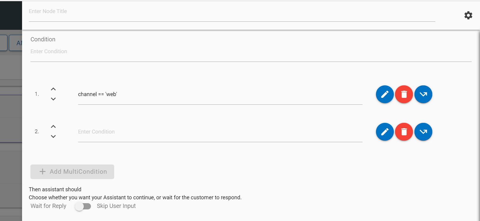
MCR nodes can be moved up and down by clicking on the Up/Down arrow buttons
 corresponding to
the node that you want to move.
corresponding to
the node that you want to move.Figure 9. Move Multicondition Node 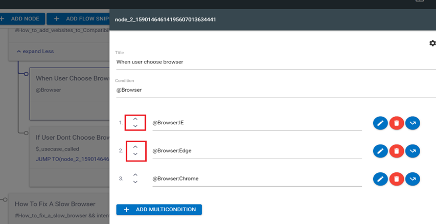
-
The following actions can be taken on each condition:
-
Edit: Each condition can be edited by using the edit icon
 corresponding to the
condition to be edited. You can edit the condition to provide a response and
context variables.
corresponding to the
condition to be edited. You can edit the condition to provide a response and
context variables.Figure 10. Edit Multi Condition Response 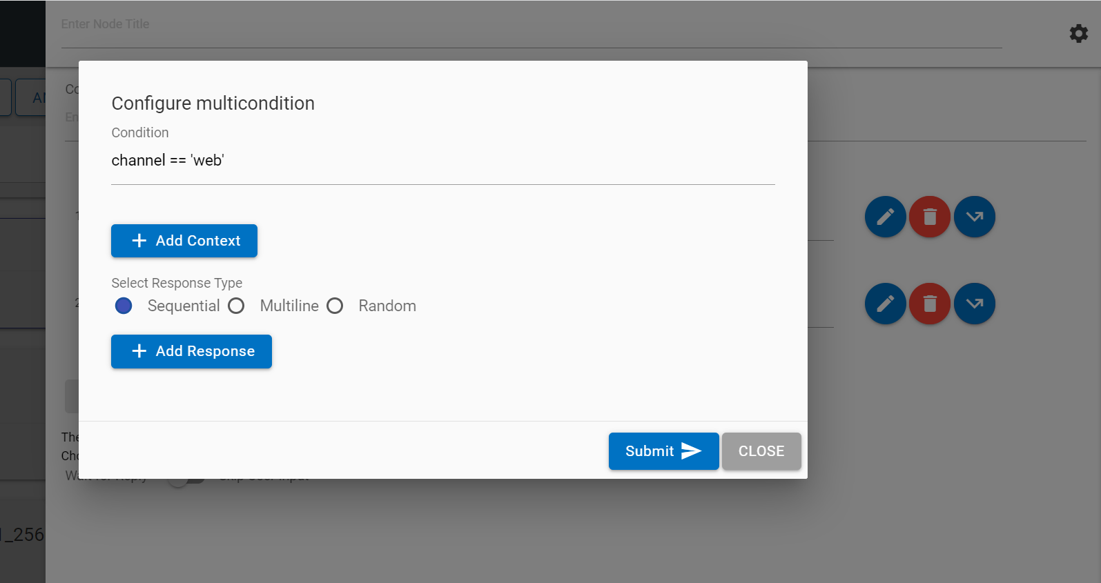
-
Jump: Each condition can be edited for a jump using the jump button
 corresponding
to the condition to which you want to apply this option. Clicking on the
Jump button displays three conditions: assistant recognize, wait for user
input and response. On selection of the appropriate condition, the use case
design console shows flags on the available nodes on the Landing Node
screen. Clicking on any of the flags attaches that node to the jump.
corresponding
to the condition to which you want to apply this option. Clicking on the
Jump button displays three conditions: assistant recognize, wait for user
input and response. On selection of the appropriate condition, the use case
design console shows flags on the available nodes on the Landing Node
screen. Clicking on any of the flags attaches that node to the jump.Figure 11. Node Associated Jump Actions 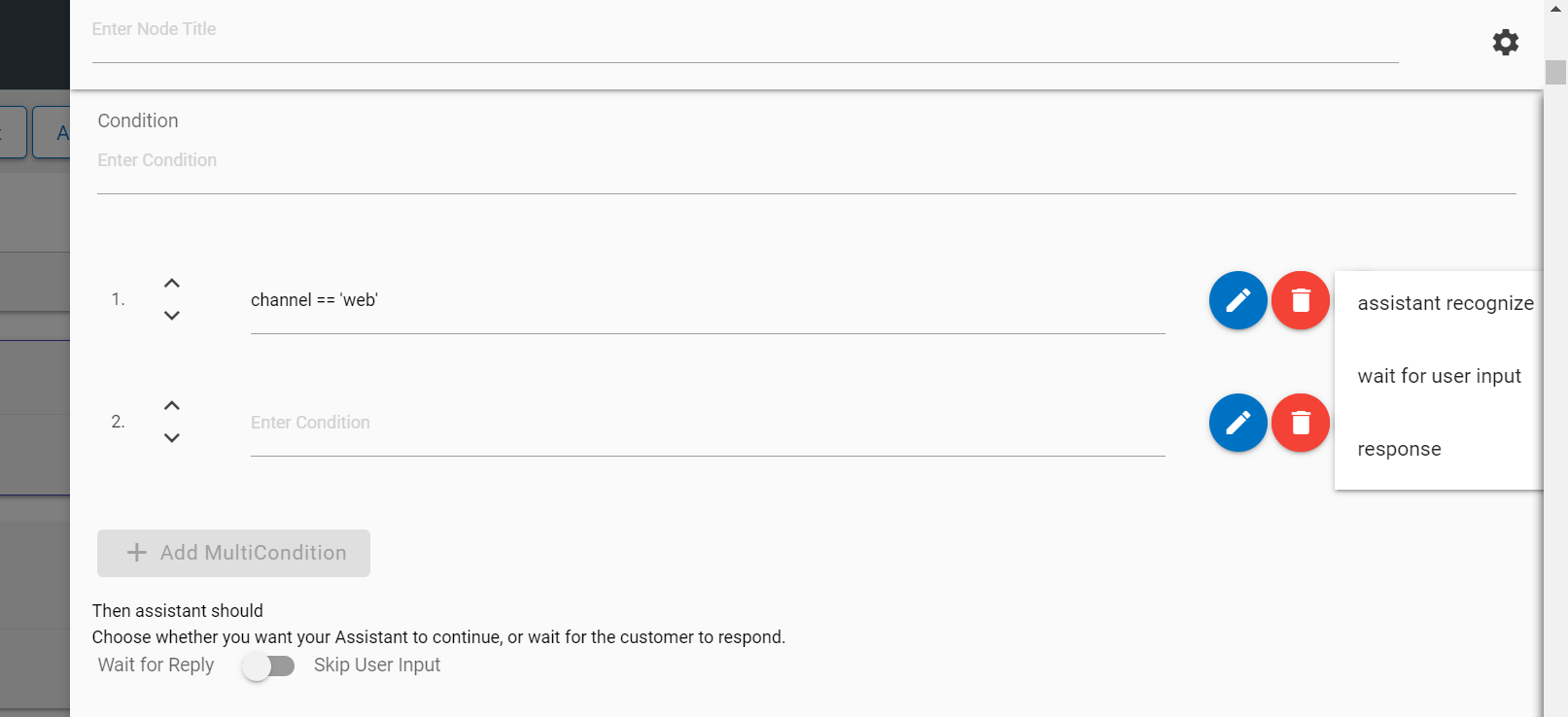
Figure 12. Landing Node Screen 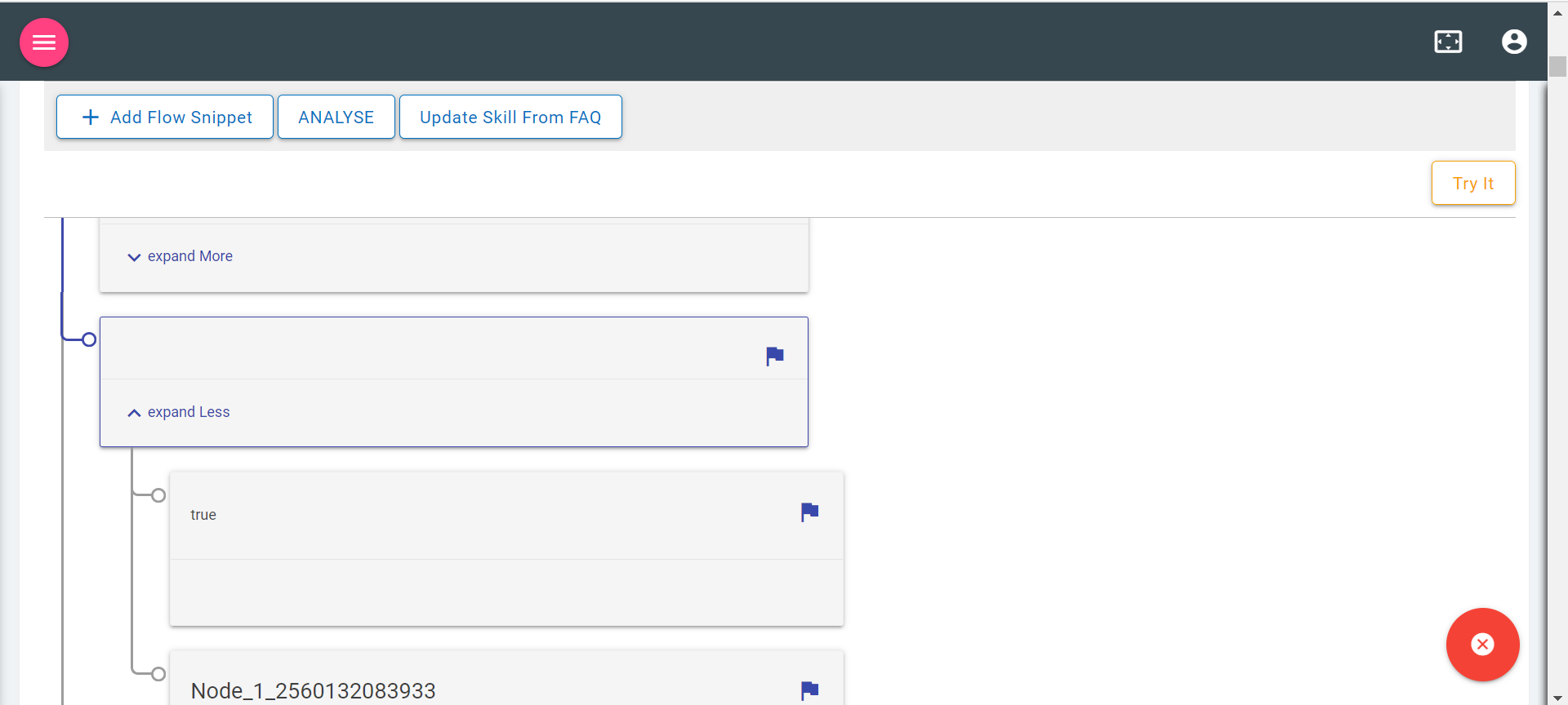
- You can also cancel the jump using the close button
 on the Landing Node
screen.
on the Landing Node
screen. - Delete: Clicking on Delete icon
 deletes the corresponding condition.
-
Edit: Each condition can be edited by using the edit icon
Digressions - Digressions can also be enabled using the same gear icon for context switching use cases.
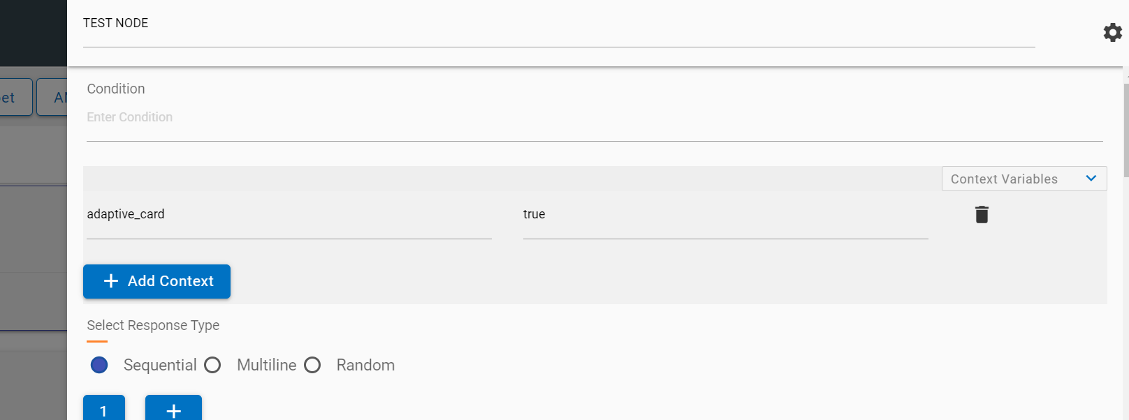
Context Variables
Context variables are present in a collapsible and can be added based on requirement. More variables can be added by using the Add Context button.
x`
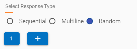
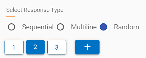
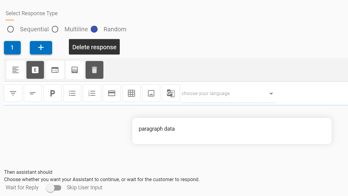
SME can select the different type of response which is sent by the current node to the BigFix AEX UI to the end user. The following responses can be configured using the correct radio button:
- Sequential
- Multiline
- Random
Sequential: Responses are displayed in sequence in the BigFix AEX response in the same chat block
Multiline: Responses are shown in ordered or unordered sequence in the BigFix AEX response; however, they are in separate chat blocks.
- To use multiline, enable the multiline flag as true.
- Also use <OL> tag to set sequence of responses.
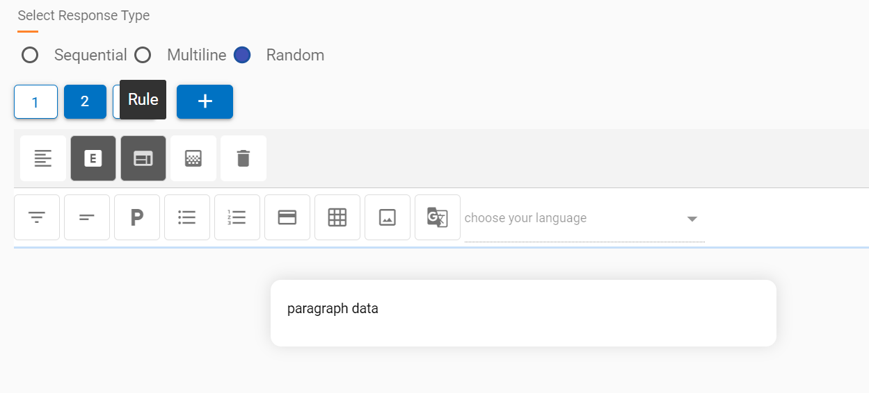
Random: Responses are shown randomly from the list of responses when a node is executed. Response blocks can be added by using the + icon below the response type radio button. On adding a new response, the editor changes the focus to the latest response.
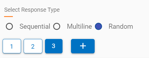
Focus can be changed to any other response block by clicking on the number.
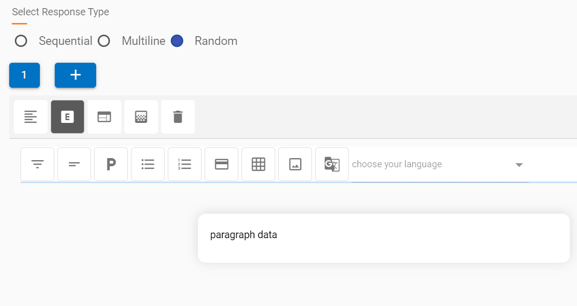
Each response block, when added, has the four following response types:
- Text
- HTML Editor (Default)
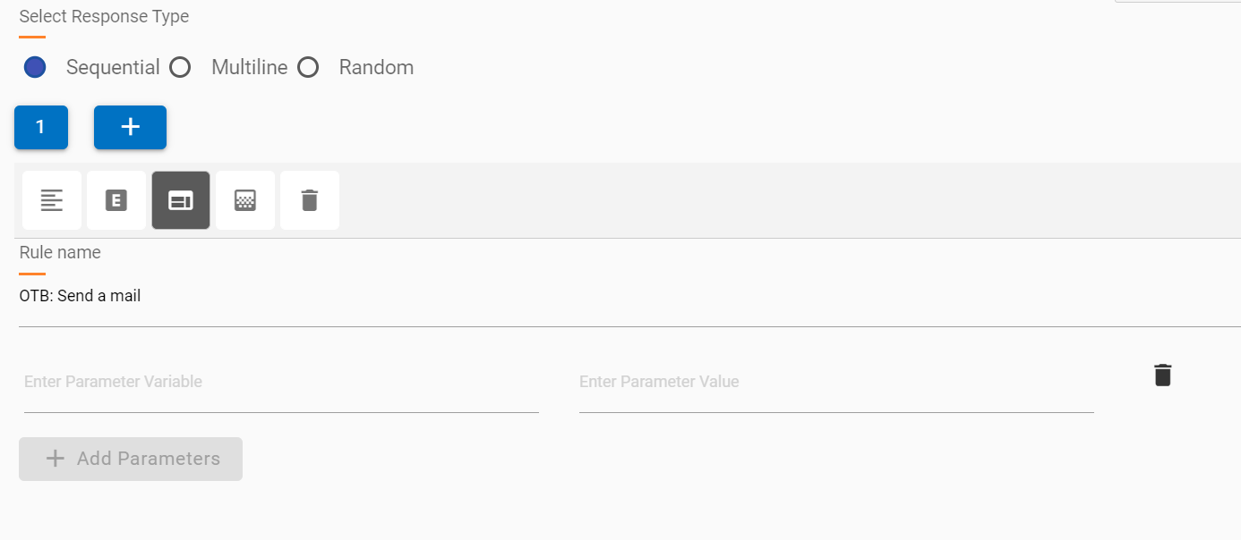
- API Rule
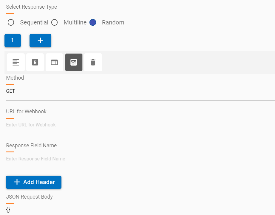
- Webhook
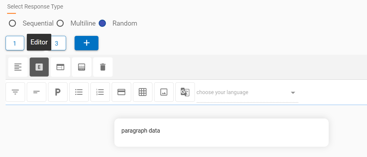
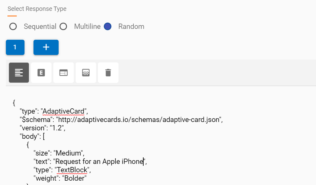
Text (HTML Tags & Plain Text, Adaptive Card JSON):
HTML Editor: Each response block, when added, has the HTML editor type as its default response type.
Refer to Capabilities of Default HTML Editor section to understand the basic capabilities of HTML editor response type.
API Rule: API rule provides a simpler way to call Openwhisk functions or integration actions directly from the use case design editor.
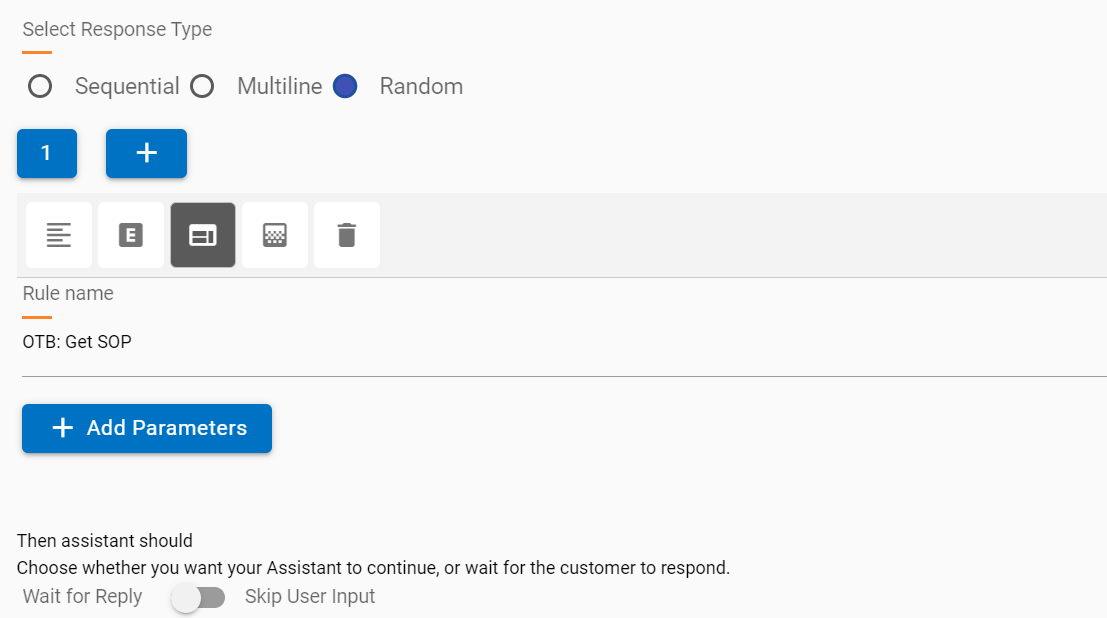
The following salient points are relevant:
- A drop-down list of existing rules in the current tenants is shown.
- An appropriate rule can be selected, and relevant parameters can be passed along with values.
- The added parameters are passed to the selected rule.
Webhook: Webhooks provide a quick way to call API services with relevant headers and body parameters to fetch a response.
- Multiple webhooks can be added to the same response editor with new responses in the same node.
- Webhook requests can be GET or POST.
- Response should be JSON only.
- Required parameters can be added based on the API service.
- It is recommended to check headers and authentication using a service like POSTMAN so the correct values are passed in the Webhook response.
- Text and HTML response blocks have a limit of 4096 characters as the response created in the editor is saved in Watson and sent to the user when a node is executed.
- For HTML editor (default type) responses, the 4096 character limit is calculated based on the raw HTML text, which might have several more characters than the characters visible in the view.
- When the character limit exceeds 4096, the entire editor response is automatically changed to an SOP and saved, however these technicalities are abstracted from the user creating the response.
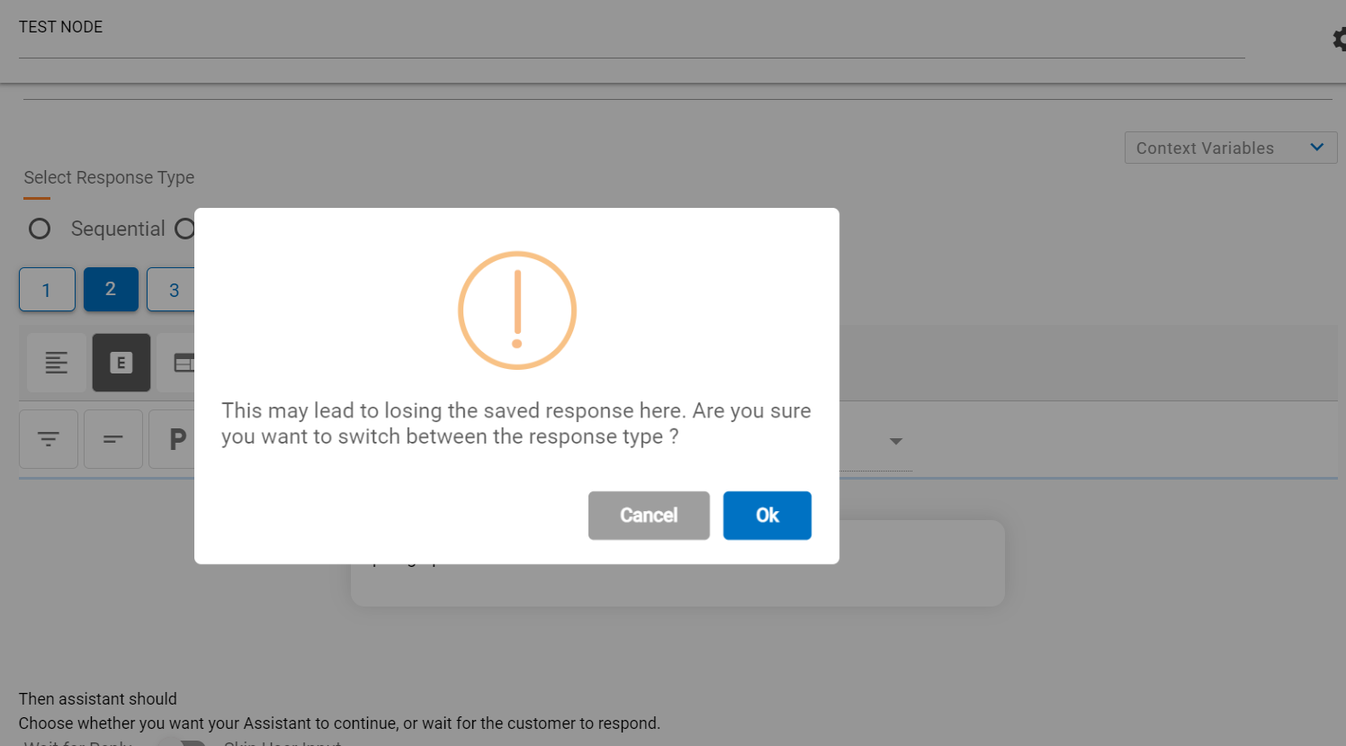
- Response Type can be changed to other types as well, but the change will delete all the data from the current type, and you will encounter a warning before making the change.
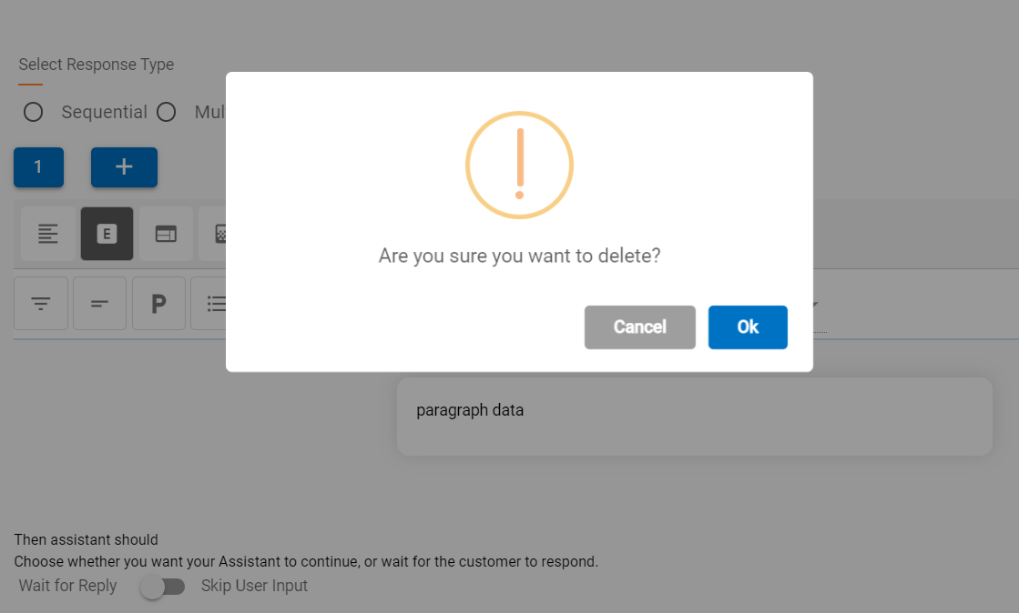
A response block can also be deleted using the delete button  . This action deletes the current
block on focus and returns focus to the previous block. If there is only one response
and that it is deleted, a new first block is auto added.
. This action deletes the current
block on focus and returns focus to the previous block. If there is only one response
and that it is deleted, a new first block is auto added.
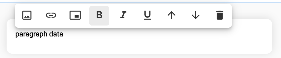
Capabilities of Default HTML Editor:
The following pointers outline the basic capabilities of the default HTML editor response type.
- The editor contains a components bar which can be added to the response based on the
requirement.
Figure 28. HTML Editor Components 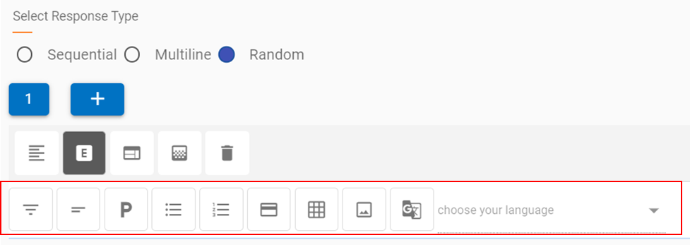
- The buttons represent basic HTML pre-built components, which in the background add the requisite HTML code. This allows the response creator or the cognitive SME to focus on the user experience and doesn’t require knowledge of HTML scripting.
- The components when clicked, are added to the response section, as shown in the
example below, where a table is added below a paragraph section.
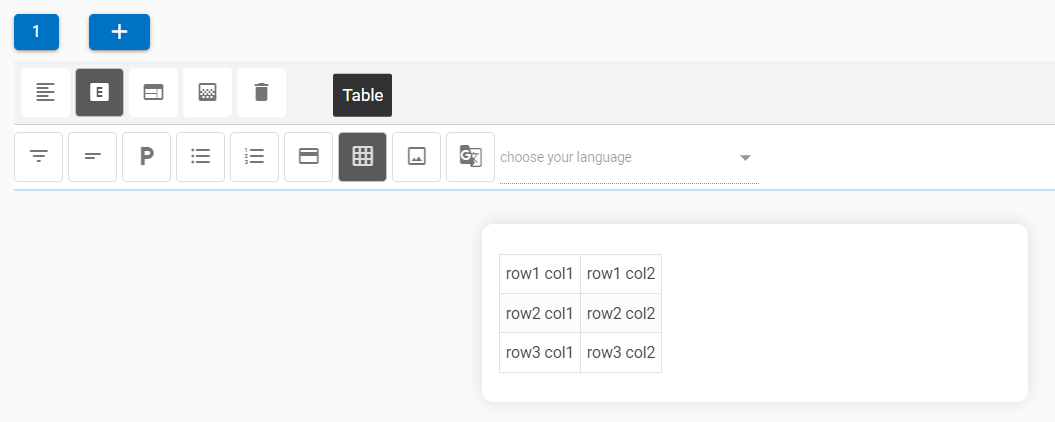
Figure 29. Paragraph & Table Components 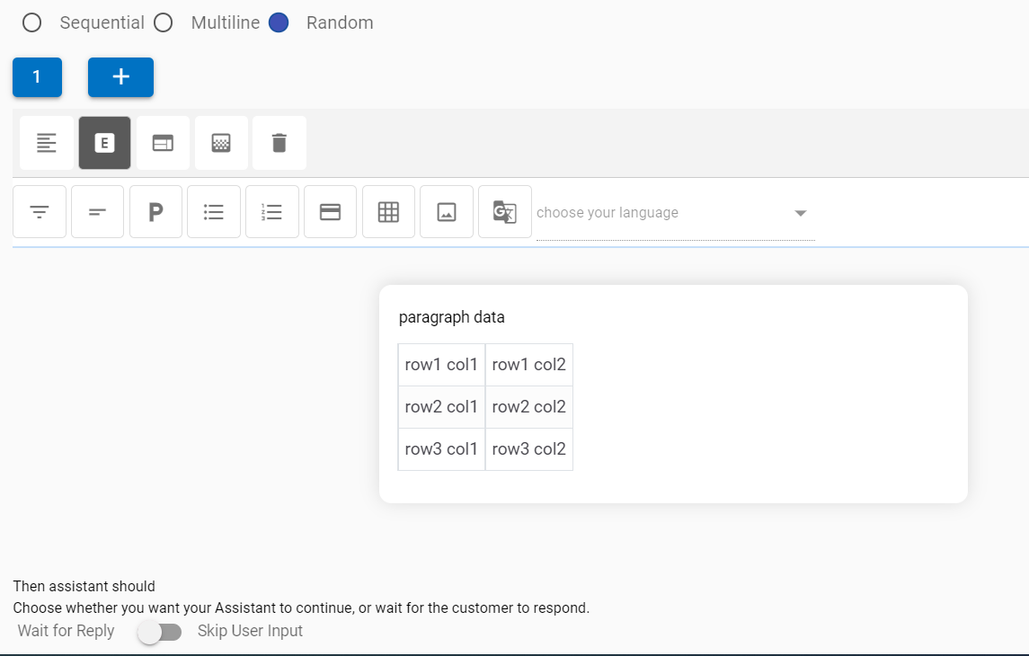
HTML Editor Components
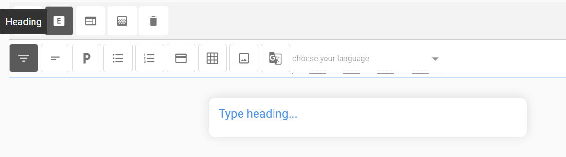
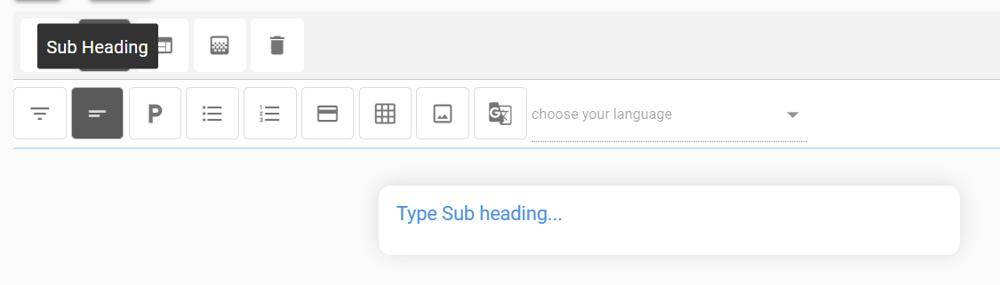
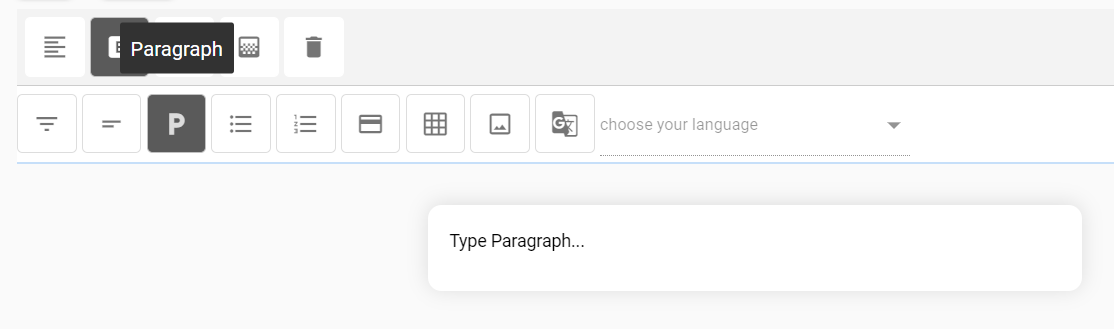
Editor components are self-explanatory; these components are listed as follows in the same order as in the screenshot above:
- Heading
- Subheading
- Paragraph
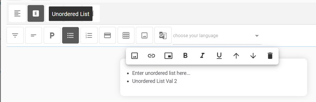
- Unordered list
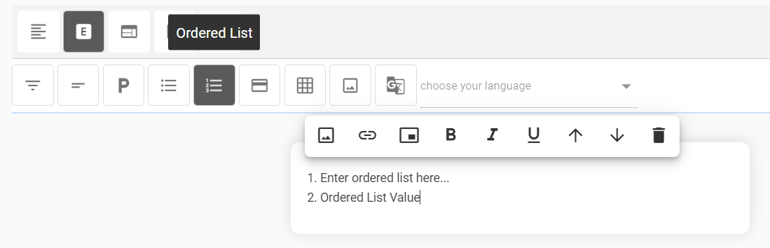
- Ordered List
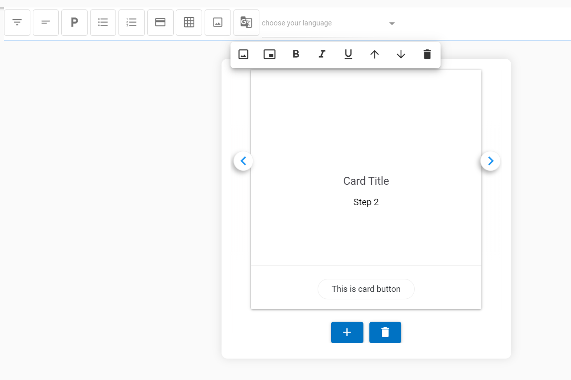
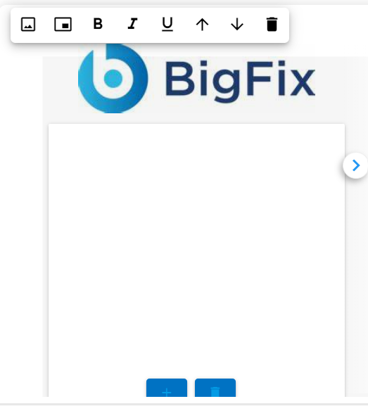
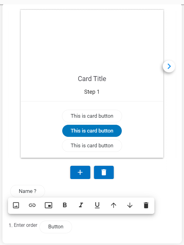
Card: The Card component provides a pre-built HTML component that contains a title, body, and a button bar.
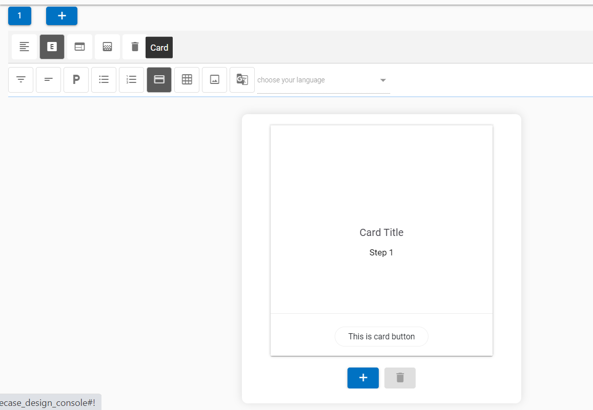
- More cards can be added to a carousel by clicking the
 button. This adds cards in a
sequence, next to the current card. The focus also changes to the latest card in the
carousel.
button. This adds cards in a
sequence, next to the current card. The focus also changes to the latest card in the
carousel. - With the addition of new cards, navigation icons are also added to the UI to move between the cards.
- Any card can be deleted by using the delete icon
 at the bottom of the card.
- Table
Image
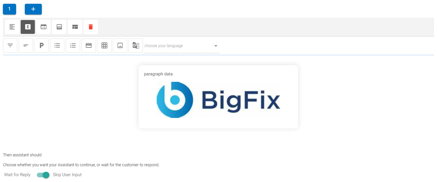
- When a user clicks on the Image component, a dialog box appears where a public image URL must be provided for the image to be displayed in the image card.(E.g.: https://www.dryice.ai/sites/default/files/product/banner-images/2021-01/BigFix AEX_0.png)
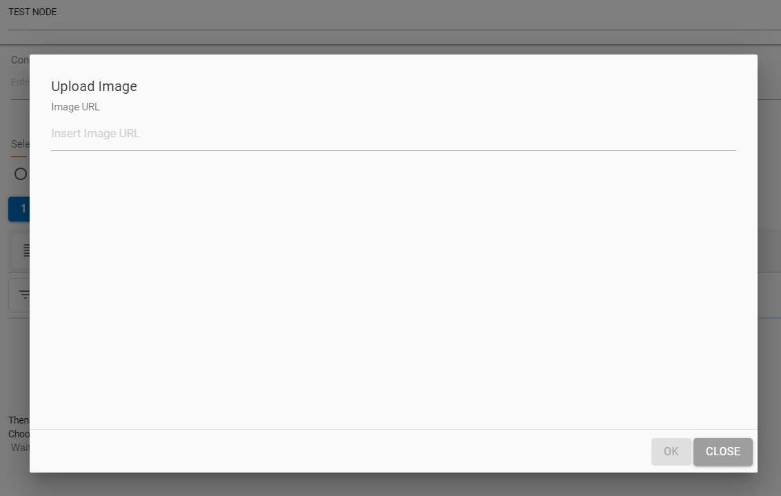
- On providing the right URL, the picture would be rendered inside the image panel.
Translation
- This option uses BigFix AEX’s fast translation capabilities to translate text in over 51 languages at once, right from the use case design console’s HTML editor.
- Multilingual connector for the current tenant must be activated before use of this feature.
- This functionality can be used only once for the current set of text. If the text needs to be changed, the current node needs to be deleted and re-created for the translation to be triggered again.
- This is not the most ideal functionality for translation (since automated translation always has lower accuracy than manual), however for quick use case implementation in different languages this capability should be used, language should always be validated by a language SME.
- Not all 51 languages are available on the chat console. However, they are currently being converted and saved as a knowledge repository in the backend.
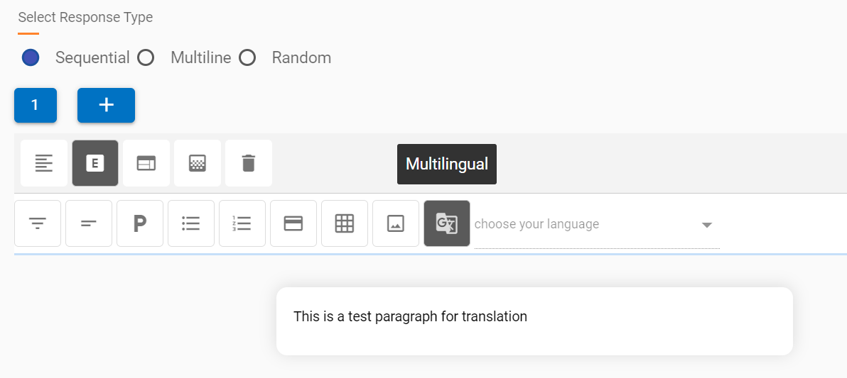
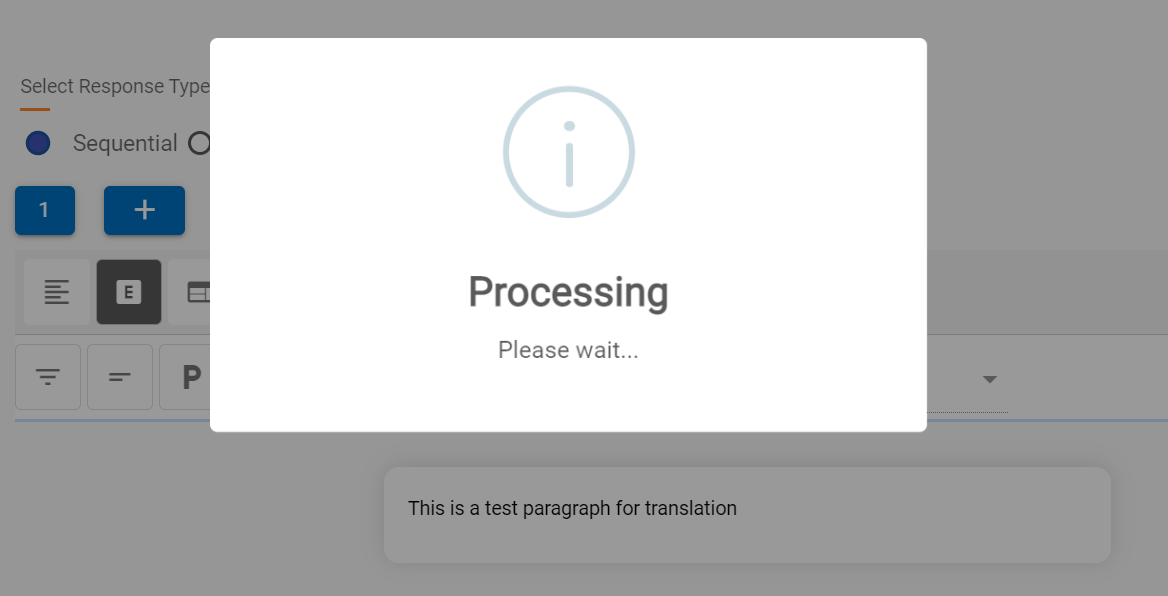
- To use this functionality, after a response block is suitable for translation, the user needs to click on the translate component button and wait for the window to confirm the translation is done. In the following image, the translation component is translating the statement “This is a test paragraph for translation.”
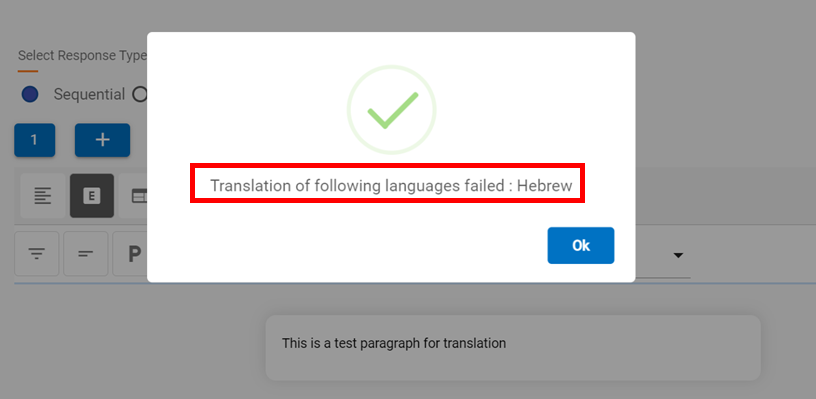
- Once the translation is complete, you will see the following dialog box confirm the translation of all 51 languages, except any failures, which are also listed.
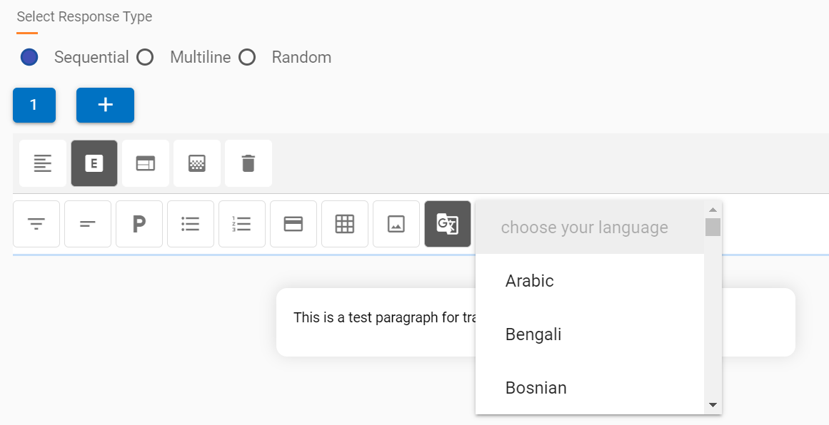
- Translation of all successful languages can be accessed using the drop-down which is populated post translation, like in the following screenshot:
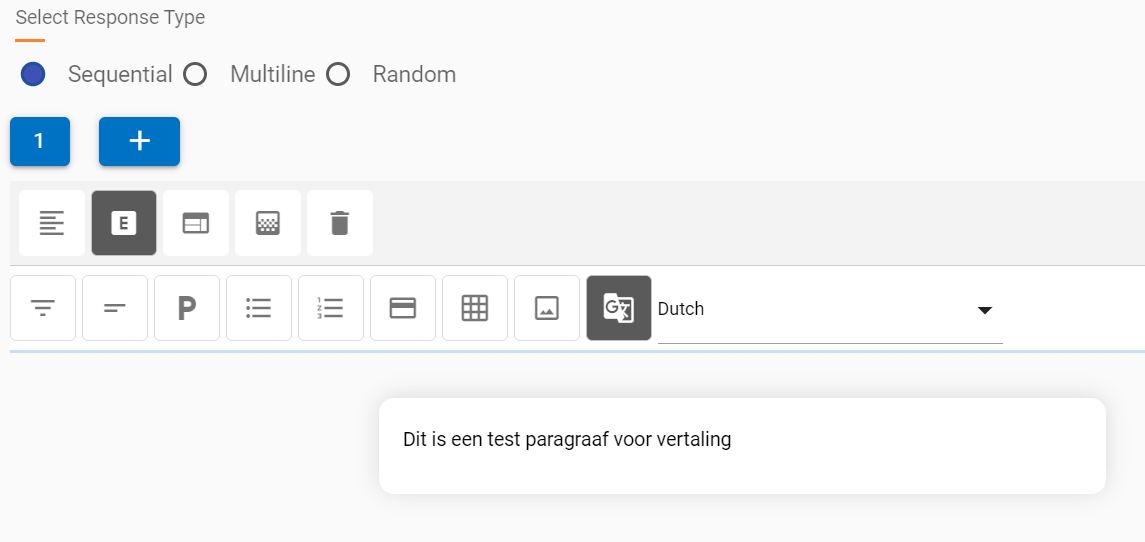
- On clicking the required language, the translation appears in the same response block. We have selected Dutch from the drop-down in this example for our original text.
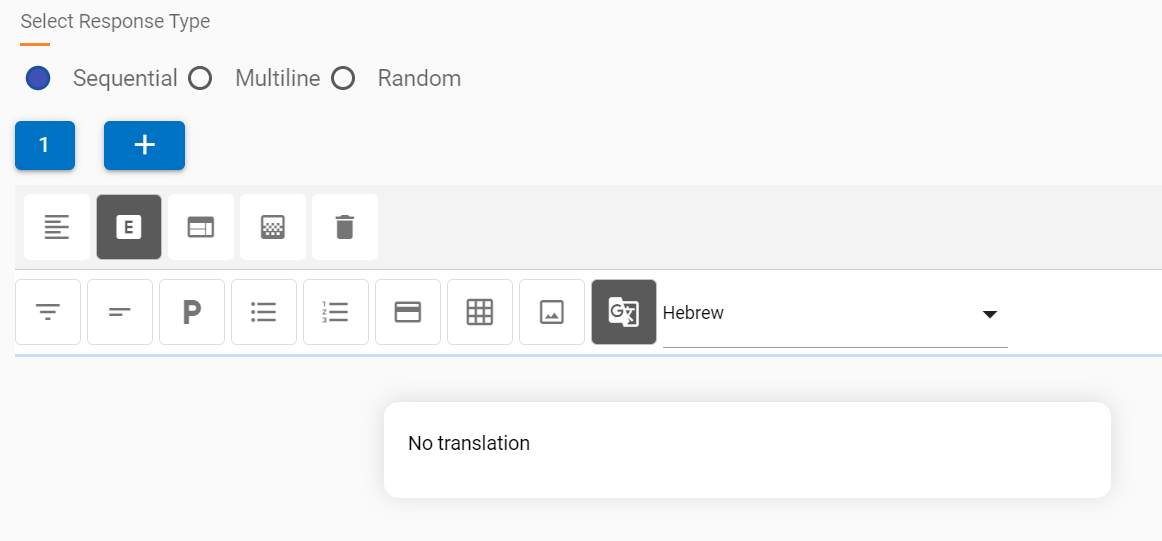
- The response for failed languages will be a default “No translation” when selected from the drop-down. For example, the failed translation into the Hebrew language.
Component Properties
Each component, when added to the response, shows options which are applicable to it on click, a list of all these options is as the following ( they will change based on every component ):
- Insert Image:

This option adds an image inline or as a new block. Insert an image inline based on the component.
- For cards, images are always inserted inside the body of the card, above the card title, the Upload Image dialog box does not show an inline option.
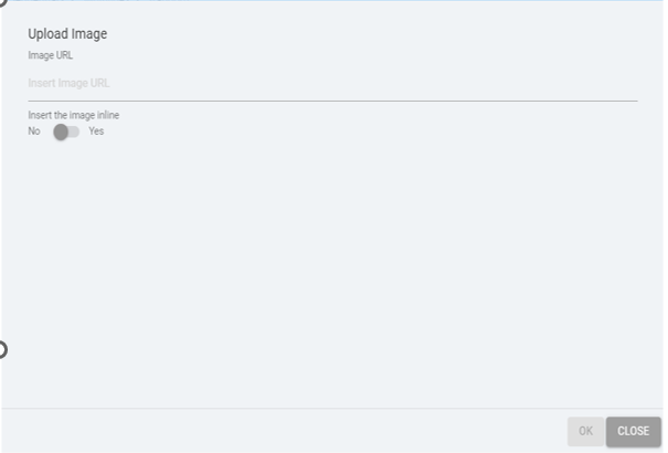
- For other components, the Upload Image dialog box displays the option of inserting an image inline.
- Otherwise, all the images are inserted inline by default.
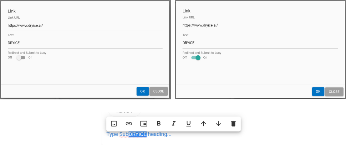
Insert Link: 
This option inserts a hyperlink in the response, which is added inline wherever the cursor is clicked. There are two types of links:
- Generic redirection link
- Custom link (which is of MCT input URL type) can be used when redirection and submission to BigFix AEX are to be done.
Insert Button:

This option inserts an MCT input button at the required location:
- In case of cards, a button is added to the bottom button bar
- In case of other components, a button is added at the cursor location
- Name of the button can be changed by clicking on the button
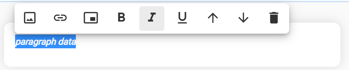
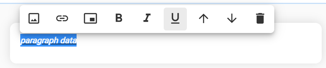
Bold: 
Makes the select text bold
Italic:

Makes the selected text italic
Underline:

- Underlines the selected text
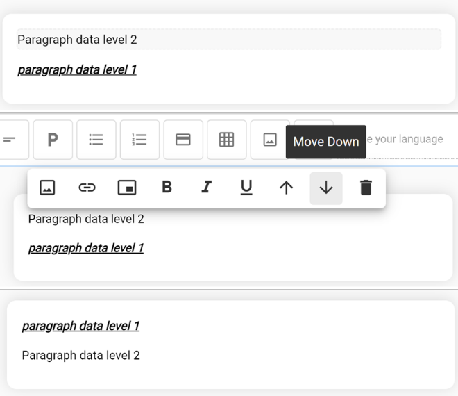
Move Up:

- Moves the component under focus (current component) above the previous component
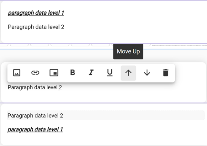
Move Down: 
- Moves the component under focus (current component) below the previous component
Delete: 
- Delete the current component from the response
Row Header:
 (Available only in the Table
Component)
(Available only in the Table
Component)
- Makes the top row (row header) of the current table bold.
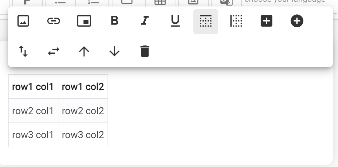
Column Header:  (Available only in Table Component)
- Makes the first column (column header) of a table bold
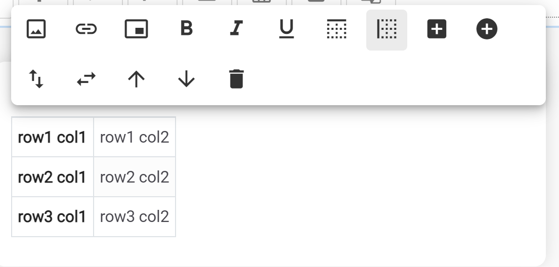
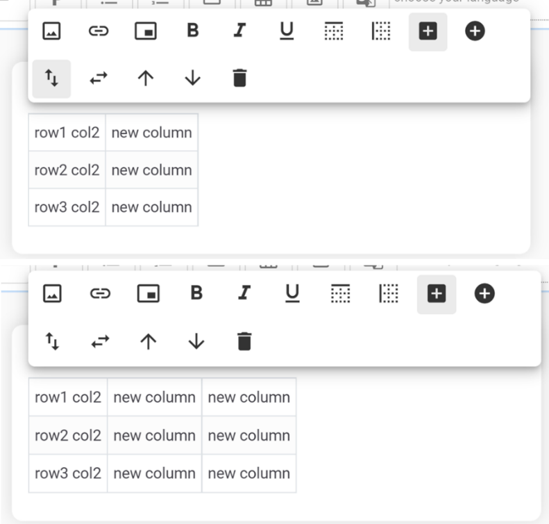
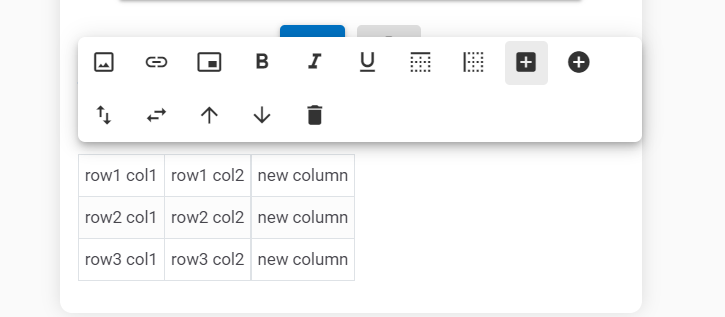
Add Column:
 (Available only in Table
Component)
(Available only in Table
Component)
- Adds a new column to the right for the current table
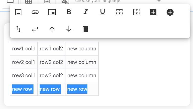
Add Row:  (Available only
in Table Component)
(Available only
in Table Component)
- Adds a new row to the bottom of the current table
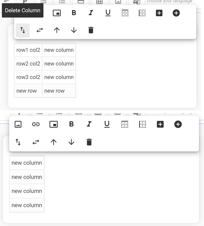
Delete Column:
 (Available only in Table
Component)
(Available only in Table
Component)
- Deletes the current column (where the cursor is present) from the current table
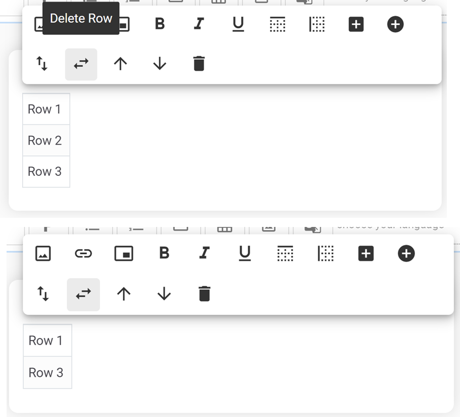
Delete Row:  (Available
only in Table Component)
(Available
only in Table Component)
- Deletes the current row (where the cursor is present) from the current table
Some examples of different options based on the component can be seen in the screenshots below:
A new component is always added to the end of the current response by default; however, it can be moved up or down using the appropriate action.
Finally, at the end you may see an option to assistant response:
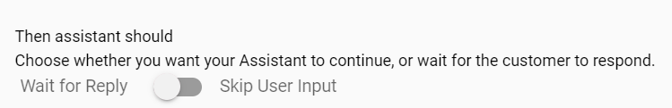
- Wait for Reply
- Skip User Input