Text: It defines the text which is to be displayed. It is of type string and is a
required field.
Color: It controls the color of the TextBlock elements. Allowed values are
default, dark, light, accent, good, warning and attention.
Font Type: It specifies the type of fonts to use for rendering. It is not a
required value. Allowed values are default and monospace.
Horizontal Alignment: It controls the horizontal text alignment. If not
specified, the value of horizontal Alignment is inherited from the parent container. If
no parent container has horizontal Alignment set, it defaults to left. It is not a
required value and allowed values are left, centre and right.
MaxLines: It specifies the maximum number of lines to display. It is of type
number and not a required field.
Size: It controls the size of the text. It is not a required value and allowed
values are default, small, medium, large, and extra-large.
Wrap: It wraps the text if its value is set to true, if not then the text is
clipped.
Height: Specifies the height of an element. It is not a required value. Allowed
values are auto and stretch.
Separator: When true, it will draw a separating line at the top of an element. It
is not a required field and is of type Boolean.
Spacing: Controls the amount of spacing between this element and the preceding
element. It is not a required value. Allowed values are default, none, small, medium,
large, extra-large, and padding.
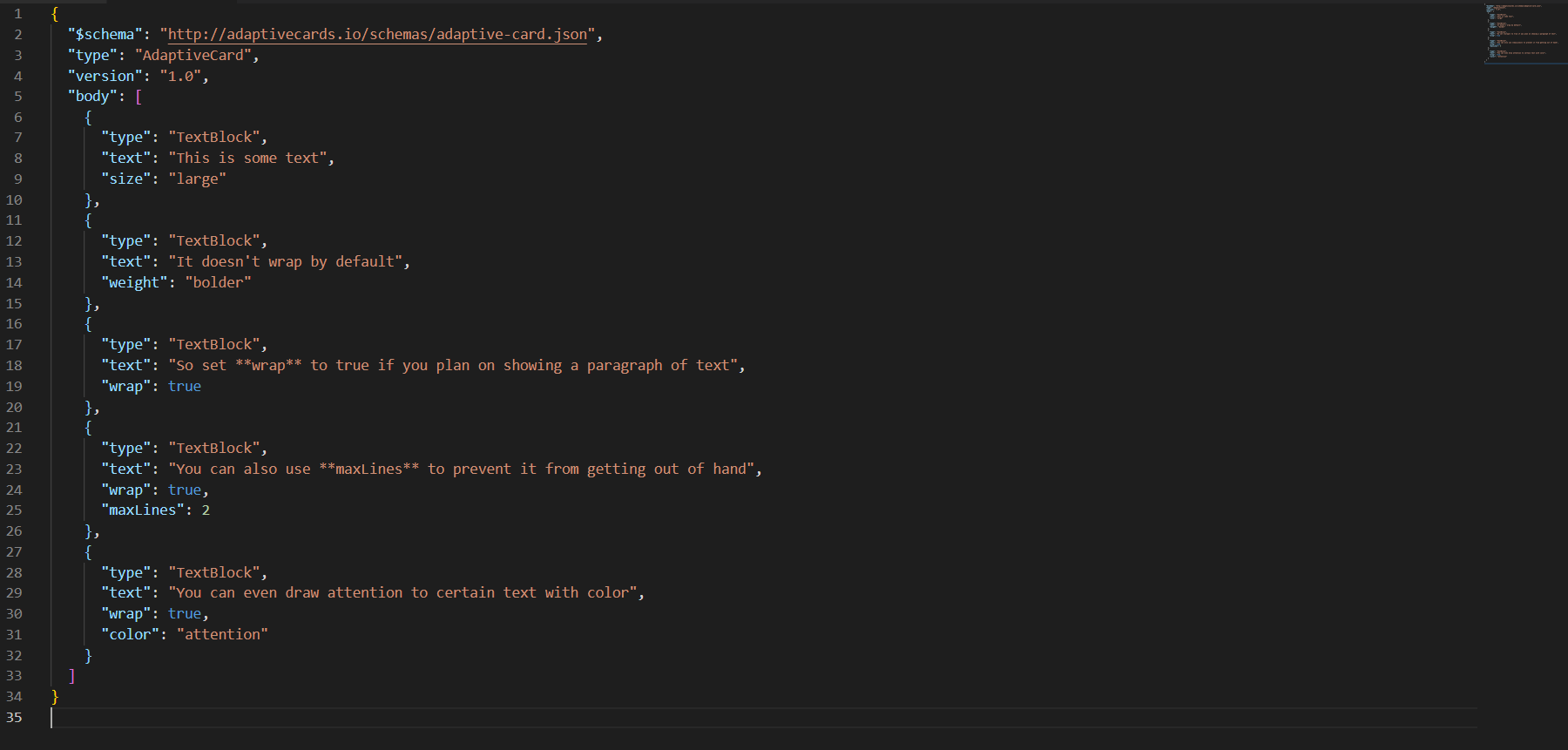
Example Code:
Figure 1. Example Code (Text Block)
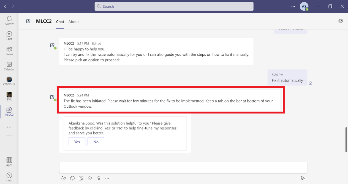
Teams UI TextBlock Example:
Figure 2. Teams UI Text Block Example
Image – Properties:
URL: It consists of URL of the image. It is of type Uri and is a required
value.
Alt Text: It will display the alternate text to display if image is not present.
It is of type string and not a required value.
Background Colour: It will apply a background to a transparent image. It is of
type string and not a required value.
Height: It will specify the height of the image. It is not a required value.
Default value is auto and allowed values are string, auto and stretch.
Horizontal Alignment: It will control how the element is horizontally positioned
within its parent. When not specified, the value of horizontalAlignment is inherited
from the parent container. If no parent container has horizontalAlignment set, it
defaults to left. Allowed values are left, centre and right.
Size: It will control the size of the image. Allowed values are auto, stretch,
small, medium, and large.
Style: It will control how the image is displayed. Allowed values are default and
person.
Width: It will control the desired on-screen width of the image, if defined in
pixel it will overrides the size property. It is not a required field.
Separator: If specified true, it will draw a separating line at the top of the
element.
Spacing: It will control amount of spacing between the elements. It is not a
required value. Allowed values are default, none, small, medium, large, extra-large, and
padding.
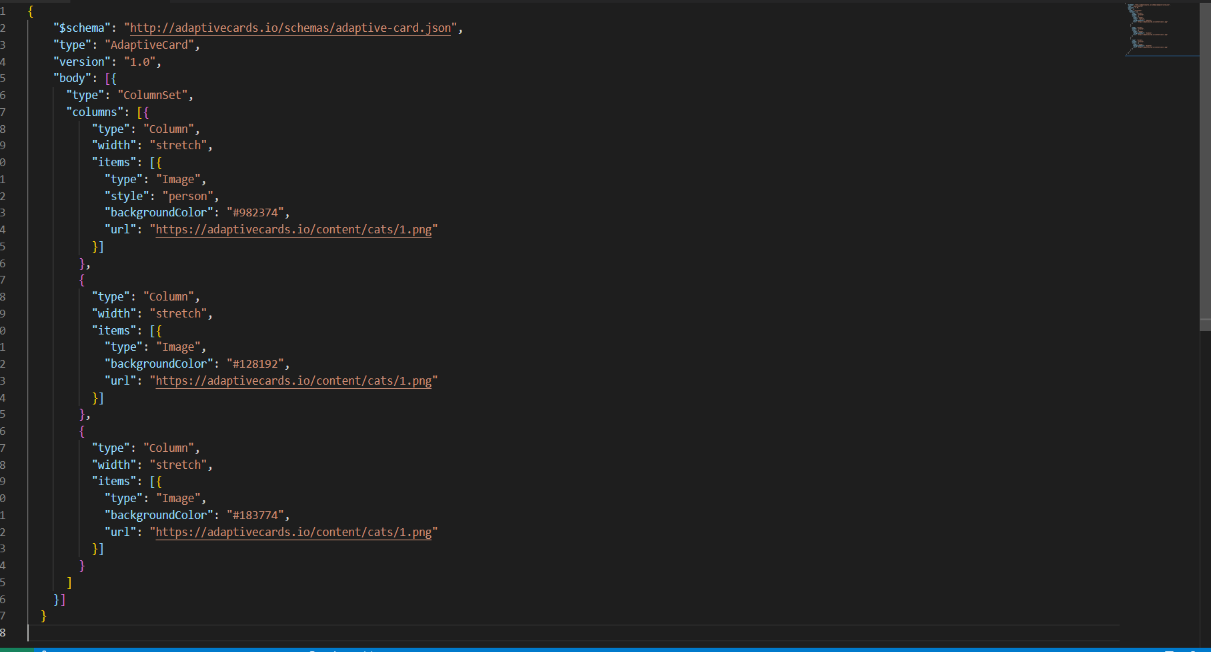
The following screen display the example code of image properties: