url: It will contain the URL which is to open. It is a required property and of
type URL.
Title: It is a label for button or link for action. It is not a required property
and of type string.
iconURL: It is the optional icon to be shown on the action in conjunction with
the title. It is not a required field and of type URL.
Id: A unique Identifier associated with the action. It is not a required property
and of type string.
Style: It controls the style of an action, which influences how the action is
displayed, spoken, etc. It is of type ActionStyle. It is not a required property.
Allowed values are default, positive and destructive.
Fallback: It will tell what to do when an unknown element is encountered or the
requires of this or any children can't be met. It is not a required value. It is of type
Action and Fallback Option. It is supported in version 4.2. Allowed values are
Action.Execute, Action.OpenUrl, Action.ShowCard, Action.Submit, Action.ToggleVisibility
and drop (Causes this element to be dropped immediately when unknown elements are
encountered.)
Tooltip: It defines text that should be displayed to the end user as they hover
the mouse over the action and read when using narration software. It is of type string
and supported in version 1.5. It is not a required property.
isEnabled: It determines whether the action should be enabled. It is of type
Boolean and supported in version 1.5.
mode: It determines whether the action should be displayed as a button or in the
overflow menu. It is of type ActionMode and supported in version 1.5. Allowed values are
primary and secondary.
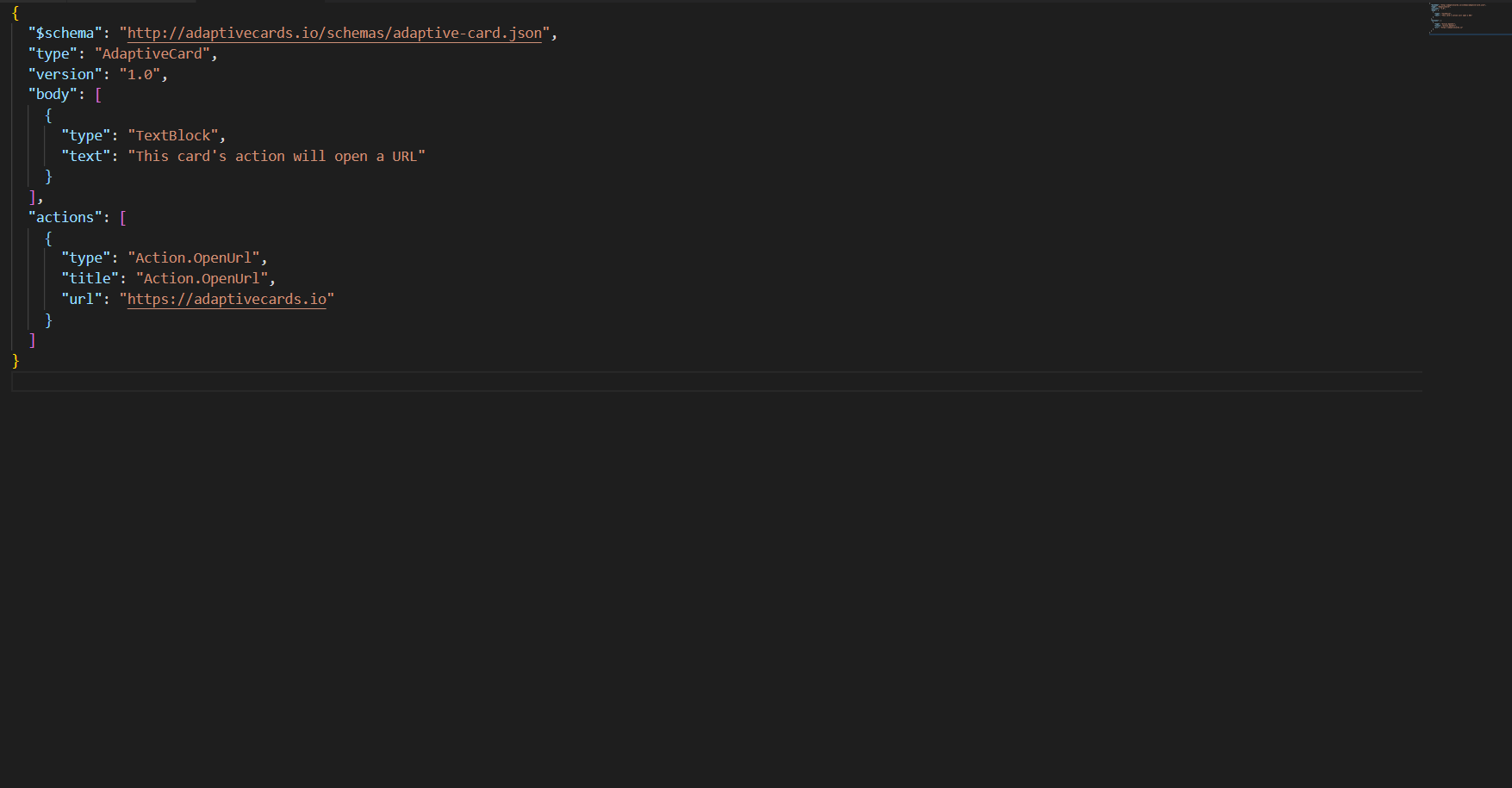
The following screen displays the example code of OpenUrl Properties:
Figure 1. Example Code (Action.openURL)
Action.Submit – Properties:
Data: Initial data that input fields will be combined with. These are essentially
‘hidden’ properties. It is of type string or object and not a required
property.
associatedInputs: It controls which inputs are associated with the submit action.
It is of type AssociatedInputs and is not a required property. Allowed values are auto
and none. Default one is auto.
Title: It is a label for button or link for action. It is not a required property
and of type string.
iconURL: It is the optional icon to be shown on the action in conjunction with
the title. It is not a required field and of type URL.
Id: A unique Identifier associated with the action. It is not a required property
and of type string.
Style: It controls the style of an action, which influences how the action is
displayed, spoken, etc. It is of type ActionStyle. It is not a required property.
Allowed values are default, positive and destructive.
Fallback: It will tell what to do when an unknown element is encountered or the
requires of this or any children can't be met. It is not a required value. It is of type
Action and Fallback Option. It is supported in version 4.2. Allowed values are
Action.Execute, Action.OpenUrl, Action.ShowCard, Action.Submit, Action.ToggleVisibility
and drop (Causes this element to be dropped immediately when unknown elements are
encountered.)
Tooltip: It defines text that should be displayed to the end user as they hover
the mouse over the action and read when using narration software. It is of type string
and supported in version 1.5. It is not a required property.
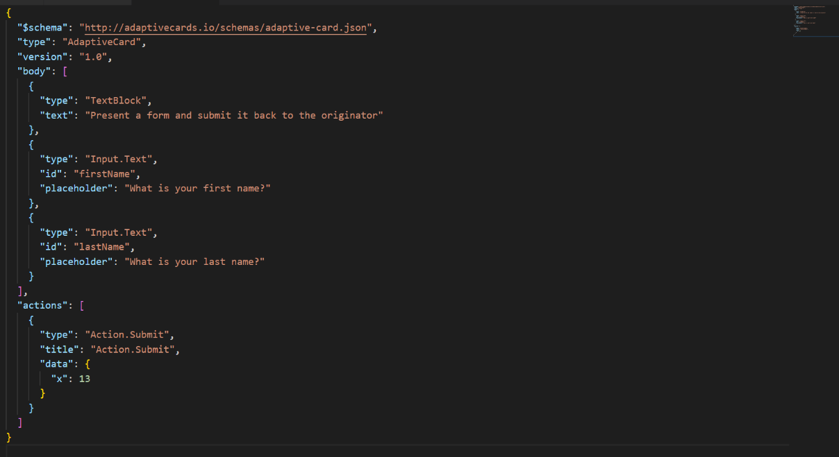
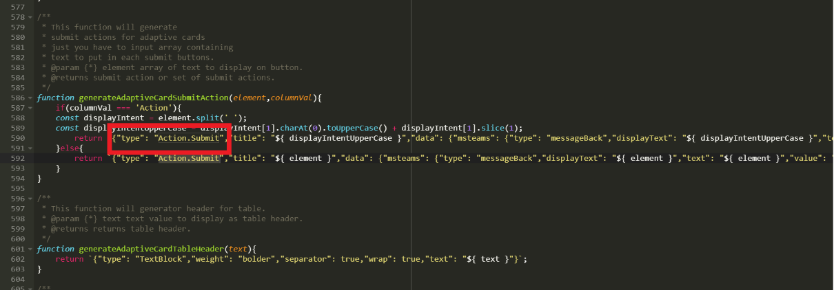
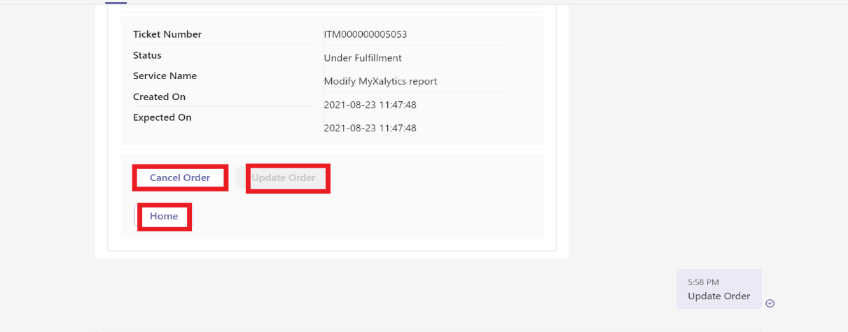
The following screen displays the example code of Action.Submit Properties: Figure 2. Example Code (Action.Submit)Figure 3. Example Code (Action.Submit) (Cont.)Figure 4. Teams UI Action.Submit Example
Action.ShowCard – Properties:
Card: The Adaptive Card to show. Inputs in ShowCards will not be submitted if the
submit button is located on a parent card. It is of type AdaptiveCard. Allowed values
are: Adaptive Card.
Title: It is a label for button or link for action. It is not a required property
and of type string.
iconURL: It is the optional icon to be shown on the action in conjunction with
the title. It is not a required field and of type URL.
Id: A unique Identifier associated with the action. It is not a required property
and of type string.
Style: It controls the style of an action, which influences how the action is
displayed, spoken, etc. It is of type ActionStyle. It is not a required property.
Allowed values are default, positive and destructive.
Fallback: It will tell what to do when an unknown element is encountered or the
requires of this or any children can't be met. It is not a required value. It is of type
Action and Fallback Option. It is supported in version 4.2. Allowed values are
Action.Execute, Action.OpenUrl, Action.ShowCard, Action.Submit, Action.ToggleVisibility
and drop (Causes this element to be dropped immediately when unknown elements are
encountered.)
Tooltip: It defines text that should be displayed to the end user as they hover
the mouse over the action and read when using narration software. It is of type string
and supported in version 1.5. It is not a required property.
isEnabled: It determines whether the action should be enabled. It is of type
Boolean and supported in version 1.5.
mode: It determines whether the action should be displayed as a button or in the
overflow menu. It is of type ActionMode and supported in version 1.5. Allowed values are
primary and secondary.
The following screen displays the example code of Action ShowCard Properties: Figure 5. Example Code (Action.ShowCard)
Action.ToggleVisibility – Properties:
Target Elements: It will contain the array of target elements. It is of type
TargetElement[] and a required property. Allowed values are TargetElement and
string.
Title: It is a label for button or link for action. It is not a required property
and of type string.
iconURL: It is the optional icon to be shown on the action in conjunction with
the title. It is not a required field and of type URL.
Id: A unique Identifier associated with the action. It is not a required property
and of type string.
Style: It controls the style of an action, which influences how the action is
displayed, spoken, etc. It is of type ActionStyle. It is not a required property.
Allowed values are default, positive and destructive.
Fallback: It will tell what to do when an unknown element is encountered or the
requires of this or any children can't be met. It is not a required value. It is of type
Action and Fallback Option. It is supported in version 4.2. Allowed values are
Action.Execute, Action.OpenUrl, Action.ShowCard, Action.Submit, Action.ToggleVisibility
and drop (Causes this element to be dropped immediately when unknown elements are
encountered.)
Tooltip: It defines text that should be displayed to the end user as they hover
the mouse over the action and read when using narration software. It is of type string
and supported in version 1.5. It is not a required property.
isEnabled: It determines whether the action should be enabled. It is of type
Boolean and supported in version 1.5.
mode: It determines whether the action should be displayed as a button or in the
overflow menu. It is of type ActionMode and supported in version 1.5. Allowed values are
primary and secondary.
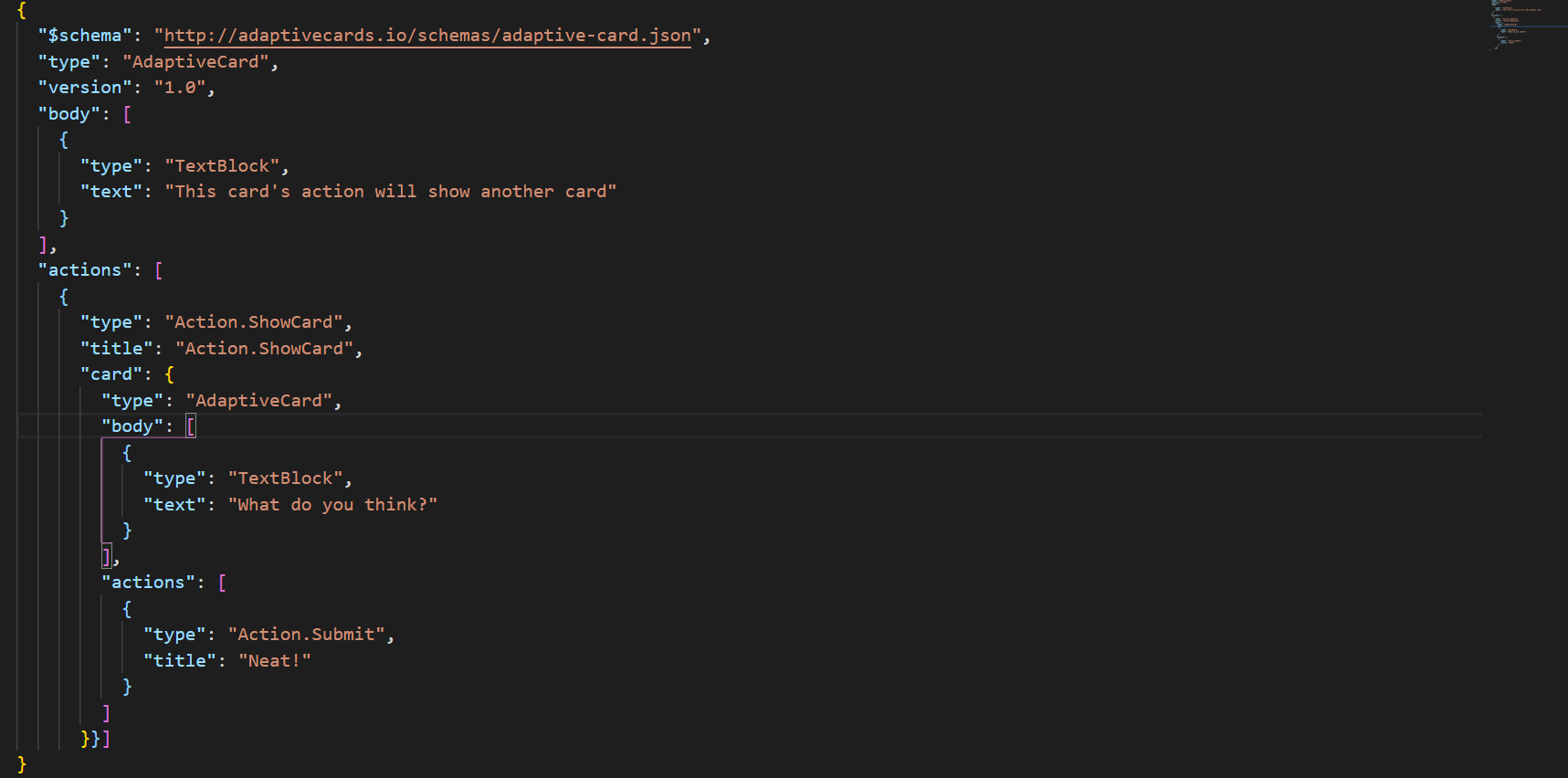
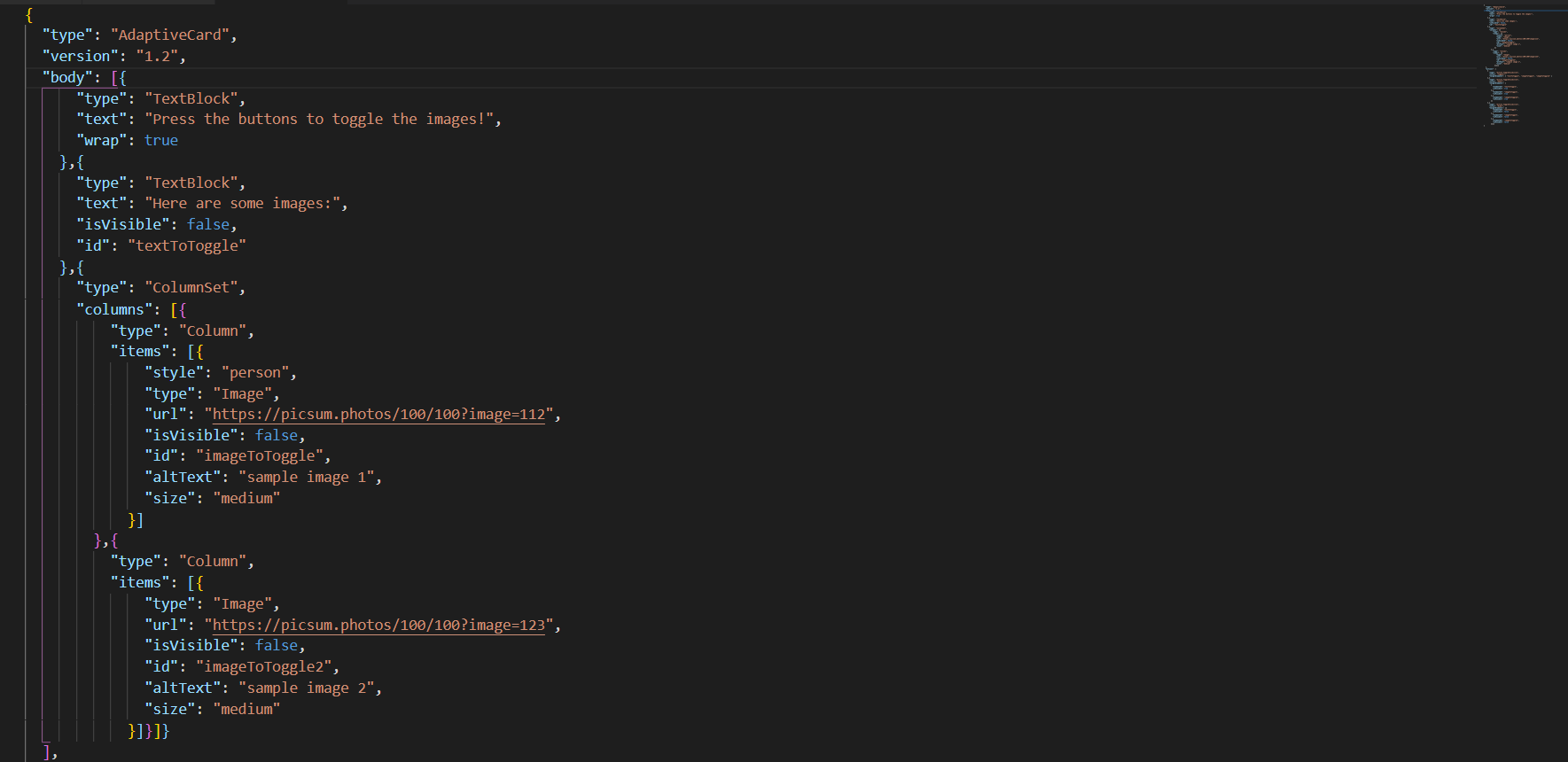
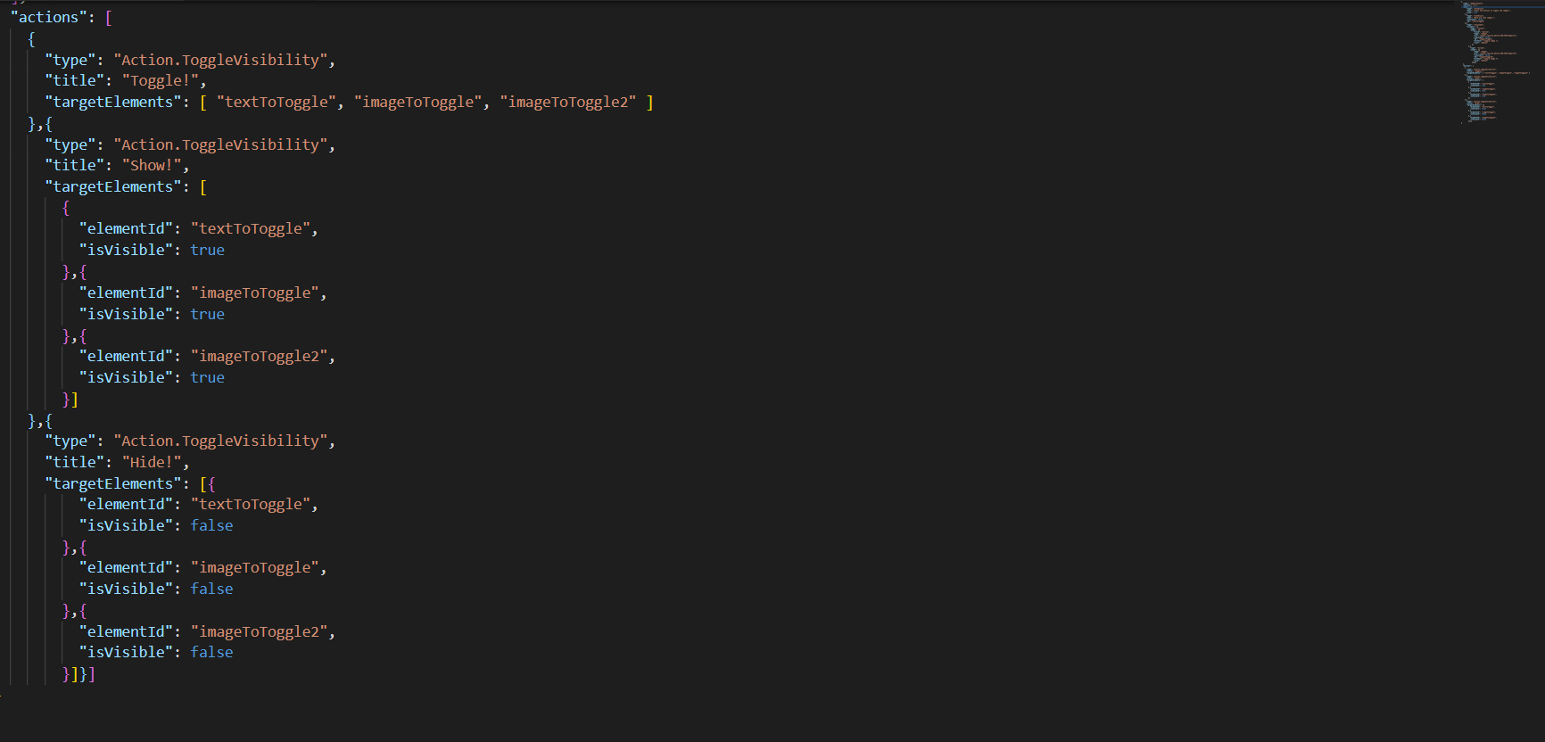
The following screen displays the example code of Action. ToggleVisibility Properties:Figure 6. Example Code (Action.ToggleVisibility)Figure 7. Example Code (Action.ToggleVisibility) (Cont.)
TargetElement – Properties:
elementId: It specifies the element id of the element to toggle. It is of type
string and a required property.
isVisible: If value is true, always show target element. If value is false, it
hides target element. It is of type Boolean and not a required property.
Action.Execute – Properties:
Verb: The card author can define verb associated with the action. It is of type
string and not a required property.
Data: Initial data that input fields will be combined with. These are essentially
‘hidden’ properties. It is of type string or object and not a required property.
associatedInputs: It controls which inputs are associated with the submit action.
It is of type AssociatedInputs and is not a required property. Allowed values are auto
and none. Default one is auto.
Title: It is a label for button or link for action. It is not a required property
and of type string.
iconURL: It is the optional icon to be shown on the action in conjunction with
the title. It is not a required field and of type URL.
Id: A unique Identifier associated with the action. It is not a required property
and of type string.
Style: It controls the style of an action, which influences how the action is
displayed, spoken, etc. It is of type ActionStyle. It is not a required property.
Allowed values are default, positive and destructive.
Fallback: It will tell what to do when an unknown element is encountered or the
requires of this or any children can't be met. It is not a required value. It is of type
Action and Fallback Option. It is supported in version 4.2. Allowed values are
Action.Execute, Action.OpenUrl, Action.ShowCard, Action.Submit, Action.ToggleVisibility
and drop (Causes this element to be dropped immediately when unknown elements are
encountered.)
Tooltip: It defines text that should be displayed to the end user as they hover
the mouse over the action and read when using narration software. It is of type string
and supported in version 1.5. It is not a required property.
isEnabled: It determines whether the action should be enabled. It is of type
Boolean and supported in version 1.5
mode: It determines whether the action should be displayed as a button or in the
overflow menu. It is of type ActionMode and supported in version 1.5. Allowed values are
primary and secondary.
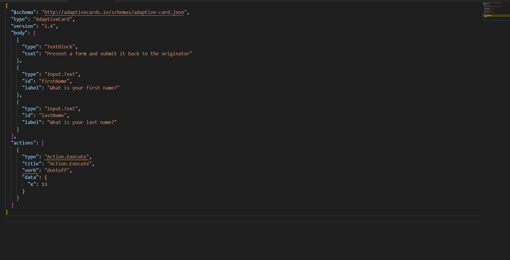
The following screen displays the example code of Action.Execute Properties:Figure 8. Example Code (Target Element)