Control Properties
This section details the steps for a provider user to edit the control and provide customized value to controls.
To edit/modify the properties, the provider needs to follow the steps below:
- Click Property (
 ).
).Figure 1. Property 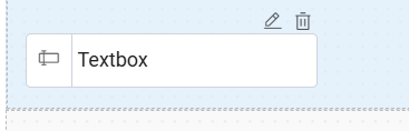
- A section window appears as shown below:
Figure 2. Properties 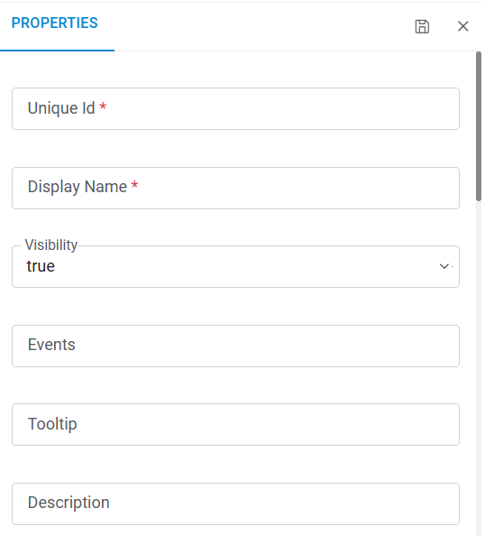
Figure 3. Properties (Cont.) 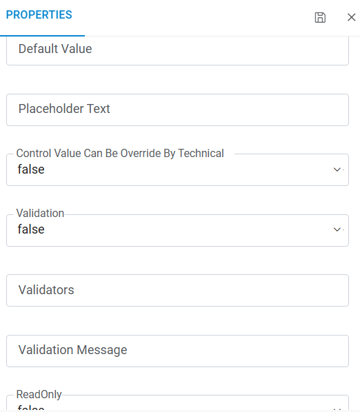
Figure 4. Properties (Cont.) 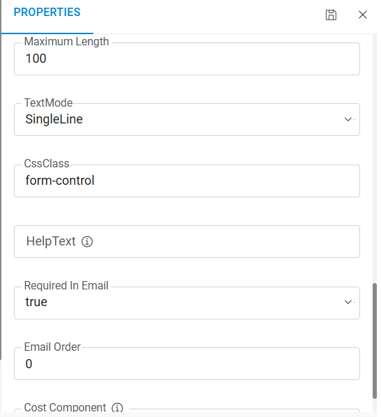
Refer to the table below to understand the fields mentioned in the above figure:
Control Properties
Fields Description Unique ID A unique identifier for each control (i.e., tags, additional storage, subnet) can’t be chosen as an id of a control Display Name To display the name of the control on screen Visibility To show/hide control on the screen. By default, it is set to true Events - Defines the event for a control, like onblur=blurevent ().
- Multiple events can be separated by a pipe (|); e.g., onblur=blurevent ();, onkeyup=keyupevent ();
Tool Tip Display the note as a tooltip when a user hovers on the control Description Provide details about the control Default value Auto-populate the default text/selected value of the control Placeholder text Provide a piece of information as watermark within the control Control value can be Override by Technical This contains two values true and false. It is false by default; It means that the technical Approver cannot override it. When it is marked as true, then technical approver can change the value of the control irrespective of the visibility property of the control is set to true or false. Validation To enable/disable validation for control. By default, it is false. It means there is no validation on control Validators This contains the available validator list. Multiple validators can be selected Validation Message Shows the validation message for a control. In case of multiple validators, multiple validation messages can be separated by double pipe (||) ReadOnly To make control as read-only Maximum length Used for defining the control length so that the user cannot type more than the defined length TextMode This is used for defining the control mode like a text box/password CssClass This is used for defining the pre-build CSS classes on the control for designing purpose HelpText To provide the help text for a control, once there is a value in this property, a control will appear on screen with information icon, and the help text will be visible by hovering on the information icon Allowed Values This field is unique for “Select” control. It contains comma-separated values which is used for the drop down/select control data binding Multiple This field is unique for “Select” control. It allows the user to select more than one value. By default, it is false, and the user can select only one value, but if it’s set as true, then it can select multiple items from the list Max tag count This field is unique for “Key value pair” control. It sets the limit of the tag, e.g., if the value is five then user can add only five tags Collection Type This field is unique for “Key value pair” control Max Tag count This field is unique for “Addl. storage” control. It sets the limit for storage, e.g., if it is five so users can only add five storages Required in Email To enable/disable control availability for email. Email Order For defining the sequence number on email. Data Source This field is unique for “Select” control. It contains functions which are used for the drop down/ select control data binding. Cost Component This field defines whether control will be used for expected cost calculation., if this property is enabled for a control, then symbol “$” will be visible with control Possible values are “Applicable” and “Not Applicable”.
“Not Applicable”: Control will not be used for expected cost calculation.
“Applicable”: Control will be used for expected cost calculation.
Below are the values for Cost Component:
- Not Applicable (default)
- Compute CPU
- Compute Memory
- OS Disk Quantity
- OS Disk Type
- Period Interval
- Period Value
- Service Plan
In Custom control & Additional Storage there will be 2 values in "Cost Component" as
- Not Applicable (default)
- Additional Disk Type
By default, cost from above configuration will be calculated in show cost, in case users want to calculate by their logic they will write their logic in dynamic UI form under
Function showCost and comment the HCL BigFix CLM out of box function “GetComponentExpectedCost” as mentioned in below.
function ShowCost() {
// Comment below function to write your own custom logic to calculate cost.
GetComponentExpectedCost();
return true;
}
For all UI fields, by default "Cost Component" will have "Not Applicable" as selected and $ will display (as in below screen shot for objected) in case there is other value then "Not Applicable" selected in any fields.
- Enter the details in each field and click Save icon
 .
.