UI Components
You will be navigated to a canvas where controls and tabs are visible, as shown below:
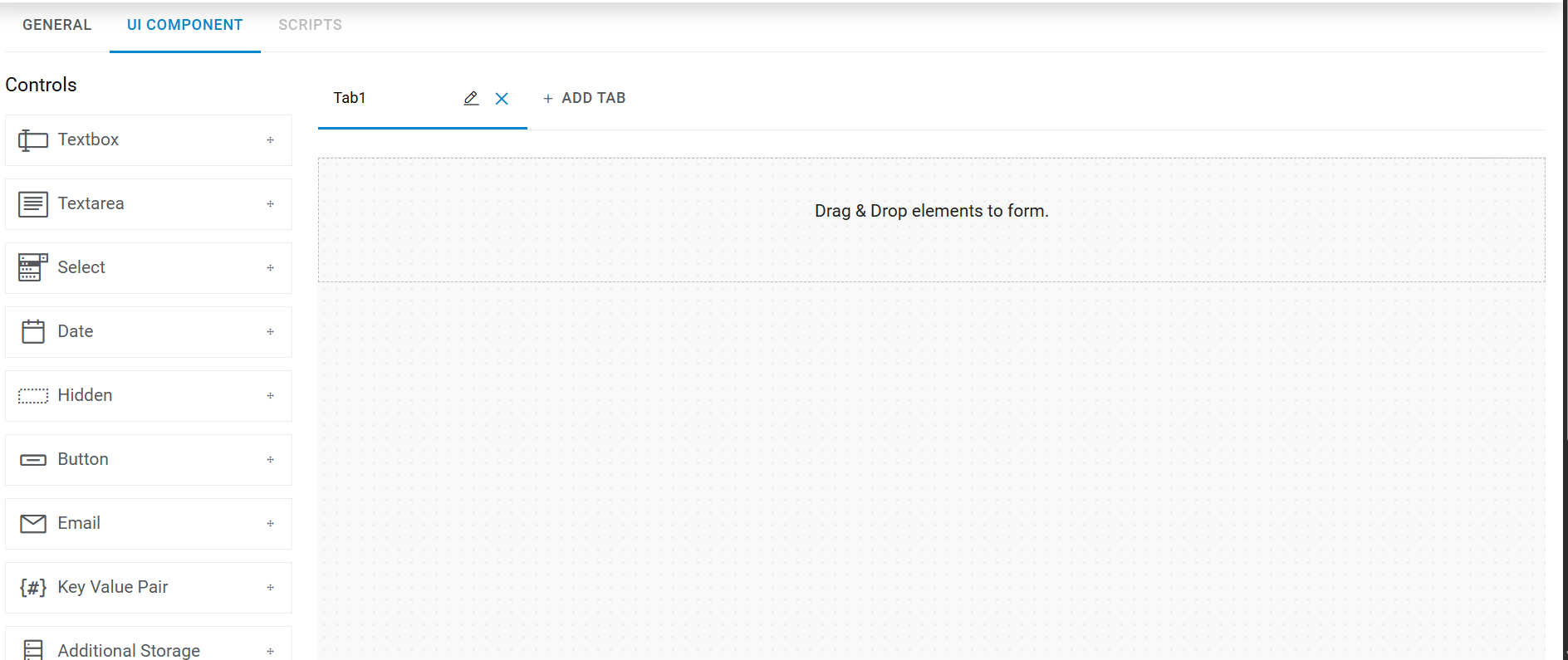
The left-side panel lists all the controls, and the right-side panel contains the tab details, based on no. of tabs selected in the above section:
- In the Tabs section, there is an Add Tab (
 ) option that helps the user to add more
tab(s) on canvas.
) option that helps the user to add more
tab(s) on canvas. - Tabs sequence can be changed using the drag drop tabs into the tab container area.
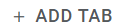
Figure 2. Adding Control to a Tab 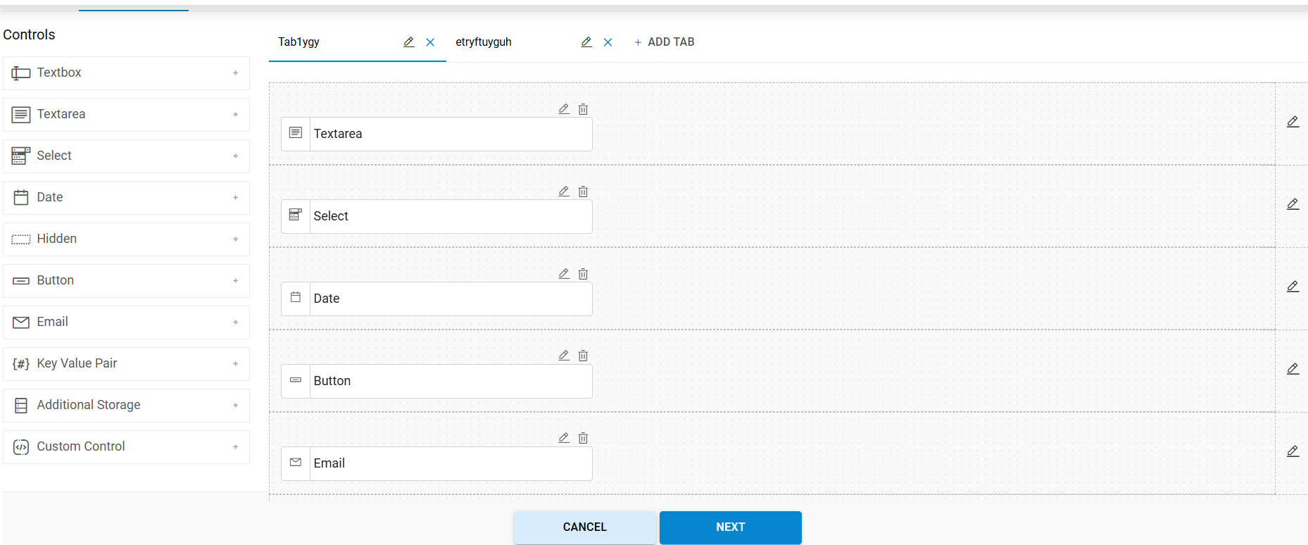
Refer to the below table to understand the fields mentioned in the above figure:
Edit Tab Fields
Fields Description Text Box Add the text box on the screen Text Area Add the text area (multi-line text box) on the screen and use for input like large text, i.e., description, address, etc. Select Add the select/drop down list on the screen. It is used for selecting data from the list like region, city, state, etc. Date Add the text box with date calendar control on the screen. It is used for selecting the date like From Date, To Date, etc. Hidden Field Used for storing the value which is not visible to end-user Key value Pair Used for tags. USER can take multiple key value pair controls. Addl. Storage This is a custom control which is used for collecting the storage details. All storage details are in GB, and only one additional storage control per screen is allowed Button Generate the button on the screen. It is used for performing any action on the screen Email Add the text box to the screen. It is used for sending additional emails. We can define multiple emails with semicolon (;) Custom control Custom control is a set of controls which can be used for collecting disk and network details for different cloud platforms. Users will have options to select different controls which are readily available and can customize their properties. It is platform dependent and can render controls based on specific cloud platforms. Users can take only one custom control for disk and network, respectively. - Drag and drop the Controls (Text Area, Text, Select, Date, Key-value Pair and many more) on the Tab container area.
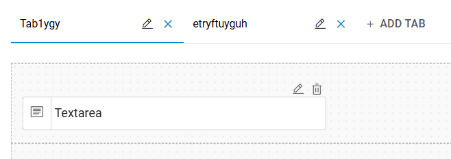
- To remove a tab, click on
 icon.
icon.
Note:
The tab container area is where a user drags and drops any number of control(s) and Tab name is mandatory.
The Header section contains the following controls:

|
The user can preview the email of the UI by clicking on this Email Preview icon. |

|
User can preview the complete form using the Preview icon. |

|
The user can create new UI Form using the Create New icon. |
|
The user can update the update UI Form using the Update icon. |
|
The Copy to New UI icon helps users to copy the existing UI into new UI Form. |