The Selection List component is responsible for recognizing selection
lists. Selection lists are like menus, but they are presented as a
list of options, each of which is preceded by a leading token and
a delimiter, such as in the following example:
Option 1. Prepare form
Option 2. Work with forms
you submitted
Option 3. Work with forms
requiring action
In this example, Option is
the string before the leading token, 1, 2,
and 3 are the leading
tokens, and the delimiter is a period followed by a space (. ).
Once a list item has been selected (either clicked or selected
depending on the widget), its leading token is placed in the targeted
host input field.
A recognized selection list can be rendered by the following widgets:
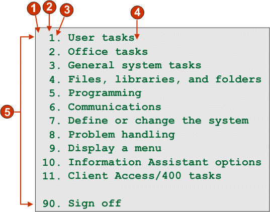
The following figure shows how a selection list component might
appear on your host screen:
Figure 1. Selection list component example
String before the leading token (a space)
Leading token type (digit)
Delimiter (a period (.))
End delimiter (a space)
List options (or items)
The following settings can be configured for this component:
String before the leading token
Optional. The string which precedes the leading token of each
list item.
Leading token type
Specifies whether each list item starts with letters, digits,
or both letters and digits.
Maximum length of leading token
Specifies the maximum length of the leading token. The default
is 4.
Delimiter
Required. The string of characters between the leading token
and the description. You can specify more than one value, separated
by the vertical bar (|) character.
End delimiter
Optional. The string of characters which must follow each list
item.
Minimum required options
The minimum number of list items that must be found in order
for the selected region to be recognized as a selection list.
Group Items Individually
Select this box if you want to group items individually.
Selection target field
Specifies which input field receives the selection. Options: First on screen, Last on screen, Previous field, Next field, Cursor position, or User defined.
Row
Specifies the row of the input field which should receive the
selection.
Note: This setting only applies
if User defined is selected as the
selection target.
Column
Specifies the column of the input field which should receive
the selection.
Note: This setting only applies
if User defined is selected as the
selection target.
Auto submit on select
If selected, an AID key is automatically sent to the host even
if the input field is blank. If cleared, an AID key is not automatically
sent.
Action key
Optional. Specifies the host aid key that should be pressed
after the target input field has been updated with the user's selection.
The default value is [enter] meaning
that the enter key will be pressed once the user makes a selection.
Sort list options
If selected, list items are sorted according to either their
leading token or description (see below for more information about
other settings).
Sort by
Specifies whether to sort the set of list options by their leading
token or description.
Sort order
Specifies whether to sort the set of list options in ascending
or descending order.
Note: The locale-sensitive
sorting methods, built into Java™,
are used to perform this operation.
Placeholder options
Specifies whether to embed placeholder list items when gaps
(such as empty space) exist between list items. Options: Actual, None, or Single.
Have feedback?
Google Analytics is used to store comments and ratings. To provide a comment or rating for a topic, click Accept All Cookies or Allow All in Cookie Preferences in the footer of this page.