Reports & Dashboards
To view reports, the user needs to:
- Go to the Reports and Dashboards link, which is available on the left navigation panel of the HCL BigFix Service Management platform.
- Select the report that you want to view.
The report will be displayed in a new tab. The user can then view the report and export the report in the available formats. These reports can be of the following types:
- Transaction report: ITSM data analytics report provides comprehensive information on data, including individual records and values. This information can be used to identify trends and patterns, and to make informed decisions about the improvement of ITSM processes.
- Foundation report: Data analytics report provides comprehensive information on data. The report is organized by data type and includes charts and graphs to visualize the data. The report is a valuable tool for companies to understand their users, teams, departments, locations, and other relevant information.
-
Dashboards are visual representations of data that can be used to track ITSM
performance, monitor customer satisfaction, evaluate operational efficiency, and identify
potential problems.

Transaction Reports
These reports can be viewed based on the logged in user's company. A user's master role in any report does not affect the view. These reports contain the required information about transaction data.
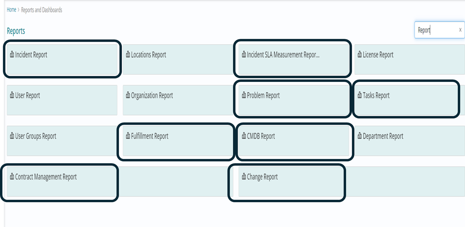
Following reports have been incorporated into the scope for the Reports and Dashboards system under this category:
- Incident Report
- Problem Report
- Change Report
- Task Report
- CMDB Report
- Contract Report
- SLA Measurement Report
Foundation Reports
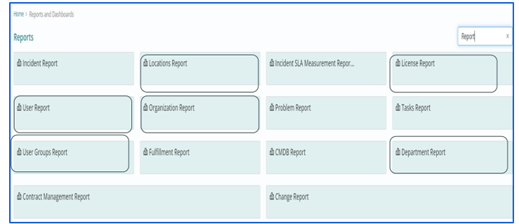
These reports can be viewed based on the logged in user's company. A user's master role in any report does not affect the view. These reports contain the required information about data objects related to foundation activities, such as user profiles, groups, locations, memberships, organizations, and departments.
Following reports have been incorporated into the scope for the Reports and Dashboards system under this category:
- User Profiles report
- User Groups report
- Locations report
- User Group Membership report
- Role Membership report
- Organization report
- Department report
Dashboards
Dashboards are a critical component of any IT service management (ITSM) program. They provide a comprehensive view of the organization's IT operations, including the status of its services, the performance of its processes, and the risks to its infrastructure.
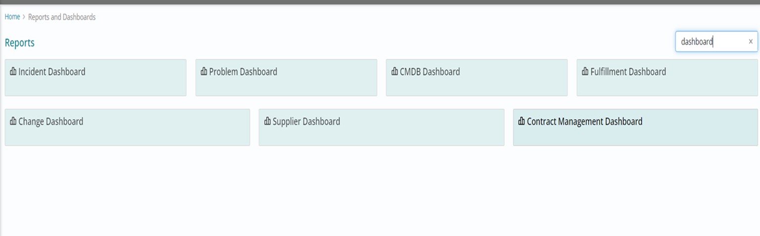
There are many different types of ITSM dashboards that can be created, depending on the organization's specific needs. Currently, the following dashboards have been incorporated into the scope for the Reports and Dashboards system under this category:
- Incident dashboard
- Change Dashboard
- Problem Dashboard
- Fulfilment Dashboard
- Supplier Dashboard
- Contract Management Dashboard
- CMDB Dashboard
Dashboard Filters
On Dashboards, users can filter the content by applying filters on various fields or columns provided . These filters are different for each dashboard depending on the columns present in the tables used to configure the Dashboard.
Dashboard Widgets
Dashboards in HCL BigFix Service Management reports and dashboard contain widgets which are used to present data in different Charts. Widgets are mostly pictorial representation of data based on some key factors.
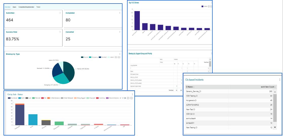
KPI Widgets
KPI: These widgets are used in dashboards to display the performance level of the given indicator at the top of each dashboard page.
Pie Chart: Pie charts are used in dashboards to visualize data that is categorical in nature, such as the breakup of incidents by priority. This type of data is well-suited for pie charts because it is easy to see the relative proportions of different categories.
For example, a pie chart could be used to show that 50% of incidents were classified as high priority, 30% were classified as medium priority, and 20% were classified as low priority. Users can filter the entire dashboard by clicking on any slice of the pie chart based.
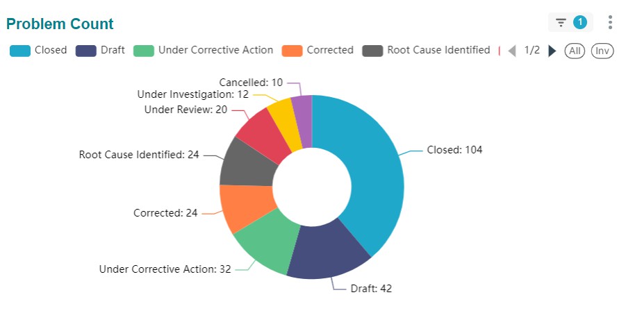
Chart Widgets
Stacked Bar Chart: A stacked bar chart is a variation of a bar chart in which the bars are stacked on top of each other. Stacked bar charts are often used to show how different categories contribute to a total.
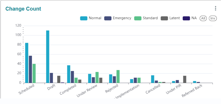
Bar Chart: Bar charts are used in dashboards to compare data sets in a variety of
ways, such as the top 10 CI drivers for incidents, changes by CI, and problems by
service.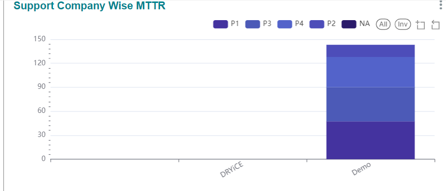
Heat Map/Treemap Widgets
Heatmaps are used to depict the intensity of values such as incidents by group and priority.
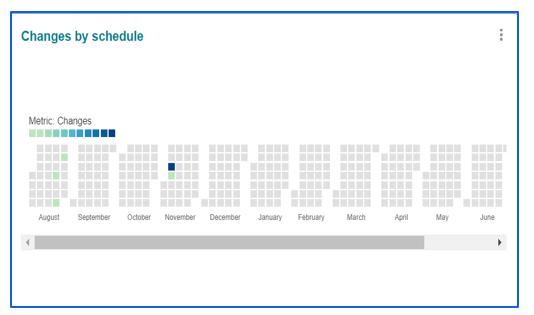
Calendar heatmap: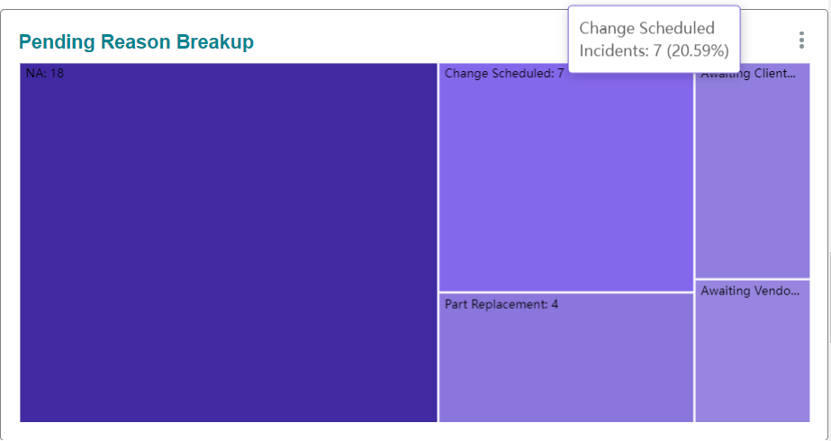
A calendar heatmap is used in the HCL BigFix Service Management reports and dashboards system to represent information based on calendar, such as scheduled changes.
Trend Widgets
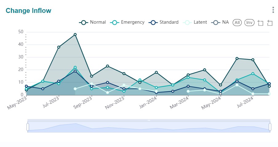
Trend charts are visual representations of the change of a variable over time. They are used to identify trends and outliers, and to make predictions about the future.
Trend charts are a valuable tool for businesses and organizations of all sizes. Examples include incidents created over time, MTTR over a period. If a user needs to filter for a specific period, they can do the same for the relevant chart using the sub-part below the chart.