The Input field with hints component is for recognizing input fields
(non-protected fields) which have accompanying hints (text immediately
following the input field on the same row). This component is functionally
similar to the Input field component, except
that hints must be found next to the candidate input. For example,
suppose your host screen had the following input field:
Product code: [ ] (Valid codes: A, B,
C, D)
In this example, the start of the hints is Valid codes:, the end of the hints is a
close parenthesis [)], the separator
is a comma (,), and the leading token
type is None.
A recognized input field can be rendered by the following widgets:
The input field also uses valid value hints. By default, the
input field does not recognize hints, therefore you will have to modify
the component settings in order to pass these along to the rendering
widget.
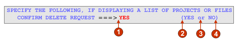
The following figure shows how an input field with hints component
might appear on your host screen:
Figure 1. Input field with hints
component example
Delimiter: position of delimiter, but leading token type was set
to None.
Start of hints: open parenthesis (
Separator: or
End of hints: close parenthesis )
Leading token type is not marked. In this example, the leading
token type is None. No
letter or digit precedes the hints.
The following settings can be configured for this component:
Extract field caption
If selected, a caption for the recognized input field is extracted
(see the description above for more information about this algorithm).
This extracted caption can be used by the widget.
Restrict caption to selected region
If selected, the caption is limited to the text within the
selected part of the screen.
Strip end of caption
If selected, the end of the caption is stripped after (and including)
the first occurrence of any value specified in the Strip after setting. This
setting is useful for cleaning up extracted captions.
Strip after
Required. The string (or set of strings) that is used to strip
the extracted caption. For example, if the extracted caption is Command ==> and the value
for this setting is =,
everything after (and including) the first = is stripped off.
Replace with
Optional. The string with which to replace
the stripped off portion (if applicable) of the caption.
Trim spaces on caption
If selected, white space (for example spaces and tabs) is removed
from both ends of the extracted (and stripped) caption.
Clip input field to selected region
If selected, only the part of the input field inside of the
selected region is recognized and rendered. If cleared, if any part
of an input field is inside the selected region, the entire input
field is recognized and rendered. This setting is useful if you need
to break a large host screen input field into multiple, smaller Web
page input fields.
Start of hints
Optional. The string of characters which identifies where the
set of hints starts. Multiple values can be specified for this setting;
separate with the vertical bar (|) character.
End of hints
Optional. The string of characters which identifies where the
set of hint ends. Multiple values can be specified for this setting;
separate with the vertical bar (|) character.
Separator
Required. The string of characters which separates each hint
in the hint set. Multiple values can be specified for this setting;
separate with the vertical bar (|) character.
Leading token type
Specifies what each hint is. For example, if
the hint set was A=Apple,O=Orange,G=Grape,
you would set this value to Letter (or Letter or Digit) because A, O, and G are
all letters. You would set the delimiter to =.
Maximum length of leading token
Specifies the maximum length of the leading token. The default
is 4.
Delimiter
Required. The string of characters which separates the leading
token from the hint description. This setting only applies when the
leading token type is not None.
Minimum required hints
The minimum number of hints that must be found for this input
field to be recognized by this component. This setting is useful for
avoiding errant recognition.