voltmx.ui Namespace
Functions
The voltmx.ui Namespace contains the following functions.
voltmx.ui.ActionItem
Constructs an ActionItem object for use in an ActionSheet object.
Syntax
new voltmx.ui.ActionItem(actionItemParams);
Input Parameters
actionItemParams
A JavaScript object containing key-value pairs that define the configuration parameters for the action item. This object must contain the following keys.
| Constant | Description |
|---|---|
| title | A string that specifies the title for the action item. |
| style | A value from the Action Item Style Constants that selects the style of the action item. |
| actionCallback | A JavaScript function that handles user selections from the action item. For more information, see Remarks below. |
Example
//Creating the Action Item Object
  setActionSheet: function(){
    var actionItem = new voltmx.ui.ActionItem({
    "title": "Open Basecamp",
    "style": constants.ACTION_STYLE_DEFAULT,
    "action": function(){
     voltmx.application.openURL("https://basecamp.voltmx.com/s/");
    }
Return Values
Returns an ActionItem object that can be added to an Action Sheet.
Remarks
The actionCallback function, which is passed into this function through the actionSheetParams parameter, must have the following prototype.
actionItemCallback(actionSheetObject, actionItem1);
where actionSheetObject is a handle to the ActionSheet object that the ActionItem object is associated with, and actionItem1 is a handle to the ActionItem object that the user selected.
Platform Availability
iOS
voltmx.ui.ActionSheet
Constructs an ActionSheet object that represents an iOS Action Sheet.
Syntax
voltmx.ui.ActionSheet(actionSheetParams);
Input Parameters
actionSheetParams
A JavaScript object containing key-value pairs that define the configuration parameters for the Action Sheet. This object must contain the following keys.
| Key | Description |
|---|---|
| title | A string that specifies the title for the Action Sheet. |
| message | A string containing the action sheet's message to display to the user. |
| showCompletionCallback | A callback function that is invoked after the display of the action sheet. For details, see the Remarks section below. |
Example
//Creating the Action Sheet Object
  var actionSheetObject = new voltmx.ui.ActionSheet({
        "title":"VoltMX Basecamp",
        "message":"Welcome to Volt MX Base Camp! Explore. Learn. Develop. Share.",
        "showCompletionCallback": function(){
        }
    });
Return Values
Returns an ActionSheet object.
Remarks
The actionSheetParams parameter is an object containing key-value pairs. When your app uses the showCompletionCallback key, it specifies a callback function that is automatically invoked after your app displays the action sheet. The callback function must have the following signature.
showCompletionCallback();
In an Action Sheet, only one action item can have the style constants.ACTION_ITEM_STYLE_CANCEL.
Platform Availability
iOS
voltmx.ui.Alert
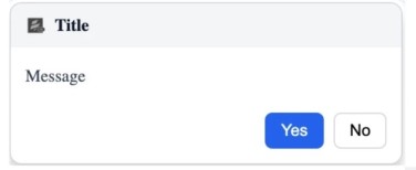
This API provides you the ability to add alerts in the application. The alerts are of the following types:
- information - an informative message is displayed on the screen. This message can be in turn a warning or a success message.
- confirmation - a confirmation message with Yes and No options is displayed on the screen.
- error - an error message is displayed on the screen.
All the alerts are modal in nature, i.e., the user cannot proceed with other UI operations unless the alert is dismissed.
Syntax
voltmx.ui.Alert(basicConfig, pspConfig);
Input Parameters
basicConfig
basicConfig is an object with the following configuration properties.
| Property | Description |
|---|---|
| message [String] - Mandatory | The message(can be internationalised) to be shown when an alert is thrown. |
| alertType [Number] - Mandatory | Denotes the type of the alert. The possible values are as follows. |
| alertTitle [String] - Optional | Title(can be internationalised) of the alert. If no title is specified, the title falls back to the system default on iPhone. On Android and Desktop Native, a blank title bar is displayed. |
| yesLabel [String] - Optional | Text(can be internationalised) to be displayed for the Yes label. If the text for the Yes label is not provided, individual platforms display default values. This is the only button displayed for Info and Error type alerts. |
| noLabel [String] - Optional | Text(can be internationalised) to be displayed for the No label. If the text for the No label is not provided, individual platforms display default values. |
| alertIcon [String / image Object] - Optional | Icon to be displayed to visually indicate the type of alert, such as, Info, Error, Confirmation. This parameter is not supported on iPhone. On Desktop Native, this parameter accepts only a string value for the alert icon. You can create an image Object by using voltmx.image Namespace functions. |
| alertHandler [Read / Write Event] - Mandatory | JavaScript function that should get called when alert is dismissed either through yesLabel button or through noLabel button. The function accepts a boolean input parameter indicating the user's choice.true if the button with the yesLabel is clicked.false if the button with the noLabel is clicked. |
pspConfig
pspConfig is an object with platform specific configuration properties.
| Property | Description |
|---|---|
| contentAlignment | Used to align content of an alert. Following are the values of this property. |
| iconPosition | It is used to align an alert title icon. Following are the values of this property.contentAlignment and iconPosition parameters. |
The pspConfig parameters are not supported on the iPhone and SPA/Desktop Web platforms.
Example
confirmationAlert: function(){
   //Creating the basicConfig object
  var basicConf = {
    message: "This is an confirmation alert",
    alertType: constants.ALERT_TYPE_CONFIRMATION,

};
   //Creating the pspConfig object
  var pspConfig = {
    "contentAlignment": constants.ALERT_CONTENT_ALIGN_CENTER
};
   voltmx.ui.Alert(basicConf, pspConfig);
 },

   informationAlert: function(){
     //Creating the basicConfig object
  var basicConf = {
    message: "This is an info alert",
    alertType: constants.ALERT_TYPE_INFO,

};
     //Creating the pspConfig object
  var pspConfig = {
  "contentAlignment": constants.ALERT_CONTENT_ALIGN_LEFT
};
   voltmx.ui.Alert(basicConf, pspConfig);
 },

   errorAlert: function(){
   //Creating the basicConfig object
  var basicConf = {
    message: "This is an error alert",
    alertType: constants.ALERT_TYPE_ERROR,

};
     //Creating the pspConfig object
  var pspConfig = {
  "contentAlignment": constants.ALERT_CONTENT_ALIGN_RIGHT
};
   voltmx.ui.Alert(basicConf, pspConfig);
 },

 //Desktop Native

 function callBackFunction(ret) {
  if (ret === true) callSuccessCallBackFunction();
  if (ret === false) callFailureCallBackFunction();
}
var basicConfig = {
  message: "Message",
  alertType: constants.ALERT_TYPE_CONFIRMATION,
  alertTitle: "Title",
  yesLabel: "Yes",
  noLabel: "No",
  alertIcon: "iconPath",
  alertHandler: callBackFunction
};
var pspConfig = {
  contentAlignment: constants.ALERT_CONTENT_ALIGN_LEFT,
  iconPosition: constants.ALERT_ICON_POSITION_LEFT
};
voltmx.ui.Alert(basicConfig, pspConfig);
Return Values
None.
Remarks
Invoking this API multiple times in the same action sequence leads to an erroneous behavior.
This API should be invoked at the end of a function as a best practice.
The following are the behavioral aspects of alerts on various platforms:
RichClient
In all native implementations alert is non blocking, i.e. the execution of any logic defined after the alert definition continues without the alert confirmation.
Android
Android platform supports display of multiple alerts each time the voltmx.ui.Alert API is invoked. On device back, the alert gets dismissed and also the alert handler is raised.
For CONFIRMATION type alert, the alert callback is invoked with cancel flag. For example, false Boolean argument.
For INFO & ERROR type alert, the alert callback is invoked with true argument.
iPhone
iPhone does not support displaying image icons based on the alert types: info,confirmation, error. "\n" as a newline character in the alert messages supported for iPhone Platform
Mobile Web/SPA/Desktop Web
- For advanced Mobile Web devices like iPhone, Android, and Palm Pre, alerts are displayed as popups. For basic devices, the alerts are displayed in a new page.
- For all platforms you cannot customize alert icons/yes or no labels/ look and feel.
- Titles of the alerts are provided by the browser and you cannot modify them. The alert title attribute does not apply for Mobile Web. Usually, the title on the alert will be the IP address or the domain name of the application.
- Confirmation alerts in the basic devices will be displayed in another form.
- If the alert message is nil, alert is not displayed.
- In case of all platforms, the execution of the logic defined after alert is blocked until the user clicks "yes" or "no".
- The pspConfig parameters are not supported on SPA/Desktop Web platform.
Desktop Native
-
For INFO and ERROR alert types, only the yesLabel is displayed.
-
If multiple alerts are invoked simultaneously, the most recently invoked alert is displayed on top and remains interactive.
-
The alert is treated as a native alert when none of the following properties are provided: alertTitle, yesLabel, noLabel, alertIcon, contentAlignment, or iconPosition.
-
Displaying an Alert will not pause application code execution.
-
Non-native alerts can be dragged with the title bar to change the alert dialog position.
-
Localization of button labels (yesLabel, noLabel) and alertTitle is supported only for non-native alerts. The message field can be localized for both custom and native alerts.
Note: Custom Alert configuration is not supported through the Action Editor in Iris IDE. To use Custom Alert features, configure the
voltmx.ui.AlertAPI programmatically.
Example
var basicConfig = {
  message: voltmx.i18n.getLocalizedString(messageKey),
  alertTitle: voltmx.i18n.getLocalizedString(alertTitleKey),
  yesLabel: voltmx.i18n.getLocalizedString(yesLabelKey),
  noLabel: voltmx.i18n.getLocalizedString(noLabelKey),
  ...
}
For JavaScript conversion, an alert has to be created using another variant constructor,i.e an Indexed argument constructor.
voltmx.ui.Alert(message, alertHandler, alertType, yesLabel, noLabel, alertTitle, alertIcon, pspConfig);
Platform Availability
Available on all platforms.
voltmx.ui.ARRenderer
Creates the ARRenderer widget. It occupies some space on a form depending on its positional and dimensional properties.
Syntax
voltmx.ui.ARRenderer(arBasic, arLayout, arPsp);
Input Parameters
| Parameter | Description |
|---|---|
| arBasic | A JavaScript object containing key-value pairs. The keys are the names of the ARRenderer widget's basic properties and the values are the initial values of the properties. For a complete list of the ARRenderer widget's properties, see the Volt MX Iris Widget Programmer's Guide. |
| arLayout | A JavaScript object containing key-value pairs. The keys are the names of the ARRenderer widget's layout properties and the values are the initial values of the properties. For a complete list of the ARRenderer widget's properties, see the Volt MX Iris Widget Programmer's Guide. |
| arPsp | A JavaScript object containing key-value pairs. The keys are the names of the ARRenderer widget's platform-specific properties and the values are the initial values of the properties. For a complete list of the ARRenderer widget's properties, see the Volt MX Iris Widget Programmer's Guide. |
Example
var myscene = new voltmx.ui.ARRenderer({
"placeholderText": "Please wait while the camera loads..",
"placeholderSkin": "voltmxmpiSknlblItemName",
"height": "100%",
"id": "arscene",
"isVisible": true,
"left": "0%",
"top": "0%",
"width": "100%",

"zIndex": 1
}, {
"contentAlignment": constants.CONTENT_ALIGN_CENTER,
"displayText": true,
"padding": [0, 0, 0, 0],
"paddingInPixel": false
}, {

});
Return Values
Returns an instantiated and configured ARRenderer widget.
Platform Availability
Android, iOS
voltmx.ui.BarButtonItem
BarButtonItem
Syntax
voltmx.ui.BarButtonItem(
    options);
Input Parameters
options
A JavaScript object containing key-value pairs that the constructor uses to set the configuration of the BarButtonItem object. The following keys are supported.
| Key | Description |
|---|---|
| type | Specifies the type of the BarButtonItem. Must be one of the ButtonBarItem Type Constants. |
| tintColor | Selects the color to apply to the BarButtonItem. Must be specified as a hexadecimal value. |
| style | Sets the style of the BarButtonItem.. constants.BAR_ITEM_STYLE_PLAIN: Glows when tapped. The default item is style.. constants.BAR_ITEM_STYLE_DONE: The style for a done button—for example, a button that completes some task and returns to the previous view. |
| enabled | Holds a Boolean value that enables or disables the BarButtonItem. |
| action | Contains a function that is automatically called when the user selects the BarButtonItem. |
| metaData | Holds the data needed by the BarButtonItem. For more information see Remarks below. |
Example
var item = new voltmx.ui.BarButtonItem(
    {type:constants.BAR_BUTTON_IMAGE,
    tintColor: hex color string,
    style :constants.BAR_ITEM_STYLE_PLAIN,
    enabled :true,
    action : funtionObject,
    metaData:{image:"imagename"}} );
Return Values
Returns an instantiated and configured BarButtonItem object.
Remarks
metaDatais a dictionary whose value varies depending on the type of bar button being constructed.
The kind of data needed by the BarButtonItem in its metaData key in the options parameter varies depending on the type of the BarButtonItem that is being created. The value for the metaData key can be any of the following.
BarButtonItem of type IMAGE:
Here, the metadata contains a key named image with the value being the source name of the image. Using this image, a bar button item of type image is constructed.
var item = new voltmx.ui.BarButtonItem({
    “type” :constants.BAR_BUTTON_IMAGE,
    “tintColor” : hex color string,
    “style” : constants.BAR_ITEM_STYLE_PLAIN,
    “enabled” :true,
    “action” : funtionObject,
    “metaData” : {
        “image”:"imagename"
    }},
    “id”:”item”
);
BarButtonItem of type TITLE:
Here, the metadata contains a key named title with the value ”Edit” specifies the title of the BarButtonItem.
var item = new voltmx.ui.BarButtonItem({
    “type” :constants.BAR_BUTTON_TITLE,
    “tintColor” : hex color string,
    “style” : constants.BAR_ITEM_STYLE_PLAIN,
    “enabled” :true,
    “action” : funtionObject,
    “metaData” : {
        “title”:"Edit"
    }},
    “id”:”item”
);
BarButtonItem of type SYSTEM ITEM:
Here, the metaData contains a key named systemItem with the value which represents a system-supported bar button item used to create the bar button item. You can find all the system supported bar button items here.
var item = new voltmx.ui.BarButtonItem({
    “type” :constants.BAR_BUTTON_SYSTEM_ITEM,
    “tintColor” : hex color string,
    “style” : constants.BAR_ITEM_STYLE_PLAIN,
    “enabled : true,
    “action : funtionObject,
    “metaData” : {
        systemItem : constants.SYSTEM_ITEM_DONE
    }},
    “id” : “item”
);
BarButtonItem of type CUSTOM:
Here, the metaData contains a key named custom with the value as a widget reference. Only the Label and Button widgets can be set as a widget reference. For these widgets, the following properties are supported.
| Widget | Properties |
|---|---|
| Button | text, displayText, skin, focusSkin, width, height, onClick |
| Label | text, skin, width, height |
In this example, the widget reference is a Button widget.
var RBarBtnItemButton1 = new voltmx.ui.Button({
    "focusSkin": "defBtnFocus",
    "skin": "defBtnNormal",
    "text": "Button",
    "width": voltmx.flex.USE_PREFERRED_SIZE,
    "id": "RBarBtnItemButton1"
}, {
    "displayText": true
}, {});

var RBarBtnItem1 = new voltmx.ui.BarButtonItem({
    "type": constants.BAR_BUTTON_CUSTOM,
    "tintColor": "4b88f100",
    "style": constants.BAR_ITEM_STYLE_PLAIN,
    "enabled": true,
    "metaData": {
        "custom": RBarBtnItemButton1
    },
    "id": "RBarBtnItem1"
});
voltmx.ui.Browser
Creates a Browser widget.
Syntax
voltmx.ui.Browser(
    basicConfig,
    layoutConfig,
    pspConfig);
Input Parameters
| Parameter | Description |
|---|---|
| basicConfig | A JavaScript object containing key-value pairs. The keys are the names of the Button widget's basic properties and the values are the initial values of the properties. For a complete list of the Button widget's properties, see the Volt MX Iris Widget Programmer's Guide. |
| layoutConfig | A JavaScript object containing key-value pairs. The keys are the names of the Button widget's layout properties and the values are the initial values of the properties. For a complete list of the Button widget's properties, see the Volt MX IrisWidget Programmer's Guide. |
| pspConfig | A JavaScript object containing key-value pairs. The keys are the names of the Button widget's platform-specific properties and the values are the initial values of the properties. For a complete list of the Button widget's properties, see the Volt MX Iris Widget Programmer's Guide. |
Example
var basicConfig = {
    "detectTelNumber": false,
    "enableZoom": false,
    "id": "brwInline",
    "isVisible": true,
    "requestURLConfig": {
        "URL": "http://www.google.co.in/",
        "requestMethod": constants.BROWSER_REQUEST_METHOD_GET
    }
};

var LayoutConfig = {
    "containerHeightReference": constants.CONTAINER_HEIGHT_BY_FORM_REFERENCE,
    "containerWeight": 100,
    "margin": [0, 0, 0, 0],
    "marginInPixel": false
};

var PSPConfig = {};

//Creating the browser widget
    var webtemp = new voltmx.ui.Browser(basicConfig, LayoutConfig, PSPConfig);

//Adding the widge
frmBrowser.add(webtemp);
Return Values
Returns an instantiated Browser widget.
Remarks
All writable properties can be optionally passed inside dictionary objects to the constructor. Unspecified properties or an empty constructor results in the defaults values being used for all unprovided information.
voltmx.ui.BrowserSettings.getSafeBrowsingPrivacyPolicyUrl
Returns a URL that points to the privacy policy for Safe Browsing reporting, which is displayed to end users if you want a custom interstition.
Syntax
voltmx.ui.BrowserSettings.getSafeBrowsingPrivacyPolicyUrl();
Example
var webBasic = {id:"browserID",
    isVisible:true,
    screenLevelWidget: false,
    requestURLConfig:{URL: "https://www.google.co.in/",
    requestMethod:constants.BROWSER_REQUEST_METHOD_GET}};
var webLayout = {containerWeight:100};

//Creating the Browser
var browser = new voltmx.ui.Browser(webBasic, webLayout, {});
frm.add(browser);
voltmx.ui.BrowserSettings.getSafeBrowsingPrivacyPolicyUrl();
//Getting the SafeBrowsingPrivacyPolicyUrl to display a custom interstition
Type
Static
Input Parameters
None
Return Values
String - The URL that points to a privacy policy document that can be displayed to end users. Returns null if the device API Level is earlier than 27.
Platform Availability
- Android (API Level 27 and later)
voltmx.ui.BrowserSettings.setOnSafeBrowsingInitializedCallback
This API is used to set an event callback that is triggered once the Safe Browsing initialization process is completed.
The URL is not guaranteed to be protected by Safe Browsing until after the callback is invoked with true. Safe Browsing is not fully supported on all devices. For those devices, callback will receive false.
For optimal protection against known threats, you must wait until the onSafeBrowsingInitialized callback is triggered with true before you invoke a Browser widget object's loadUrl() method.
Syntax
voltmx.ui.BrowserSettings.setOnSafeBrowsingInitializedCallback(eventCallback);
Input Parameters
| Parameter | Description |
|---|---|
| eventCallback | The callback function that is triggered once the Safe Browsing initialization process is completed with the following parameter. |
Event Callback Syntax
onSafeBrowsingInitialized(initStatus)
Input Parameters
| Parameter | Description |
|---|---|
| initStatus | The value of this parameter is true if the initialization is successful; otherwise, the value is false or it may be null. For Android devices with API level earlier than 27, the callback will not be triggered. |
Example
var webBasic =
{
  id:"browserID",
  isVisible:true,
  screenLevelWidget: false
};
var webLayout = {containerWeight:100};

//Creating the Browser
var browser = new voltmx.ui.Browser(webBasic, webLayout, {});
frm.add(browser);
voltmx.ui.BrowserSettings.setOnSafeBrowsingInitializedCallback(onSafeBrowsingInitializedCallback);
// setting safebrowsing initialization callback

function onSafeBrowsingInitializedCallback(initStatus)
{
  if(initStatus == true)
  {
   frm.browser.requestURLConfig = {"URL":"http://testsafebrowsing.appspot.com/s/malware.html", "requestMethod":constants.BROWSER_REQUEST_METHOD_GET};
  }
}
Type
static
Platform Availability
- Android (API Level 27 and later)
voltmx.ui.BrowserSettings.setSafeBrowsingWhitelist
Sets the list of hosts (domain names/IP addresses) that are exempt from SafeBrowsing checks. The list of such hosts is global for all Browser widgets across any application.
The following table illustrates the rules that are applicable for different hosts.
| Rule | Example | Matches Subdomain |
| HOSTNAME | example.com | Yes |
| .HOSTNAME | example.com | Yes |
| IPV4_LITERAL | 192.168.1.1 | No |
| IPV6_LITERAL_WITH_BRACKETS | [10:20:30:40:50:60:70:80] | No |
All other rules, including wildcards, are not valid. The correct syntax for hosts is defined by RFC 3986.
Syntax
voltmx.ui.BrowserSettings.setSafeBrowsingWhitelist(\[url1,url2\], callback);
Type
Static
Input Parameters
| Parameter | Description |
|---|---|
| Array - Mandatory | A mandatory array of the list of hosts. |
| callback [Function] | A JavaScript function that will be called with value as "true," if the hosts are successfully added to the whitelist. The callback function will be called with value as "false," if any hosts are malformed. This value may be null. |
Example
var webBasic = {id:"browserID",
    isVisible:true,
    screenLevelWidget: false,
    requestURLConfig:{URL: "https://www.google.co.in/",
    requestMethod:constants.BROWSER_REQUEST_METHOD_GET}};
var webLayout = {containerWeight:100};

//Creating the Browser
var browser = new voltmx.ui.Browser(webBasic, webLayout, {});
frm.add(browser);

voltmx.ui.BrowserSettings.setSafeBrowsingWhitelist([url1,url2],resultCallback);
//Setting the whitelist

function resultCallback(result){}
Platform Availability
- Android (API Level 27 and later)
voltmx.ui.Button
Creates a Button widget.
Syntax
voltmx.ui.Button(
    basicConfig,
    LayoutConfig,
    PSPConfig);
Input Parameters
| Parameter | Description |
|---|---|
| basicConfig | A JavaScript object containing key-value pairs. The keys are the names of the Button widget's basic properties and the values are the initial values of the properties. For a complete list of the Button widget's properties, see the Volt MX Iris Widget Programmer's Guide. |
| layoutConfig | A JavaScript object containing key-value pairs. The keys are the names of the Button widget's layout properties and the values are the initial values of the properties. For a complete list of the Button widget's properties, see the Volt MX Iris Widget Programmer's Guide. |
| pspConfig | A JavaScript object containing key-value pairs. The keys are the names of the Button widget's platform-specific properties and the values are the initial values of the properties. For a complete list of the Button widget's properties, see the Volt MX Iris Widget Programmer's Guide. |
Example
//Call back function onClick of button
function onClickCallBack()
{
    alert("button clicked");
}

var basicConfig = {
    "focusSkin": "slButtonGlossRed",
    "height": "50dp",
    "id": "Button0cde40e79ba934b",
    "isVisible": true,
    "left": "65dp",
    "onClick": onClickCallBack,
    "skin": "slButtonGlossBlue",
    "text": "Button",
    "top": "486dp",
    "width": "260dp",
    "zIndex": 1
};

var LayoutConfig = {
    "contentAlignment": constants.CONTENT_ALIGN_CENTER,
    "displayText": true,
    "padding": [0, 0, 0, 0],
    "paddingInPixel": false
};

var PSPConfig={};

var Button0cde40e79ba934b = new voltmx.ui.Button(basicConfig,LayoutConfig,PSPConfig);

//Adding the button to the form
Form06900dd40fc7842.add(Button0cde40e79ba934b);
Return Values
Returns an instantiated Button widget.
Remarks
All writable properties can be optionally passed inside dictionary objects to the constructor. Unspecified properties or an empty constructor results in the defaults values being used for all unprovided information.
voltmx.ui.Calendar
Creates a Calendar widget.
Syntax
voltmx.ui.Calendar(
    basicConf,
    layoutConf,
    PSPConf);
Parameters
| Parameter | Description |
|---|---|
| basicConfig | A JavaScript object containing key-value pairs. The keys are the names of the Calendar widget's basic properties and the values are the initial values of the properties. For a complete list of the Calendar widget's properties, see the Volt MX Iris Widget Programmer's Guide. |
| layoutConfig | A JavaScript object containing key-value pairs. The keys are the names of the Calendar widget's layout properties and the values are the initial values of the properties. For a complete list of the Calendar widget's properties, see the Volt MX IrisWidget Programmer's Guide. |
| pspConfig | A JavaScript object containing key-value pairs. The keys are the names of the Calendar widget's platform-specific properties and the values are the initial values of the properties. For a complete list of the Calendar widget's properties, see the VoltMX IrisWidget Programmer's Guide. |
Example
//Defining the properties for a calendar with id:"calendar1"
var basicConf = {
    id: "calendar1",
    isVisible:true,
    skin:"slCalendar",
    dateFormat:"dd/MM/yyyy",
    viewType:constants.CALENDAR_VIEW_TYPE_DEFAULT,
    validStartDate:[01,01,2017],
    validEndDate:[31,12,2017],
    calendarIcon:"calbtn.png"
};

var layoutConf = {
    "contentAlignment": constants.CONTENT_ALIGN_CENTER,
    padding:[2,2,2,2],
    "paddingInPixel": false
};

var PSPConf = {};

//Creating the Calendar.
var calendar1 = new voltmx.ui.Calendar(basicConf,layoutConf,PSPConf);

//adding the calendar to form
frmHome.add(calendar1);
Return Values
Returns an instantiated Calendar widget.
Remarks
All writable properties can be optionally passed inside dictionary objects to the constructor. Unspecified properties or an empty constructor results in the defaults values being used for all unprovided information.
voltmx.ui.Camera
Creates a Camera widget.
Syntax
voltmx.ui.Camera(
    basicConfig,
    layoutConfig,
    pspConfig);
Input Parameters
| Parameter | Description |
|---|---|
| basicConfig | A JavaScript object containing key-value pairs. The keys are the names of the Camera widget's basic properties and the values are the initial values of the properties. For a complete list of the Camera widget's properties, see the VoltMX Iris Widget Programmer's Guide. |
| layoutConfig | A JavaScript object containing key-value pairs. The keys are the names of the Camera widget's layout properties and the values are the initial values of the properties. For a complete list of the Camera widget's properties, see the VoltMX Iris Widget Programmer's Guide. |
| pspConfig | A JavaScript object containing key-value pairs. The keys are the names of the Camera widget's platform-specific properties and the values are the initial values of the properties. For a complete list of the Camera widget's properties, see the VoltMX Iris Widget Programmer's Guide. |
Example
function onCameraCaptureAPI(eventobject)
{
    var  cameraRawBytes = camera1.rawBytes;
    Form06900dd40fc7842.Image0e7a54b01924146.rawBytes=cameraRawBytes;

    alert("camera raw bytes");
    if( null !== cameraRawBytes)
    {
        voltmx.camera1.releaseRawBytes(cameraRawBytes);
        cameraRawBytes = null;
    }
}

var basicConfig = {
    "height": "50dp",
    "id": "camera1",
    "isVisible": true,
    "left": "60dp",
    "onCapture": onCameraCaptureAPI,
    "skin": "slCamera",
    "text": "Camera",
    "top": "405dp",
    "width": "260dp",
    "zIndex": 1
};

var LayoutConfig = {
    "contentAlignment": constants.CONTENT_ALIGN_CENTER,
    "padding": [0, 0, 0, 0],
    "paddingInPixel": false
};

var PSPConfig = {
    "accessMode": constants.CAMERA_IMAGE_ACCESS_MODE_PUBLIC,
    "enableOverlay": false,
    "enablePhotoCropFeature": false
};

var camera1 = new voltmx.ui.Camera(basicConfig,LayoutConfig,PSPConfig );
CameraForm.add(camera1);
Return Values
Returns an instantiated Camera widget.
Remarks
All writable properties can be optionally passed inside dictionary objects to the constructor. Unspecified properties or an empty constructor results in the defaults values being used for all unprovided information.
voltmx.ui.Canvas
Creates a Canvas widget.
Syntax
voltmx.ui.Canvas(
    basicConfig,
    layoutConfig,
    pspConfig);
Input Parameters
| Parameter | Description |
|---|---|
| basicConfig | A JavaScript object containing key-value pairs. The keys are the names of the Canvas widget's basic properties and the values are the initial values of the properties. For a complete list of the Canvas widget's properties, see the Volt MX Iris Widget Programmer's Guide. |
| layoutConfig | A JavaScript object containing key-value pairs. The keys are the names of the Canvas widget's layout properties and the values are the initial values of the properties. For a complete list of the Canvas widget's properties, see the VoltMX Iris Widget Programmer's Guide. |
| pspConfig | A JavaScript object containing key-value pairs. The keys are the names of the Canvas widget's platform-specific properties and the values are the initial values of the properties. For a complete list of the Canvas widget's properties, see the VoltMX Iris Widget Programmer's Guide. |
Example
//Sample code to draw a red and a green line using Canvas widget.
define({
 addCanvasWidget: function() {
  var shapesDataArray = [{
   "shapeid": "shape1",
   "shapeType": voltmx.canvas.SHAPE_TYPE_LINE,
   "lineStyle": voltmx.canvas.LINE_STYLE_SOLID,
   "thickness": "10px",
   "points": [
    ["5%", "20%"],
    ["95%", "20%"]
   ],
   "strokeColor": "ff000000"
  }, {
   "shapeid": "shape2",
   "shapeType": voltmx.canvas.SHAPE_TYPE_LINE,
   "lineStyle": voltmx.canvas.LINE_STYLE_SOLID,
   "thickness": "10px",
   "points": [
    ["5%", "40%"],
    ["95%", "40%"]
   ],
   "strokeColor": "00FF0000"
  }];
  var basicConfig = {
   "id": "canvas",
   "isVisible": true,
   "skin": "canvasskin",
   "width": "100%",
   "height": "40%",
   "centerY": "50%",
   "shapesData": shapesDataArray
  };
  var LayoutConfig = {
   "marginInPixel": false,
  };
  var PSPConfig = {};
  var canvas = new voltmx.ui.Canvas(basicConfig, LayoutConfig, PSPConfig);
  this.view.add(canvas);
 }
});
Return Values
Returns an instantiated Canvas widget.
Remarks
All writable properties can be optionally passed inside dictionary objects to the constructor. Unspecified properties or an empty constructor results in the defaults values being used for all unprovided information.
voltmx.ui.CheckBoxGroup
Creates a CheckBoxGroup widget.
Syntax
 voltmx.ui.CheckBoxGroup(
    basicConf,
    layoutConf,
    pspConf);
Input Parameters
| Parameter | Description |
|---|---|
| basicConfig | A JavaScript object containing key-value pairs. The keys are the names of the CheckBoxGroup widget's basic properties and the values are the initial values of the properties. For a complete list of the CheckBoxGroup widget's properties, see the VoltMX Iris Widget Programmer's Guide. |
| layoutConfig | A JavaScript object containing key-value pairs. The keys are the names of the CheckBoxGroup widget's layout properties and the values are the initial values of the properties. For a complete list of the CheckBoxGroup widget's properties, see the VoltMX Iris Widget Programmer's Guide. |
| pspConfig | A JavaScript object containing key-value pairs. The keys are the names of the CheckBoxGroup widget's platform-specific properties and the values are the initial values of the properties. For a complete list of the CheckBoxGroup widget's properties, see the VoltMX Iris Widget Programmer's Guide. |
Example
//Defining the properties for a checkBoxGroup with id:"chkBox1"
var basicConf = {
    id: "chkBox1",
    isVisible: true,
    skin:"slCheckBoxGroup",
    onSelection:onSelCallBck,
    masterData": [
        ["cbg1", "Checkbox One"],
        ["cbg2", "Checkbox Two"],
        ["cbg3", "Checkbox Three"]
    ],
    "selectedKeyValues": [
        ["cbg1", "Checkbox One"]
    ],
    "selectedKeys": ["cbg1"]
}

var layoutConf = {
    "padding": [0, 0, 0, 0],
    "paddingInPixel": false,
    "itemOrientation":constants.CHECKBOX_ITEM_ORIENTATION_VERTICAL
}
var pspConf = {};

//Create a new Checkbox.
var chkBox1 = new voltmx.ui.CheckBoxGroup(basicConf, layoutConf, pspConf);
//Adding checkBoxGroup to form
frmHome.add(chkBox1);

//Call back function onSelection of checkBox
function onSelCallBck(chkBox)
{
    alert("on selection event triggered");
}
Return Values
Returns an instantiated CheckBoxGroup widget.
Remarks
All writable properties can be optionally passed inside dictionary objects to the constructor. Unspecified properties or an empty constructor results in the defaults values being used for all unprovided information.
voltmx.ui.ComboBox
Creates a ComboBox widget.
Syntax
voltmx.ui.ComboBox(
    basicConf,
    layoutConf,
    pspConf);
Parameters
| Parameter | Description |
|---|---|
| basicConfig | A JavaScript object containing key-value pairs. The keys are the names of the ComboBox widget's basic properties and the values are the initial values of the properties. For a complete list of the ComboBox widget's properties, see the VoltMX Iris Widget Programmer's Guide. |
| layoutConfig | A JavaScript object containing key-value pairs. The keys are the names of the ComboBox widget's layout properties and the values are the initial values of the properties. For a complete list of the ComboBox widget's properties, see the VoltMX Iris Widget Programmer's Guide. |
| pspConfig | A JavaScript object containing key-value pairs. The keys are the names of the ComboBox widget's platform-specific properties and the values are the initial values of the properties. For a complete list of the ComboBox widget's properties, see the VoltMX Iris Widget Programmer's Guide. |
Example
//Defining properties of ComboBox with d:combobox1
var comboBasic = {
    id:"combobox1",
    isVisible:true,
    masterDataMap:[
        [
            {
                "mykey":"key1",
                "myvalue":"value1"
            },
            {
                "mykey":"key2",
                "myvalue":"value2"
            }
        ],
        "mykey","myvalue"
    ],
    skin:"comboSkin", selectedKey:"key1",
    onSelection:onSelCallBck
};

var comboLayout = {
    containerWeight:80,
    widgetAlignment:constants.WIDGET_ALIGN_MIDDLE_LEFT,
    padding:[0,0,0,0],
    hExpand:true,
    vExpand:false
};

var comboPSP= {
    viewType:constants.COMBOBOX_VIEW_TYPE_TABLEVIEW,
    contentAlignment:constants.CONTENT_ALIGN_MIDDLE_LEFT,
    placeholder:"Please select a value",
    placeholderI18NKey:"plcHolder",
    popupTitle:"ComboPopUp",
    groupCells:true,
    preOnclickJS:preOnclickJSCallBck,
    postOnclickJS:postOnclickJSCallBck
};
//creating a combobox
combo = new voltmx.ui.ComboBox(comboBasic, comboLayout, comboPSP);
//adding the widget to form
frmHome.add(combo);
Return Values
Returns a ComboBox widget.
Remarks
All writable properties can be optionally passed inside dictionary objects to the constructor. Unspecified properties or an empty constructor results in the defaults values being used for all unprovided information.
voltmx.ui.createAnimation Function
Creates an object that defines an animation.
Syntax
voltmx.ui.createAnimation(
    animationDefinition);
Input Parameters
| Parameter | Description |
|---|---|
| animationDefinition | An object that defines the transformations to perform during the animation. |
Example
var transformObject = voltmx.ui.makeAffineTransform();
transformObject.translate(10, 0);
transformObject.scale(0.1, 1);
animationDef = {
    100: {
        "transform": transformObject
    }
};
animationConfig = {
    duration: 0.3,
    fillMode: voltmx.anim.FILL_MODE_FORWARDS
};
animationDefObject = voltmx.ui.createAnimation(animationDef);
Return Values
Returns an instantiated animation object.
voltmx.ui.DataGrid
Creates a DataGrid widget.
Syntax
voltmx.ui.DataGrid(
    dgridBasic,
    dgridLayout,
    dgridPSP);
Input Parameters
| Parameter | Description |
|---|---|
| dgridBasic | A JavaScript object containing key-value pairs. The keys are the names of the DataGrid widget's basic properties and the values are the initial values of the properties. For a complete list of the DataGrid widget's properties, see the VoltMX Iris Widget Programmer's Guide. |
| dgridLayout | A JavaScript object containing key-value pairs. The keys are the names of the DataGrid widget's layout properties and the values are the initial values of the properties. For a complete list of the DataGrid widget's properties, see the VoltMX Iris Widget Programmer's Guide. |
| dgridPSP | A JavaScript object containing key-value pairs. The keys are the names of the DataGrid widget's platform-specific properties and the values are the initial values of the properties. For a complete list of the DataGrid widget's properties, see the VoltMX Iris Widget Programmer's Guide. |
Example
//Defining the properties for dataGrid with id:dgrid
var dgridBasic = {
    id:"dgrid",
    info:{key:"This is a datagrid"},
    isVisible:true,
    headerSkin:"hSkin",
    rowNormalSkin:"rNSkin",
    rowFocusSkin:"rFSkin",
    rowAlternateSkin:"rASkin",
    showColumnHeaders:true,
    columnHeadersConfig:[
        {
            columnID:"col1",
            columnType:constants.DATAGRID_COLUMN_TYPE_TEXT,
            columnHeaderText:"Account Type",
            columnWidthInPercentage:40
        },
        {
            columnID:"col2",
            columnType:constants.DATAGRID_COLUMN_TYPE_TEXT,
            columnHeaderText:"Account Number",
            columnWidthInPercentage:30
        },
        {
            columnID:"col3",
            columnType:constants.DATAGRID_COLUMN_TYPE_TEXT,
            columnHeaderText:"Balance",
            columnWidthInPercentage:30
        }
    ],
    isMultiSelect:true,
    data:[
        {
            col1:"Checking", col2:"490",col3:"$400",
            metainfo:{skin:"rowskin1", col1_skin:"colskin1"}
        },
        {
            col1:"Checking",col2:"494", col3:"$2000.34"
        },
        {
            col1:"Savings",col2:"567",col3:"$4000"
        }
    ]
};

var dgridLayout = {
    widgetAlignment:constants.WIDGET_ALIGN_TOP_LEFT,
    contentAlignment:constants.CONTENT_ALIGN_CENTER,
    containerWeight:99,
    padding:[0,0,0,0]
};

var dgridPSP = {};

//Creating the dataGrid.
var dgrid = new voltmx.ui.DataGrid(dgridBasic, dgridLayout, dgridPSP);
//adding data grid to form
frmHome.add(dgrid);
Return Values
Returns an instantiated DataGrid widget.
Remarks
All writable properties can be optionally passed inside dictionary objects to the constructor. Unspecified properties or an empty constructor results in the defaults values being used for all unprovided information.
voltmx.ui.defineExtendedWidget
Every widget used in Volt MX Iris has its own set of properties, methods and events. From V9 SP2, you can use the voltmx.ui.defineExtendedWidget, to provide enhancements to the existing widgets for a specific business requirement without impairing the existing functionalities of the widget. For example, you can extend the capabilities of a Label widget to automatically add the symbol $ at the starting of the text.
For more information, refer the Widget Extensions section in Volt MX Iris User guide.
Note: From V9 SP2 release, you can extend the following basic Volt MX widgets, Button, Image, Label, Switch, TextArea, and TextBox.
Syntax
voltmx.ui.defineExtendedWidget(
    chilWdg,
    baseWidget,
    protoFuncDict);
Input Parameters
| Parameter | Description |
|---|---|
| chilWdg | A String value containing the namespace to be used by the customized widget. |
| baseWidget | A JavaScript Object containing the base Volt MX class that is extended, such as voltmx.ui.Label. |
| protoFuncDict | A JavaScript object containing the user defined methods for the extended widget. This parameter must have the definition of preInitialializeCall method. For more information about this method, refer the Remarks section. |
Remarks
The protoFuncDict argument inside the voltmx.ui.defineExtendedWidgetAPI, contains the preInitializeCall method to define all the properties of the widget. This method contains the following:
- Initializations of the properties of the Volt MX widget.
- The function call of the base class widget constructor (like
voltmx.ui.Label.call(this, bconfig, lconfig, pspconfig);) - The new customized properties with their setters and getters.
Here is an example of this method for a Label widget.
preInitializeCall: function() {
  var bconfig = arguments[0];
  var lconfig = arguments[1];
  var pspconfig = arguments[2];
  this.initialize = function(bconfig, lconfig, pspconfig) {
    this.initializeProperties();
  }
  voltmx.ui.Label.call(this, bconfig, lconfig, pspconfig);
  /*The definition of the initializeProperties function must be provided here*/
}
Limitations
- You cannot override the existing properties of the Volt MX widget.
- You cannot view the extended properties of the Volt MX widget, if you use alert to display the properties of the extended widget.
- When you pass a custom property in the constructor, the property is not updated until the user updates explicitly.
- You cannot use multi-level inheritance while using widget extension.
- You cannot override the existing methods of the existing Volt MX widget class.
- Extended widget is not supported in the widgets placed inside the Segment widget.
Error Codes
| Error Codes | Description |
|---|---|
| 4001 | This error code is thrown when at least one parameter inside voltmx.ui.defineExtendedWidget API is not defined. |
| 4002 | This error code is thrown when the protoFuncDict parameter is not defined as a JSON object. |
| 4003 | This error code is thrown when the name of the extended widget class in the childWdg parameter is not a String. |
| 4004 | This error code is thrown when the Volt MX widget class provided in the chilWdg parameter is not a registered class. |
| 4005 | This error code is thrown when the preInitialializeCall method is not provided in the voltmx.ui.defineExtendedWidget API. |
| 4006 | This error code is thrown when the name provided in the childWdg parameter is already a Volt MX widget class. |
Example
/*Sample code to extend the Label widget to automatically add the '$' to the starting of the text*/
voltmx.ui.defineExtendedWidget("voltmx.ui2.Label2", voltmx.ui.Label, {
  preInitializeCall: function() {
    var bconfig = arguments[0];
    var lconfig = arguments[1];
    var pspconfig = arguments[2];
    this.initialize = function(bconfig, lconfig, pspconfig) {
      this.initializeProperties();
    }
    this.initializeProperties = function() {
      //Add your properties here
      var _DummyProperty = "";
      defineSetter(this, "BindingPath", function(val) {
        alert(val)
        this.text = val + " #";
        _DummyProperty = val;
      });
      defineGetter(this, "BindingPath", function() {
        return _DummyProperty;
      });
    };
    // Add your functions here
    this.setData = function(data) {
      this.text = "$ " + data;
    };
    voltmx.ui.Label.call(this, bconfig, lconfig, pspconfig);
    this.initialize(bconfig, lconfig, pspconfig);
  },
  setProp: function(propName, propValue) {
    this[propName] = propValue;
  }
});
//Creating an object from Inherited Widget add to form
var myInheritedLabelInstance = new voltmx.ui2.Label2({
  "focusSkin": "defBtnFocus",
  "height": "50dp",
  "id": "myInheritedLabelInstance",
  "isVisible": true,
  "left": "28dp",
  "skin": "defBtnNormal",
  "text": "myInheritedLabelInstance",
  "top": "20%",
  "width": "300dp",
  "zIndex": 1
}, {
  "contentAlignment": constants.CONTENT_ALIGN_CENTER,
  "displayText": true,
  "padding": [0, 0, 0, 0],
  "paddingInPixel": false
}, {
  "showProgressIndicator": true
})
frmHome.add(myInheritedLabelInstance)
Return Values
Returns an instance of the extended widget.
voltmx.ui.FlexContainer
Creates a FlexContainer widget.
Syntax
voltmx.ui.FlexContainer(
    basicConfig,
    layoutConfig,
    pspConfig);
Input Parameters
| Parameter | Description |
|---|---|
| basicConfig | A JavaScript object containing key-value pairs. The keys are the names of the FlexContainer widget's basic properties and the values are the initial values of the properties. For a complete list of the FlexContainer widget's properties, see the VoltMX Iris Widget Programmer's Guide. |
| layoutConfig | A JavaScript object containing key-value pairs. The keys are the names of the FlexContainer widget's layout properties and the values are the initial values of the properties. For a complete list of the FlexContainer widget's properties, see the VoltMX Iris Widget Programmer's Guide. |
| pspConfig | A JavaScript object containing key-value pairs. The keys are the names of the FlexContainer widget's platform-specific properties and the values are the initial values of the properties. For a complete list of the FlexContainer widget's properties, see the VoltMX Iris Widget Programmer's Guide. |
Example
var basicConfig = {
    "id": "flexContainer1",
    "top": "100dp",
    "left": "30dp",
    "width": "304dp",
    "height": "251dp",
    "zIndex": 10,
    "isVisible": true,
    "skin" : "slFbox05488114024e14c",
};

var LayoutConfig = {"padding": [0, 0, 0, 0]};

var PSPConfig={};

var flexContainer1 = new voltmx.ui.FlexContainer(basicConfig,LayoutConfig,PSPConfig);

//Adding to form
myForm.add(flexContainer1);
Return Values
Returns an instantiated FlexContainer widget.
Remarks
All writable properties can be optionally passed inside dictionary objects to the constructor. Unspecified properties or an empty constructor results in the defaults values being used for all unprovided information.
voltmx.ui.FlexScrollContainer
Instantiates a FlexScrollContainer widget.
Syntax
voltmx.ui.FlexScrollContainer(
    basicConf,
    layoutConf,
    pspConf);
Input Parameters
| Parameter | Description |
|---|---|
| basicConfig | A JavaScript object containing key-value pairs. The keys are the names of the FlexScrollContainer widget's basic properties and the values are the initial values of the properties. For a complete list of the FlexScrollContainer widget's properties, see the VoltMX Iris Widget Programmer's Guide. |
| layoutConfig | A JavaScript object containing key-value pairs. The keys are the names of the FlexScrollContainer widget's layout properties and the values are the initial values of the properties. For a complete list of the FlexScrollContainer widget's properties, see the VoltMX Iris Widget Programmer's Guide. |
| pspConfig | A JavaScript object containing key-value pairs. The keys are the names of the FlexScrollContainer widget's platform-specific properties and the values are the initial values of the properties. For a complete list of the FlexScrollContainer widget's properties, see the VoltMX Iris Widget Programmer's Guide. |
Example
//Defining the properties of FlexScrollContainer
function testfrm_flexScrollContainer1_onScrollStart_seq0(eventobject)
{
    normalform.show();
};

function testfrm_flexScrollContainer1_onScrollEnd_seq0(eventobject)
{
    normalform.show();
};

function testfrm_flexScrollContainer1_onScrollTouchReleased_seq0(eventobject)
{
    normalform.show();
};

function testfrm_flexScrollContainer1_onScrolling_seq0(eventobject)
{
    normalform.show();
};

function testfrm_flexScrollContainer1_onDecelerationStarted_seq0(eventobject)
{
    normalform.show();
};


function addWidgetstestfrm()
{
    var basicConfig = {
        "id": "flexScrollContainer1",
        "top": "5dp",
        "left": "6dp",
        "width": "97.15%",
        "height": "271dp",
        "zIndex": 1,
        "isVisible": true,
        "enableScrolling": true,
        "scrollDirection": voltmx.flex.SCROLL_BOTH,
        "horizontalScrollIndicator": true,
        "verticalScrollIndicator": true,
        "bounces": true,
        "allowHorizontalBounce": true,
        "allowVerticalBounce": true,
        "pagingEnabled": true,
        "Location": "[6,5]",
        "onScrollStart": testfrm_flexScrollContainer1_onScrollStart_seq0,
        "onScrollEnd": testfrm_flexScrollContainer1_onScrollEnd_seq0,
        "onScrollTouchReleased": testfrm_flexScrollContainer1_onScrollTouchReleased_seq0,
        "onScrolling": testfrm_flexScrollContainer1_onScrolling_seq0,
        "onDecelerationStarted": testfrm_flexScrollContainer1_onDecelerationStarted_seq0,
        "bouncesZoom": true,
        "zoomScale": 1.0,
        "minZoomScale": 1.0,
        "maxZoomScale": 1.0,
        "layoutType": voltmx.flex.FREE_FORM
    };

    var layoutConfig = {
        "padding": [0, 0, 0, 0],
        "marginInPixel": false,
        "paddingInPixel": false
    };

    var platforSpecificConfig = { };

    var flexScrollContainer1 = new voltmx.ui.FlexScrollContainer(basicConfig, layoutConfig, platforSpecificConfig);
    flexScrollContainer1.setDefaultUnit(voltmx.flex.DP);
    flexScrollContainer1.add();
    testfrm.add(flexScrollContainer1);
};

function testfrmGlobals()
{
    var MenuId = [];
    testfrm = new voltmx.ui.Form2({
        "id": "testfrm",
        "contentOffset": {
            "x": "3dp",
            "y": "4dp"
        },
        "contentSize": {
            "width": "5dp",
            "height": "6dp"
        },
        "enableScrolling": true,
        "bounces": true,
        "allowHorizontalBounce": true,
        "allowVerticalBounce": false,
        "pagingEnabled": true,
        "title": "myfrmt",
        "needAppMenu": true,
        "enabledForIdleTimeout": true,
        "skin": "frm",
        "zoomScale": 22,
        "minZoomScale": 1.0,
        "maxZoomScale": 1.0,
        "layoutType": voltmx.flex.FREE_FORM,
        "addWidgets": addWidgetstestfrm
    }, {
        "padding": [0, 0, 0, 0],
        "displayOrientation": constants.FORM_DISPLAY_ORIENTATION_PORTRAIT,
        "paddingInPixel": false
    }, {
        "retainScrollPosition": true,
        "needsIndicatorDuringPostShow": true,
        "formTransparencyDuringPostShow": "100",
        "inputAccessoryViewType": constants.FORM_INPUTACCESSORYVIEW_DEFAULT,
        "bouncesZoom": false,
        "configureExtendTop": true,
        "configureExtendBottom": false,
        "configureStatusBarStyle": false,
        "extendTop": false,
        "titleBar": true,
        "footerOverlap": false,
        "headerOverlap": false,
        "inTransitionConfig": {
            "transitionDirection": "fromLeft",
            "transitionEffect": "none"
        },
        "outTransitionConfig": {
            "transitionDirection": "fromRight",
            "transitionEffect": "none"
        }
    });
    testfrm.setDefaultUnit(voltmx.flex.PX);
};
Return Values
Returns a FlexScrollContainer widget.
Remarks
All writable properties can be optionally passed inside dictionary objects to the constructor. Unspecified properties or an empty constructor results in the defaults values being used for all unprovided information
voltmx.ui.Form2
Creates a new FlexForm widget.
Syntax
voltmx.ui.Form2(
    basicConf,
    layoutConf,
    pspConf);
Input Parameters
| Parameter | Description |
|---|---|
| basicConfig | A JavaScript object containing key-value pairs. The keys are the names of the FlexForm widget's basic properties and the values are the initial values of the properties. For a complete list of the FlexForm widget's properties, see the VoltMX Iris Widget Programmer's Guide. |
| layoutConfig | A JavaScript object containing key-value pairs. The keys are the names of the FlexForm widget's layout properties and the values are the initial values of the properties. For a complete list of the FlexForm widget's properties, see the VoltMX Iris Widget Programmer's Guide. |
| pspConfig | A JavaScript object containing key-value pairs. The keys are the names of the FlexForm widget's platform-specific properties and the values are the initial values of the properties. For a complete list of the FlexForm widget's properties, see the VoltMX Iris Widget Programmer's Guide. |
Example
//Defining the properties of FlexScrollContainer
function testfrm_flexScrollContainer1_onScrollStart_seq0(eventobject)
{
    normalform.show();
};

function testfrm_flexScrollContainer1_onScrollEnd_seq0(eventobject)
{
    normalform.show();
};

function testfrm_flexScrollContainer1_onScrollTouchReleased_seq0(eventobject)
{
    normalform.show();
};

function testfrm_flexScrollContainer1_onScrolling_seq0(eventobject)
{
    normalform.show();
};

function testfrm_flexScrollContainer1_onDecelerationStarted_seq0(eventobject)
{
    normalform.show();
};


function addWidgetstestfrm()
{
    var basicConfig = {
        "id": "flexScrollContainer1",
        "top": "5dp",
        "left": "6dp",
        "width": "97.15%",
        "height": "271dp",
        "zIndex": 1,
        "isVisible": true,
        "enableScrolling": true,
        "scrollDirection": voltmx.flex.SCROLL_BOTH,
        "horizontalScrollIndicator": true,
        "verticalScrollIndicator": true,
        "bounces": true,
        "allowHorizontalBounce": true,
        "allowVerticalBounce": true,
        "pagingEnabled": true,
        "Location": "[6,5]",
        "onScrollStart": testfrm_flexScrollContainer1_onScrollStart_seq0,
        "onScrollEnd": testfrm_flexScrollContainer1_onScrollEnd_seq0,
        "onScrollTouchReleased": testfrm_flexScrollContainer1_onScrollTouchReleased_seq0,
        "onScrolling": testfrm_flexScrollContainer1_onScrolling_seq0,
        "onDecelerationStarted": testfrm_flexScrollContainer1_onDecelerationStarted_seq0,
        "bouncesZoom": true,
        "zoomScale": 1.0,
        "minZoomScale": 1.0,
        "maxZoomScale": 1.0,
        "layoutType": voltmx.flex.FREE_FORM
    };

    var layoutConfig = {
        "padding": [0, 0, 0, 0],
        "marginInPixel": false,
        "paddingInPixel": false
    };

    var platforSpecificConfig = { };

    var flexScrollContainer1 = new voltmx.ui.FlexScrollContainer(basicConfig, layoutConfig, platforSpecificConfig);
    flexScrollContainer1.setDefaultUnit(voltmx.flex.DP);
    flexScrollContainer1.add();
    testfrm.add(flexScrollContainer1);
};

//******************************************************
// Create a FlexForm and add a FlexFormContainer to it.
//******************************************************
function testfrmGlobals()
{
    var MenuId = [];

    // Call the constructor for a FlexForm.
    testfrm = new voltmx.ui.Form2({    // Definition for the basicConf parameter.
        "id": "testfrm",
        "contentOffset": {
            "x": "3dp",
            "y": "4dp"
        },
        "contentSize": {
            "width": "5dp",
            "height": "6dp"
        },
        "enableScrolling": true,
        "bounces": true,
        "allowHorizontalBounce": true,
        "allowVerticalBounce": false,
        "pagingEnabled": true,
        "title": "myfrmt",
        "needAppMenu": true,
        "enabledForIdleTimeout": true,
        "skin": "frm",
        "zoomScale": 22,
        "minZoomScale": 1.0,
        "maxZoomScale": 1.0,
        "layoutType": voltmx.flex.FREE_FORM,
        "addWidgets": addWidgetstestfrm
    }, {    // Definition for the layoutConf.
        "padding": [0, 0, 0, 0],
        "displayOrientation": constants.FORM_DISPLAY_ORIENTATION_PORTRAIT,
        "paddingInPixel": false
    }, {    // Definition for the pspConf parameter.
        "retainScrollPosition": true,
        "needsIndicatorDuringPostShow": true,
        "formTransparencyDuringPostShow": "100",
        "inputAccessoryViewType": constants.FORM_INPUTACCESSORYVIEW_DEFAULT,
        "bouncesZoom": false,
        "configureExtendTop": true,
        "configureExtendBottom": false,
        "configureStatusBarStyle": false,
        "extendTop": false,
        "titleBar": true,
        "footerOverlap": false,
        "headerOverlap": false,
        "inTransitionConfig": {
            "transitionDirection": "fromLeft",
            "transitionEffect": "none"
        },
        "outTransitionConfig": {
            "transitionDirection": "fromRight",
            "transitionEffect": "none"
        }
    });
    testfrm.setDefaultUnit(voltmx.flex.PX);
};
Return Values
Returns a FlexForm widget.
Remarks
FlexForms created with this function are the recommended type of form to use in your applications. Legacy box forms should not be used in new software.
All writable properties can be optionally passed inside dictionary objects to the constructor. Unspecified properties or an empty constructor results in the defaults values being used for all unprovided information.
voltmx.ui.HorizontalImageStrip2
Creates a HorizontalImageStrip widget.
Syntax
voltmx.ui.HorizontalImageStrip2(
    hImgBasic,
    hImgLayout,
    hImgPSP);
Input Parameters
| Parameter | Description |
|---|---|
| hImgBasic | A JavaScript object containing key-value pairs. The keys are the names of the HorizontalImageStrip widget's basic properties and the values are the initial values of the properties. For a complete list of the HorizontalImageStrip widget's properties, see the VoltMX Iris Widget Programmer's Guide. |
| hImgLayout | A JavaScript object containing key-value pairs. The keys are the names of the HorizontalImageStrip widget's layout properties and the values are the initial values of the properties. For a complete list of the HorizontalImageStrip widget's properties, see the VoltMX Iris Widget Programmer's Guide. |
| hImgPSP | A JavaScript object containing key-value pairs. The keys are the names of the HorizontalImageStrip widget's platform-specific properties and the values are the initial values of the properties. For a complete list of the HorizontalImageStrip widget's properties, see the VoltMX Iris Widget Programmer's Guide. |
Example
//Defining the properties for Image strip with id:hImg1
var hImgBasic = {
    id:"hImg1",
    skin:"hImgSkn",
    isVisible:true,
    selectedIndex:1,
    imageWhileDownloading:"someimg.png",
    imageWhenFailed:"someimg3.png",
    spaceBetweenImages:20,
    data:
    [
        [
            {"imagekey":"someimage1.png"},
            {"imagekey":"someimage2.png"},
            "imagekey"
        ]
    ],
    viewType:constants.HORIZONTAL_IMAGESTRIP_VIEW_TYPE_COVERFLOW,
    showArrows:true,
    showScrollbars:true,
    onSelection:onSelectionCallBack
};

var hImgLayout = {
    padding:[0,0,0,0],
    paddingInPixel:true,
    marginInPixel:true,
    referenceWidth:100,
    referenceHeight:100,
    imageScaleMode:constants.IMAGE_SCALE_MODE_FIT_TO_DIMENSIONS,
    containerWeight:100
};

var hImgPSP={};

//Creating the Horizontal Image strip.
var hImg1=new voltmx.ui.HorizontalImageStrip2(hImgBasic, hImgLayout, hImgPSP);
// add widget to form
frmHome.add(hImg1);
Return Values
Returns an instantiated HorizontalImageStrip object.
Remarks
All writable properties can be optionally passed inside dictionary objects to the constructor. Unspecified properties or an empty constructor results in the defaults values being used for all unprovided information.
voltmx.ui.Image2
Creates an Image widget.
Syntax
voltmx.ui.Image2(
    basicConfig,
    layoutConfig,
    pspConfig);
Input Parameters
| Parameter | Description |
|---|---|
| basicConfig | A JavaScript object containing key-value pairs. The keys are the names of the Image widget's basic properties and the values are the initial values of the properties. For a complete list of the Image widget's properties, see the VoltMX Iris Widget Programmer's Guide. |
| layoutConfig | A JavaScript object containing key-value pairs. The keys are the names of the Image widget's layout properties and the values are the initial values of the properties. For a complete list of the Image widget's properties, see the VoltMX Iris Widget Programmer's Guide. |
| pspConfig | A JavaScript object containing key-value pairs. The keys are the names of the Image widget's platform-specific properties and the values are the initial values of the properties. For a complete list of the Image widget's properties, see the VoltMX Iris Widget Programmer's Guide. |
Example
var basicConfig = {
    "id": "imgBullet1",
    "isVisible": true,
    "src": "bullet_white.png"
};

var LayoutConfig = {
    "containerWeight": 11,
    "imageScaleMode": constants.IMAGE_SCALE_MODE_MAINTAIN_ASPECT_RATIO,
    "margin": [0, 0, 0, 0],
    "marginInPixel": false,
    "padding": [0, 0, 0, 0],
    "paddingInPixel": false,
    "widgetAlignment": constants.WIDGET_ALIGN_CENTER
};

var PSPConfImage = {glossyEffect:constants.MAGE_GLOSSY_EFFECT_RADIAL};

//Creating the Image
var imageIdTest = new voltmx.ui.Image2(basicConfig, LayoutConfig, PSPConfImage);

//Adding widget to form.
Form0bf93c59bdc404d.add(imageIdTest);
Return Values
Returns an instantiated Image widget.
Remarks
The Image widget, like all widgets, is a UI element that you can place of forms when you design your program or add programmatically at runtime. It simply displays images on the screen. The Image widget is different from the Image object, which encapsulates images in code for cropping, scaling, and other similar operations.
All writable properties can be optionally passed inside dictionary objects to the constructor. Unspecified properties or an empty constructor results in the defaults values being used for all unprovided information.
voltmx.ui.ImageGallery
Creates an ImageGallery widget.
Syntax
voltmx.ui.ImageGallery(
    imgGalBasic,
    imgGalLayout,
    imgGalPSP );
Input Parameters
| Parameter | Description |
|---|---|
| imgGalBasic | A JavaScript object containing key-value pairs. The keys are the names of the ImageGallery widget's basic properties and the values are the initial values of the properties. For a complete list of the ImageGallery widget's properties, see the VoltMX Iris Widget Programmer's Guide. |
| imgGalLayout | A JavaScript object containing key-value pairs. The keys are the names of the ImageGallery widget's layout properties and the values are the initial values of the properties. For a complete list of the ImageGallery widget's properties, see the VoltMX Iris Widget Programmer's Guide. |
| imgGalPSP | A JavaScript object containing key-value pairs. The keys are the names of the ImageGallery widget's platform-specific properties and the values are the initial values of the properties. For a complete list of the ImageGallery widget's properties, see the VoltMX Iris Widget Programmer's Guide. |
Example
//Defining the properties for ImageGallery widget with id:imgGallery
var imgGalBasic = {
    id: "imgGallery",
    isVisible: true,
    skin: "gradroundfocusbtn",
    focusSkin: "gradroundfocusbtn",
    selectedIndex:3,
    spaceBetweenImages: 50};
    var imgGalLayout = {
        containerWeight:50};
        var imgGalPSP = {itemsPerRow:3,
        navigationBarPosition:"Bottom"
    };

// Creating the ImageGallery.
var imgGallery = new voltmx.ui.ImageGallery(imgGalBasic,imgGalLayout,imgGalPSP );
//adding the widget to form
frmHome.add(imgGallery);
Return Values
Returns an instantiated ImageGallery widget.
Remarks
All writable properties can be optionally passed inside dictionary objects to the constructor. Unspecified properties or an empty constructor results in the defaults values being used for all unprovided information.
voltmx.ui.Label
Creates a Label widget.
Syntax
voltmx.ui.Label(
    basicConfig,
    LayoutConfig,
    PSPConfig);
Input Parameters
| Parameter | Description |
|---|---|
| basicConfig | A JavaScript object containing key-value pairs. The keys are the names of the Label widget's basic properties and the values are the initial values of the properties. For a complete list of the Label widget's properties, see the VoltMX Iris Widget Programmer's Guide. |
| layoutConfig | A JavaScript object containing key-value pairs. The keys are the names of the Label widget's layout properties and the values are the initial values of the properties. For a complete list of the Label widget's properties, see the VoltMX Iris Widget Programmer's Guide. |
| pspConfig | A JavaScript object containing key-value pairs. The keys are the names of the Label widget's platform-specific properties and the values are the initial values of the properties. For a complete list of the Label widget's properties, see the VoltMX Iris Widget Programmer's Guide. |
Example
var basicConfig = {
    "id":  "lblDescription2",
    "isVisible": true,
    "skin": "sknLblWhiteSampleApp",
    "text": "Generating checksum"
};

var LayoutConfig= {
    "containerWeight": 89,
    "contentAlignment": constants.CONTENT_ALIGN_TOP_LEFT,
    "hExpand": true,
    "margin": [0, 0, 0, 0],
    "marginInPixel": false,
    "padding": [6, 5, 6, 0],
    "paddingInPixel": true,
    "vExpand": false,
    "widgetAlignment": constants.WIDGET_ALIGN_TOP_LEFT
};

var PSPConfig = {
    renderAsAnchor:true,
    wrapping:constants.WIDGET_TEXT_WORD_WRAP};

// Creating the label.
var lbl = new voltmx.ui.Label(basicConfig, LayoutConfig, PSPConfig);

// Adding the label to form
Form06900dd40fc7842.add(lbl);
Return Values
Returns an instantiated Label widget.
Remarks
All writable properties can be optionally passed inside dictionary objects to the constructor. Unspecified properties or an empty constructor results in the defaults values being used for all unprovided information.
voltmx.ui.Line
Creates a Line widget.
Syntax
voltmx.ui.Line(
    lineBasicConf,
    lineLayoutConf,
    linePSPConf);
Input Parameters
| Parameter | Description |
|---|---|
| lineBasicConf | A JavaScript object containing key-value pairs. The keys are the names of the Line widget's basic properties and the values are the initial values of the properties. For a complete list of the Line widget's properties, see the VoltMX Iris Widget Programmer's Guide. |
| lineLayoutConf | A JavaScript object containing key-value pairs. The keys are the names of the Line widget's layout properties and the values are the initial values of the properties. For a complete list of the Line widget's properties, see the VoltMX Iris Widget Programmer's Guide. |
| linePSPConf | A JavaScript object containing key-value pairs. The keys are the names of the Line widget's platform-specific properties and the values are the initial values of the properties. For a complete list of the Line widget's properties, see the VoltMX Iris Widget Programmer's Guide. |
Example
//Defining the properties for a Line with id:"line".
var lineBasicConf = {
    id:"line1",
    skin:"gradlblskin",
    isVisible:true
};

var lineLayoutConf = {
    padding:[0,0,0,0],
    thickness:25
};

var linePSPConf = {};

//Creating the Line.
var line1 = new voltmx.ui.Line(lineBasicConf,lineLayoutConf,linePSPConf);
//adding line to form
frmHome.add(line);
Return Values
Returns an instantiated Line widget.
Remarks
All writable properties can be optionally passed inside dictionary objects to the constructor. Unspecified properties or an empty constructor results in the defaults values being used for all unprovided information.
voltmx.ui.Link
Creates a Link widget.
Syntax
voltmx.ui.Link(
    linkBasic,
    linkLayout,
    linkPSP);
Input Parameters
| Parameter | Description |
|---|---|
| linkBasic | A JavaScript object containing key-value pairs. The keys are the names of the Link widget's basic properties and the values are the initial values of the properties. For a complete list of the Link widget's properties, see the VoltMX Iris Widget Programmer's Guide. |
| linkLayout | A JavaScript object containing key-value pairs. The keys are the names of the Link widget's layout properties and the values are the initial values of the properties. For a complete list of the Link widget's properties, see the VoltMX Iris Widget Programmer's Guide. |
| linkPSP | A JavaScript object containing key-value pairs. The keys are the names of the Link widget's platform-specific properties and the values are the initial values of the properties. For a complete list of the Link widget's properties, see the VoltMX Iris Widget Programmer's Guide. |
Example
//Defining properties for a link widget with id:link1
var linkBasic = {
    id:"link1",
    skin:"linkSkin",
    text:"Click here",
    isVisible:true
};

var linkLayout = {
    containerWeight:100,
    padding[0,0,0,0],
    paddingInPixel:true,
    marginInPixel:true,
    hExpand:true,
    vExpand:true
};

var linkPSP = {blockedUISkin:"blkSkin"};

//Creating the link.
var link1 = new voltmx.ui.Link(linkBasic, linkLayout, linkPSP);
//adding widget to form
frmHome.add(link1);
Return Values
Returns an instantiated Link widget.
Remarks
All writable properties can be optionally passed inside dictionary objects to the constructor. Unspecified properties or an empty constructor results in the defaults values being used for all unprovided information.
voltmx.ui.ListBox
Creates a ListBox widget.
Syntax
voltmx.ui.ListBox(
    listBasic,
    listLayout,
    listPSP);
Parameters
| Parameter | Description |
|---|---|
| listBasic | A JavaScript object containing key-value pairs. The keys are the names of the ListBox widget's basic properties and the values are the initial values of the properties. For a complete list of the ListBox widget's properties, see the VoltMX Iris Widget Programmer's Guide. |
| listLayout | A JavaScript object containing key-value pairs. The keys are the names of the ListBox widget's layout properties and the values are the initial values of the properties. For a complete list of the ListBox widget's properties, see the VoltMX Iris Widget Programmer's Guide. |
| listPSP | A JavaScript object containing key-value pairs. The keys are the names of the ListBox widget's platform-specific properties and the values are the initial values of the properties. For a complete list of the ListBox widget's properties, see the VoltMX Iris Widget Programmer's Guide. |
Example
//Defining properties for a listbox with id:listbox
var listBasic = {
    id:"listbox",
    isVisible:true,
    "masterData":[
        ["lb1", "Listbox One"],
        ["lb2", "Listbox Two"],
        ["lb3", "Listbox Three"]
    ],
    "selectedKey": "lb1",
    "selectedKeyValue":
    ["lb1", "Listbox One"],
    "skin": "slListBox"
};
var listLayout = {
    "contentAlignment": constants.CONTENT_ALIGN_MIDDLE_LEFT,
    "padding": [0, 0, 0, 0],
    "paddingInPixel": false
};
var listPSP = {
    "applySkinsToPopup": true,
    "placeholder": "MyListbox",
    "viewType": constants.LISTBOX_VIEW_TYPE_LISTVIEW
};

//Creating the ListBox.
var listbx = new voltmx.ui.ListBox(listBasic, listLayout, listPSP);

//Adding listbox to form
frmHome.add(listbx);
Return Values
Returns an instantiated ListBox widget.
Remarks
All writable properties can be optionally passed inside dictionary objects to the constructor. Unspecified properties or an empty constructor results in the defaults values being used for all unprovided information.
voltmx.ui.Map
Creates a Map widget.
Syntax
voltmx.ui.Map(
    mapBasicConf,
    mapLayoutConf,
    mapPSPConf);
Input Parameters
| Parameter | Description |
|---|---|
| mapBasicConf | A JavaScript object containing key-value pairs. The keys are the names of the Map widget's basic properties and the values are the initial values of the properties. For a complete list of the Map widget's properties, see the VoltMX Iris Widget Programmer's Guide. |
| mapLayoutConf | A JavaScript object containing key-value pairs. The keys are the names of the Map widget's layout properties and the values are the initial values of the properties. For a complete list of the Map widget's properties, see the VoltMX Iris Widget Programmer's Guide. |
| mapPSPConf | A JavaScript object containing key-value pairs. The keys are the names of the Map widget's platform-specific properties and the values are the initial values of the properties. For a complete list of the Map widget's properties, see the VoltMX Iris Widget Programmer's Guide. |
Example
//Defining the properties for map with id:map1
var mapBasicConf = {
    id: "map1",
    provider:constants.MAP_PROVIDER_GOOGLE,
    mapKey:"0z5UtaSPUYj42f5qX0VAwmDGLX39Qxgbtcra0TA",
    defaultPinImage: "kmpin.png",
    isVisible:true,
    onPinClick:onPinClickCallBck
};

var mapLayoutConf = {
    margin:[20,40,50,20],
    containerWeight:100,
    widgetAlignment:constants.WIDGET_ALIGN_BOTTOM_LEFT,
    padding:[0,0,0,0],
    hExpand:false,
    vExpand:false
};

var mapPSPConf = {
    mode: constants.MAP_VIEW_MODE_HYBRID,
    showCurrentLocation:constants.MAP_VIEW_SHOW_CURRENT_LOCATION_AS_PIN
};

//Creating the map with the properties defined above.
var map = new voltmx.ui.Map(mapBasicConf,mapLayoutConf,mapPSPConf);
//adding widget to form
frmHome.add(map);
Return Values
Returns an instantiated Map widget.
Remarks
All writable properties can be optionally passed inside dictionary objects to the constructor. Unspecified properties or an empty constructor results in the defaults values being used for all unprovided information.
voltmx.ui.makeAffineTransform
Creates a transformation object that can be used in an animation definition.
Syntax
voltmx.ui.makeAffineTransform();
Example
/******************************************************************
 *  Name    : createAnimation
 *  Author  : VoltMX
 *  Purpose : To call makeAffineTransform API and createAnimation API on widgets.
 *******************************************************************/
function animation() {

    // Creates a transformation object that can be used in an animation definition.
    var transformObject = voltmx.ui.makeAffineTransform();

    // Add a translation and a scale.
    transformObject.translate(10, 0);
    transformObject.scale(0.1, 1);

    // Create the animation definition.
    animationDef = {
        100: {
            "transform": transformObject
        }
    };

    //Create the animation configuration.
    animationConfig = {
        duration: 0.3,
        fillMode: voltmx.anim.FILL_MODE_FORWARDS
    };

    // Creates an object that defines an animation.
    animationDefObject = voltmx.ui.createAnimation(animationDef);
    Form0bf93c59bdc404d.Button00aaa01360b0349.animate(animationDefObject, animationConfig);

}
Input Parameters
None.
Return Vales
An object that can be used to specify a transformation.
voltmx.ui.MLCamera
Creates a MLCamera widget.
Syntax
voltmx.ui.MLCamera(mlCamBasic, mlCamLayout, mlCamPsp);
Input Parameters
| Parameter | Description |
|---|---|
| mlCamBasic | A JavaScript object containing key-value pairs. The keys are the names of the MLCamera widget's basic properties and the values are the initial values of the properties. For a complete list of the MLCamera widget's properties, see the VoltMX Iris Widget Programmer's Guide. |
| mlCamLayout | A JavaScript object containing key-value pairs. The keys are the names of the MLCamera widget's layout properties and the values are the initial values of the properties. For a complete list of the MLCamera widget's properties, see the VoltMX Iris Widget Programmer's Guide. |
| mlCamPsp | A JavaScript object containing key-value pairs. The keys are the names of the MLCamera widget's platform-specific properties and the values are the initial values of the properties. For a complete list of the MLCamera widget's properties, see the VoltMX Iris Widget Programmer's Guide. |
Example
// //Sample code for creating an MLCamera widget.
var mlCamBasic = {
 "height": "85%",
 "id": "mlCamera",
 "isVisible": true,
 "left": "5dp",
 "top": "55dp",
 "width": "100%",
 "zIndex": 1
}
var mlCamLayout = {};
var mlCamPsp = {};
var mlCamera = new voltmx.ui.MLCamera(mlCamBasic, mlCamLayout, mlCamPsp);
Return Values
Returns an instantiated MLCamera widget.
Remarks
All writable properties can be optionally passed inside dictionary objects to the constructor. Unspecified properties or an empty constructor results in the defaults values being used for all unprovided information.
voltmx.ui.PDFView
Creates the PDFView widget. It occupies some space on a form depending on its positional and dimensional properties.
Syntax
voltmx.ui.PDFView(pdfBasic, pdfLayout, pdfPsp);
Input Parameters
| Parameter | Description |
|---|---|
| pdfBasic | A JavaScript object containing key-value pairs. The keys are the names of the PDFView widget's basic properties and the values are the initial values of the properties. For a complete list of the PDFView widget's properties, see the Widget Programmer's Guide. |
| pdfLayout | A JavaScript object containing key-value pairs. The keys are the names of the PDFView widget's layout properties and the values are the initial values of the properties. For a complete list of the PDFView widget's properties, see the Widget Programmer's Guide. |
| pdfPsp | A JavaScript object containing key-value pairs. The keys are the names of the PDFView widget's platform-specific properties and the values are the initial values of the properties. For a complete list of the PDFView widget's properties, see the Widget Programmer's Guide. |
Example
//Sample code for creating an PDFView widget.

var pdfBasic = {

 "id": " pdfViewID",
 "isVisible": true,
 "left": "0dp",
 "top": "0dp",
 "width": "100%",
 "height": "100%",
 "url": " http://www.africau.edu/images/default/sample.pdf"
};
var pdfayout = {
 containerHeight: 100
};
var pdfPsp = {};
var pdfViewID = new voltmx.ui.PDFView(pdfBasic, pdfLayout, pdfPsp);
frmPDF.add(pdfViewID);
Return Values
Returns an instantiated and configured PDFView widget.
Platform Availability
iOS
voltmx.ui.Phone
Creates a Phone widget.
Syntax
voltmx.ui.Phone(
    phBasicConf,
    phLayoutConf,
    phPSPConf);
Input Parameters
| Parameter | Description |
|---|---|
| phBasicConf | A JavaScript object containing key-value pairs. The keys are the names of the Phone widget's basic properties and the values are the initial values of the properties. For a complete list of the Phone widget's properties, see the VoltMX Iris Widget Programmer's Guide. |
| phLayoutConf | A JavaScript object containing key-value pairs. The keys are the names of the Phone widget's layout properties and the values are the initial values of the properties. For a complete list of the Map widget's properties, see the VoltMX Iris Widget Programmer's Guide. |
| phPSPConf | A JavaScript object containing key-value pairs. The keys are the names of the Phone widget's platform-specific properties and the values are the initial values of the properties. For a complete list of the Phone widget's properties, see the VoltMX Iris Widget Programmer's Guide. |
Example
// Create a phone widget.
var phBasic={
    "focusSkin": "phoneFocus",
    "id": "phone192735980025729",
    "isVisible": true,
    "onClick": makeCall,
    "skin": "phnImg",
    "text": "123-456-7890"
};

var phLayout={
    "containerWeight": 100,
    "contentAlignment": constants.CONTENT_ALIGN_CENTER,
    "displayText": true,
    "hExpand": true,
    "margin": [12, 4, 12, 4],
    "marginInPixel": true,
    "padding": [3, 10, 3, 10],
    "paddingInPixel": true,
    "vExpand": false,
    "widgetAlignment": constants.WIDGET_ALIGN_CENTER
};

var phPSP={};

//creating the widget
var phone192735980025729 = new voltmx.ui.Phone(phBasic,phLayout,phPSP);
//adding widget to form
frmHome.add(phone192735980025729);
Return Values
Returns an instantiated Phone widget.
Remarks
All writable properties can be optionally passed inside dictionary objects to the constructor. Unspecified properties or an empty constructor results in the defaults values being used for all unprovided information.
voltmx.ui.PickerView
Creates a PickerView widget.
Syntax
voltmx.ui.PickerView(
    pickerBasic,
    pickerLayout,
    pickerPSP);
Input Parameters
| Parameter | Description |
|---|---|
| pickerBasic | JavaScript object containing key-value pairs. The keys are the names of the PickerView widget's basic properties and the values are the initial values of the properties. For a complete list of the PickerView widget's properties, see the VoltMX Iris Widget Programmer's Guide. |
| pickerLayout | A JavaScript object containing key-value pairs. The keys are the names of the PickerView widget's layout properties and the values are the initial values of the properties. For a complete list of the PickerView widget's properties, see the VoltMX Iris Widget Programmer's Guide. |
| pickerPSP | A JavaScript object containing key-value pairs. The keys are the names of the PickerView widget's platform-specific properties and the values are the initial values of the properties. For a complete list of the PickerView widget's properties, see the VoltMX Iris Widget Programmer's Guide. |
Example
//Defining the properties for PickerView with id:picker
var pickerBasic = {
    id:"picker",
    info:{key:"PickerView"},
    skin:"slPickerView",
    "masterData": [
        [
            ["y1", "2009"],
            ["y2", "2010"],
            ["y3", "2011"],
            40
        ],
        [
            ["m1", "Jan"],
            ["m2", "Feb"],
            ["m3", "Mar"],
            ["m4", "Apr"],
            ["m5", "May"],
            ["m6", "Jun"],
            ["m7", "Jul"],
            60
        ]
    ],
    isVisible:true,
    selectedKeys:["y2","m1"],
    onSelect:onSelectCalBck
};

var pickerLayout =  {
    widgetAlignment:constants.WIDGET_ALIGN_CENTER
};

//Creating the PickerView.
var picker = new voltmx.ui.PickerView(pickerBasic, pickerLayout, {});

//Reading onSelect of the pickerView.
voltmx.print("pickerView onSelect event::"+picker.onSelect);

//adding widget to form
frmHome.add(picker);

//The below function is the callback function for onSelect event.
function onSelectCalBck(picker)
{
    alert("selected");
}
Return Values
Returns an instantiated PickerView widget.
Remarks
All writable properties can be optionally passed inside dictionary objects to the constructor. Unspecified properties or an empty constructor results in the defaults values being used for all unprovided information.
voltmx.ui.renderTo
Renders the Component instance and the placeholder.
Syntax
voltmx.ui.renderTo(
    model,
    elementRefById);
Input Parameters
| Parameter | Description |
|---|---|
| model [JSON Object] | A JavaScript object that contains the component instance. |
| elementRefById [String] | The placeholder Element ID. |
Example
getElement() {
    this.voltmxComp = new VoltMX.Comp({
        "autogrowMode": voltmx.flex.AUTOGROW_NONE,
        "height": "730px",
        "id": "Comp",
        "isVisible": true,
        "layoutType": voltmx.flex.FREE_FORM,
        "left": "0dp",
        "masterType": constants.MASTER_TYPE_DEFAULT,
        "isModalContainer": false,
        "skin": "slFbox",
        "top": "0dp",
        "width": "1350px",
        "appName": "Segement",
        "overrides": {
            "Comp": {
                "height": "115.53%",
                "width": "105.42%"
            }
        }
    }, {
        "paddingInPixel": false,
        "overrides": {}
    }, {
        "overrides": {}
    });
    voltmx.ui.renderTo(this.VoltMXComp, "one");
Return Values
Renders the specified component instance.
voltmx.ui.RadioButtonGroup
Creates a RadioButtonGroup widget
Syntax
voltmx.ui.RadioButtonGroup(
    radioBasic,
    radioLayout,
    radioPSP);
Input Parameters
| Parameter | Description |
|---|---|
| radioBasic | A JavaScript object containing key-value pairs. The keys are the names of the RadioButtonGroup widget's basic properties and the values are the initial values of the properties. For a complete list of the RadioButtonGroup widget's properties, see the VoltMX Iris Widget Programmer's Guide. |
| radioLayout | A JavaScript object containing key-value pairs. The keys are the names of the RadioButtonGroup widget's layout properties and the values are the initial values of the properties. For a complete list of the RadioButtonGroup widget's properties, see the VoltMX Iris Widget Programmer's Guide. |
| radioPSP | A JavaScript object containing key-value pairs. The keys are the names of the RadioButtonGroup widget's platform-specific properties and the values are the initial values of the properties. For a complete list of the RadioButtonGroup widget's properties, see the VoltMX Iris Widget Programmer's Guide. |
Example
//Defining properties for RadioButtonGroup with id:RadioButton
var radioBasic = {
    id:"RadioButton",
    isVisible:true,
    "masterData": [
        ["rbg1", "Radiobutton One"],
        ["rbg2", "Radiobutton Two"],
        ["rbg3", "Radiobutton Three"]
    ],
    "selectedKey": "rbg1",
    "selectedKeyValue": ["rbg1", "Radiobutton One"],
    skin:"slRadioButtonGroup"};

var radioLayout = {
    "itemOrientation": constants.RADIOGROUP_ITEM_ORIENTATION_VERTICAL,
    "padding": [0, 0, 0, 0],
    "paddingInPixel": false
};

var radioPSP = {
    tickedImage:"img1.png",
    untickedImage:"img2.png",
    viewType:constants.RADIOGROUP_VIEW_TYPE_TABLEVIEW
};

//Creating the RadioButtonGroup
radioBtn = new voltmx.ui.RadioButtonGroup(radioBasic, radioLayout, radioPSP);

//Reading the id of the RadioButtonGroup
alert("RadioButtonGroup Id ::"+radioBtn.id);

//add radio button group to form
frmHome.add(radioBtn);
Return Values
Returns an instantiated RadioButtonGroup widget.
Remarks
All writable properties can be optionally passed inside dictionary objects to the constructor. Unspecified properties or an empty constructor results in the defaults values being used for all unprovided information.
voltmx.ui.signInWithApple
Creates the SignInWithApple widget.
Syntax
voltmx.ui.signInWithApple(signInWithAppleBasic, signInWithAppleLayout, signInWithApplePsp);
Input Parameters
| Parameter | Description |
|---|---|
| signInWithAppleBasic | A JavaScript object containing key-value pairs. The keys are the names of the SignInWithApple widget's basic properties and the values are the initial values of the properties. For a complete list of the SignInWithApple widget's properties, see the Widget Programmer's Guide. |
| signInWithAppleLayout | A JavaScript object containing key-value pairs. The keys are the names of the SignInWithApple widget's layout properties and the values are the initial values of the properties. For a complete list of the SignInWithApple widget's properties, see the Widget Programmer's Guide. |
| signInWithApplePsp | A JavaScript object containing key-value pairs. The keys are the names of the SignInWithApple widget's platform-specific properties and the values are the initial values of the properties. For a complete list of the SignInWithApple widget's properties, see the Widget Programmer's Guide. |
Example
//Sample code for creating a SignInWithApple widget.

var signInWithAppleBasic= {
 "authorizationButtonType": voltmx.signinwithapple.BUTTON_TYPE_DEFAULT,
 "authorizationButtonStyle":voltmx.signinwithapple.BUTTON_STYLE_BLACK,
 "authorizationButtonCornerRadius" : 20.0,
 "onSuccessCallback": callback1,
 "onFailureCallback":callback2
};
var signInWithAppleLayout= {
 "contentAlignment": constants.CONTENT_ALIGN_CENTER,
 "displayText": true
};
var signInWithApplePsp= {};
var signInWithApple = new voltmx.ui.SignInWithApple(signInWithAppleBasic,signInWithAppleLayout, signInWithApplePsp);
frmSignIn.add(signInWithApple);
Return Values
Returns an instantiated and configured PDFView widget.
Platform Availability
iOS
voltmx.ui.Toast
Creates a Toast object.
Important: The voltmx.ui.Toast function is only available for the Android platform.
Syntax
voltmx.ui.Toast(configParams);
Input Parameters
| Parameter | Description |
|---|---|
| configParams | A JavaScript object that contains key-value pairs that provide the configuration of the toast to be created. The following keys are supported. text: The text for the toast to display.duration: The duration of time that the toast appears on the screen. This must be set to one of the Toast Duration Constants. |
Example
var toast = new voltmx.ui.Toast({
  "text": "This is the toast's text.",
  "duration": constants.SHORT
  });
toast.show();
Return Values
Returns an instantiated Toast Object.
Platform Availability
- Android
voltmx.ui.Video
Creates a Video widget.
Syntax
voltmx.ui.Video(
    vidBasicConf,
    vidLayoutConf,
    vidPSPConf);
Input Parameters
| Parameter | Description |
|---|---|
| vidBasicConf | A JavaScript object containing key-value pairs. The keys are the names of the Video widget's basic properties and the values are the initial values of the properties. For a complete list of the Video widget's properties, see the VoltMX Iris Widget Programmer's Guide. |
| vidLayoutConf | A JavaScript object containing key-value pairs. The keys are the names of the Video widget's layout properties and the values are the initial values of the properties. For a complete list of the Video widget's properties, see the VoltMX Iris Widget Programmer's Guide. |
| vidPSPConf | A JavaScript object containing key-value pairs. The keys are the names of the Video widget's platform-specific properties and the values are the initial values of the properties. For a complete list of the Video widget's properties, see the VoltMX Iris Widget Programmer's Guide. |
Example
var vidBasic = {
    "id": "video1",
    skin:"vSkin",
    "source": {
        "mp4": "http://www.quirksmode.org.html5/videos/big_buck_bunny.mp4",
        "mov": video file path,
        "rawBytes": camera1.rawBytes
    }
};

var vidLayout = {
    "width": "100%",
    "height": "100%",
    "zIndex": 3
};

var vidPSP = {
    "controls": false,
    "poster": null
};

// Creating the widget
var video1 = new voltmx.ui.Video(vidBasic, vidLayout, vidPSP);
//adding widget to form
frmHome.add(video1);
Return Values
Returns an instantiated Video widget.
Remarks
All writable properties can be optionally passed inside dictionary objects to the constructor. Unspecified properties or an empty constructor results in the defaults values being used for all unprovided information.
