Reporting Dashboard
Customizable dashboard that visually tracks, analyzes and displays key performance indicators (KPI), metrics and data points for BigFix AEX conversations.
In the first row there are five cards in the Reporting Dashboard:

- Questions: Count of valid queries made by users.
- Satisfied: Count of valid queries to which positive feedback was provided.
- Dissatisfied: Count of valid queries to which negative feedback was provided.
- Resolution Rate: Ratio of positive feedback to the total number of queries that were given feedback.
-
No Feedback: Count of valid queries to which feedback was not provided.
Figure 3. 1st Row of Reporting Dashboard 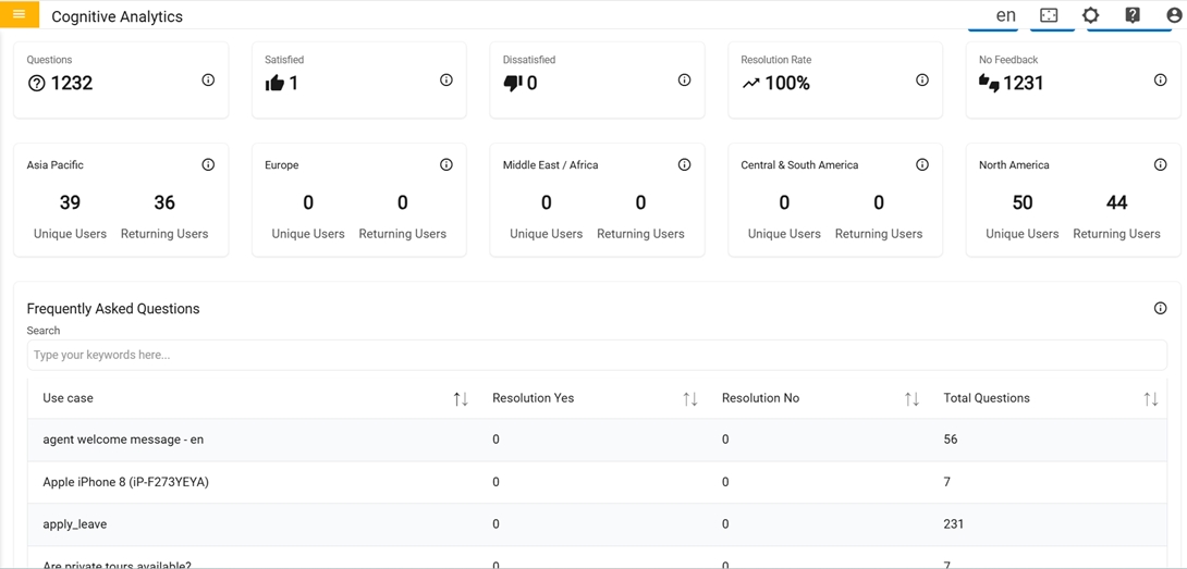
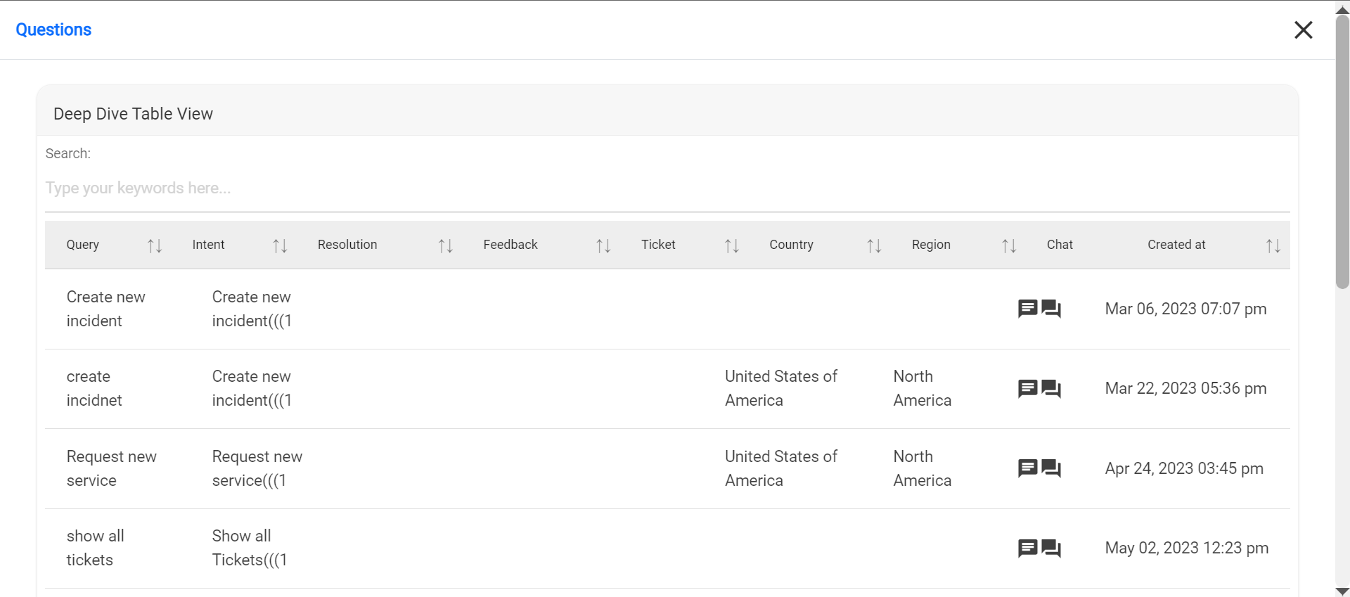
- Clicking on these cards displays detailed Table Info for each with custom pagination table where user can skip pages at the bottom of table.
In the second row there are four cards in the Reporting Dashboard:
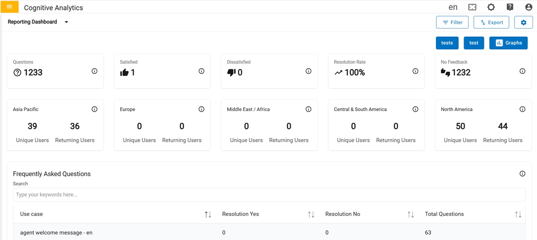
- Region wise count of distinct users (Unique Users) and the count of Unique Users who
have returned (Returning Users).
- Clicking on each of these card, gives advanced information in a table view about each
region being clicked.
Figure 7. Unique Users & Returning Users: Metrics 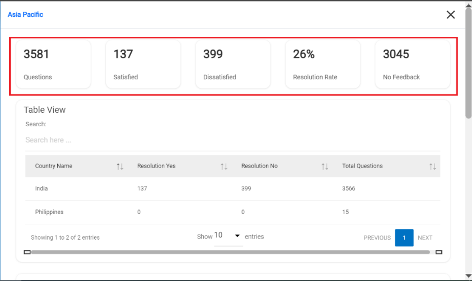
-
Table View: Table represents the list of countries along with resolution details
for that specific region.
Figure 8. Table View 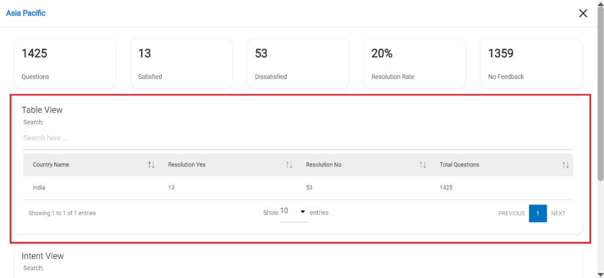
-
Intent View: Table represents the list of Usecases along with the total count of
Total Questions, Feedback as Satisfied (Resolution Yes) and Feedback as Dissatisfied
(Resolution No) for that specific region.
Figure 9. Intent View 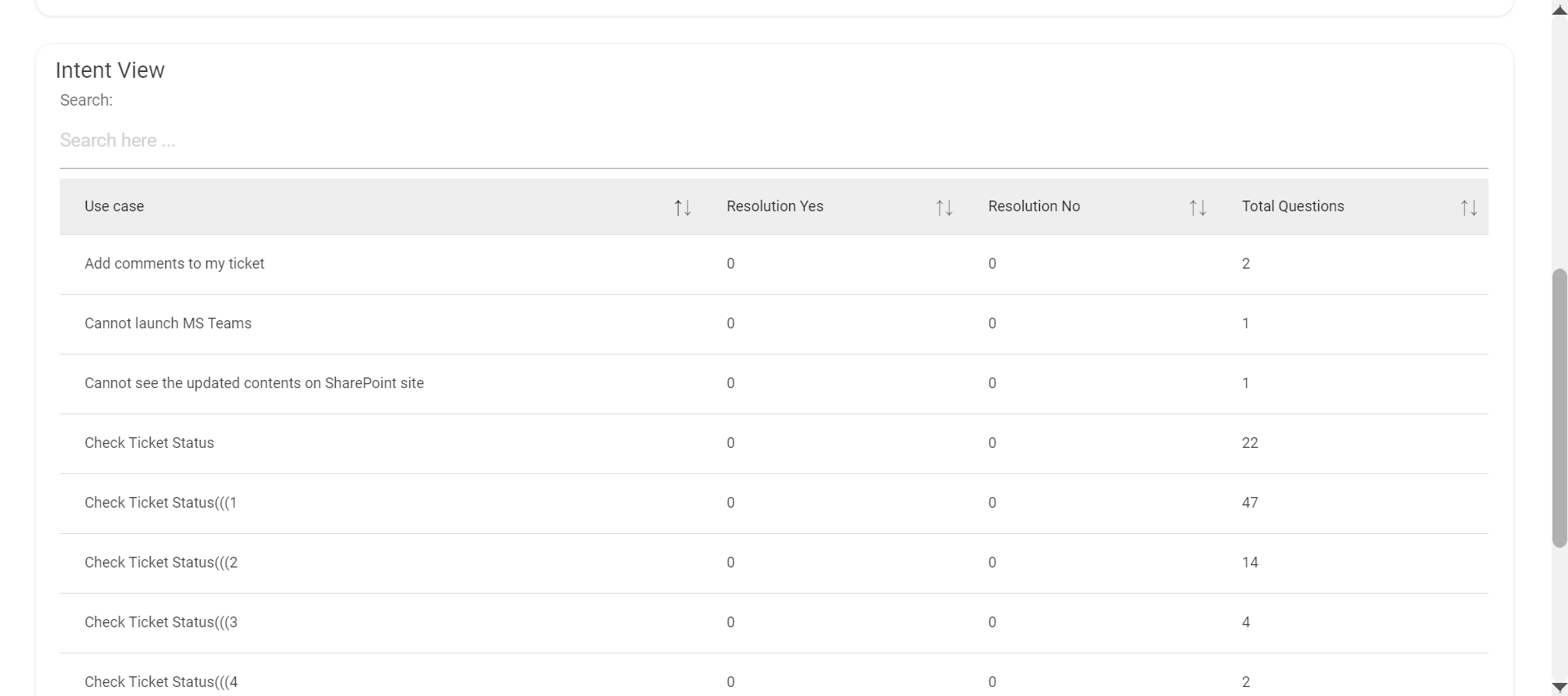
- Clicking on each of these card, gives advanced information in a table view about each
region being clicked.
In the third row there is a Frequently Asked Questions card
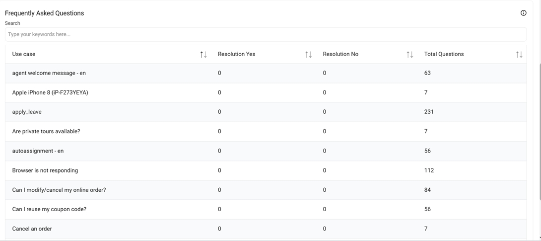
- Frequently Asked Questions: Table represents the list of Usecases along with the total count of Total Questions, Feedback as Satisfied (Resolution Yes) and Feedback as Dissatisfied (Resolution No).
-
Graph: At the top right corner, there is a button called ‘Graphs’ which contains
graphs that represent data.
Figure 11. Graphs Button 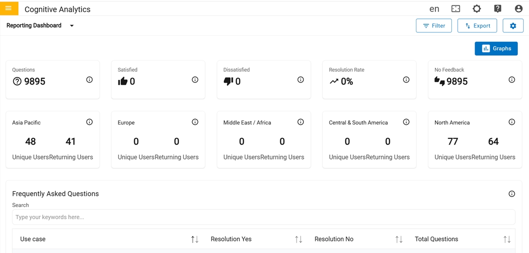
-
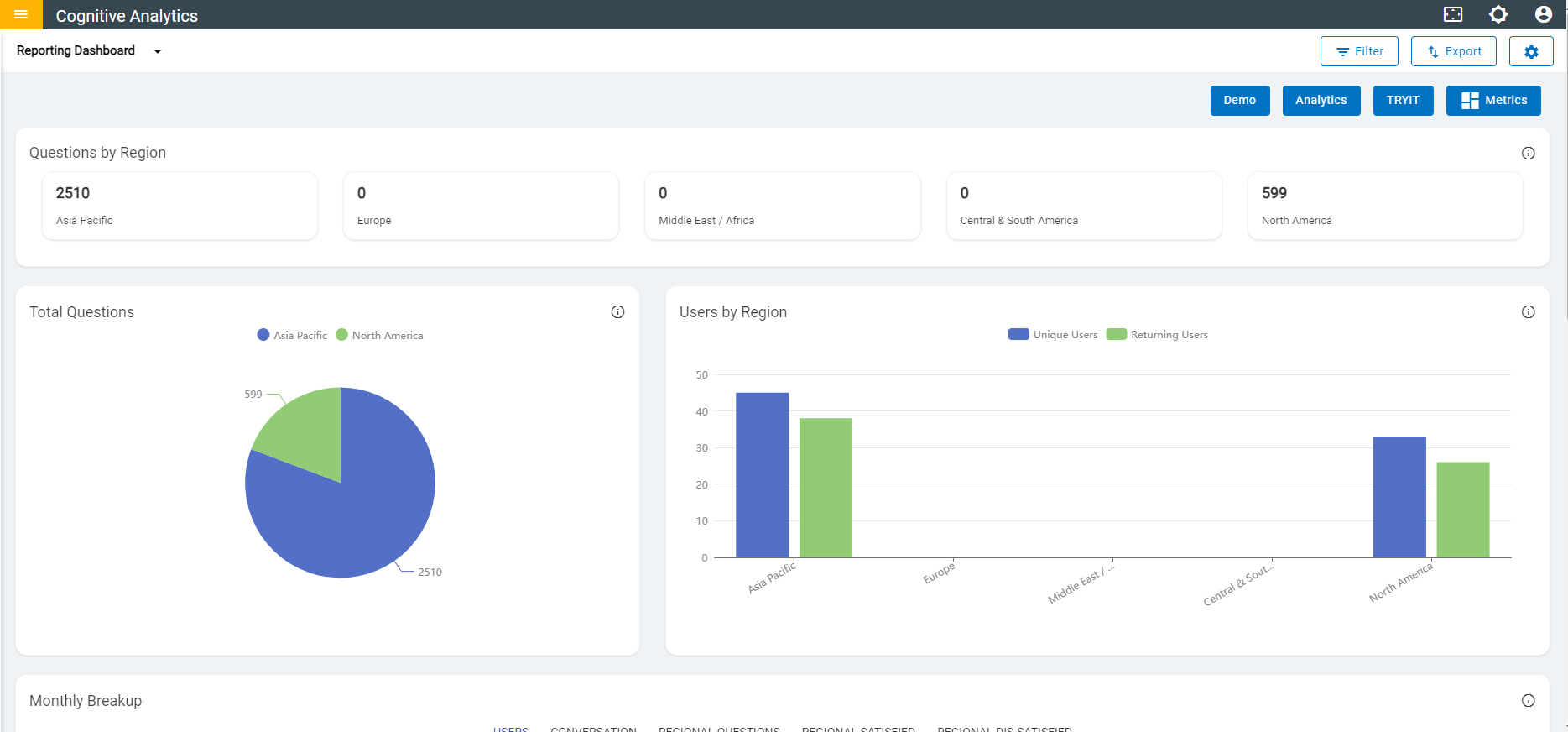
Questions by Region: The total valid queries are raised from specific regions.
In the second row, we have two cards that contains different types of graphs,
Figure 12. Graphs 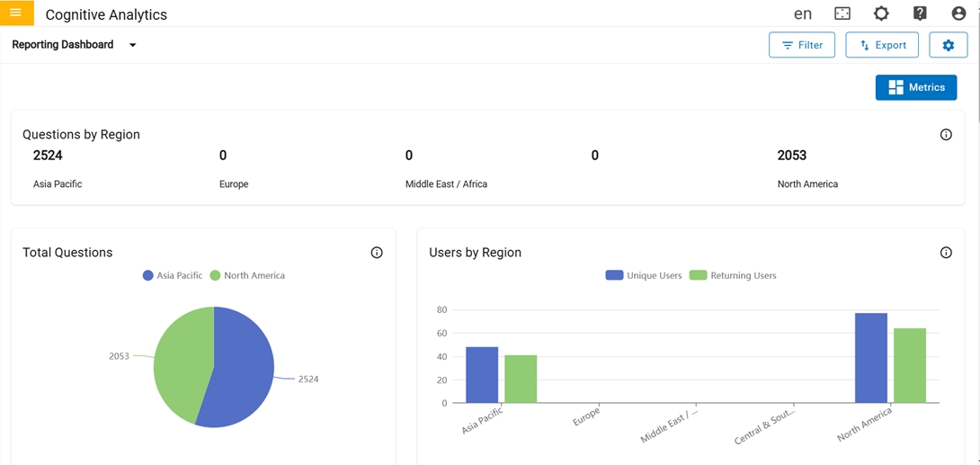
-
Total Questions: Graph represents the total count of valid queries raised from
specific regions.
Figure 13. Total Questions and Users by Region 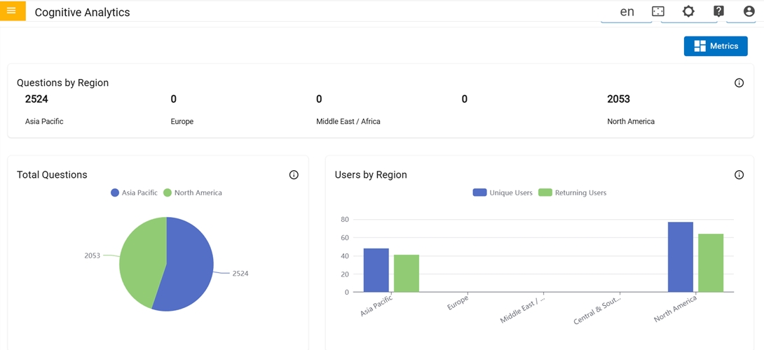
- Users by Region:Graph represents the total number of Unique and Returning users from specific regions.
-
Monthly Breakup:Graph represents the total count of monthly data for each
category
In the third row, there is only one card named “Monthly Breakup “
Figure 14. Monthly Breakup 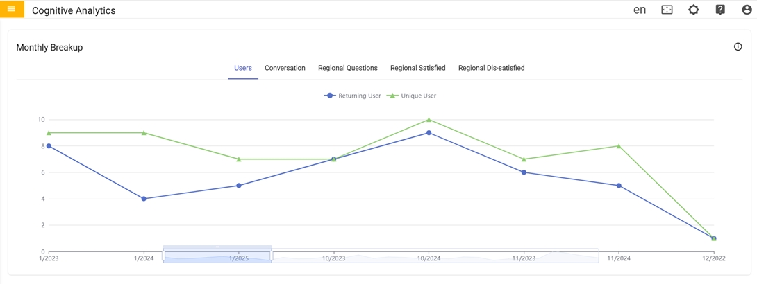
-
Unique Users Per Month:Graph represents the total count of Unique users of that
specific month for each region.
Figure 15. Unique Users Per Month 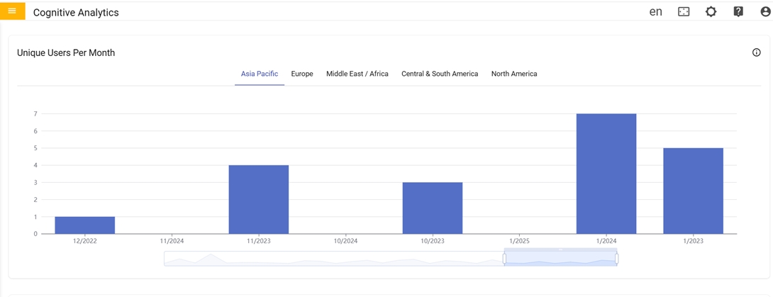
 icon navigates to
Configure page where user can create custom buttons in ‘Reporting Dashboard’ by providing
button and URL to redirect.
icon navigates to
Configure page where user can create custom buttons in ‘Reporting Dashboard’ by providing
button and URL to redirect. 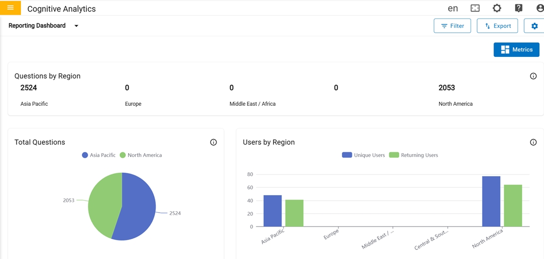
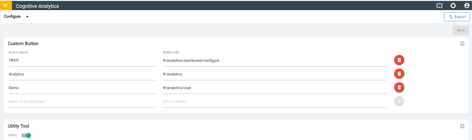
- The Configure page is a special type of content page where the users configure some
aspects of the Reporting dashboard.
In the first row, there is one card where the user can add and delete a custom button by giving name and URL to redirect.
Figure 18. Configure Page 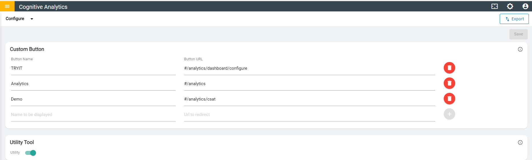
- Custom buttons can be added with the given name and URL. The Maximum number of custom buttons that can be added is 10.
- Name should be unique and should not contain special characters & numbers, but it can contain hyphens or space in between the words.
- URLs should be unique and it can be Absolute (starts with 'https') or Relative (starts with '#/') and should not contain space in between the path.
- Once user filled the required fields in configure page, successful message will be
displayed.
Figure 19. Successful Message 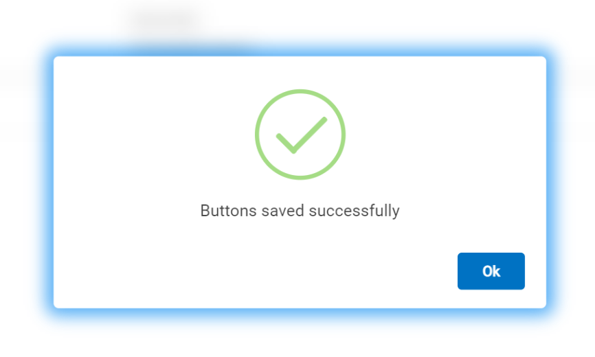
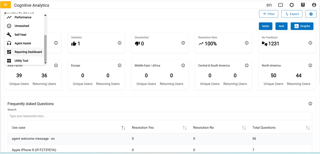
- Once user created Button Name in configure page, button name is shown in Reporting Dashboard
Figure 20. Updated Reporting Dashboard Page 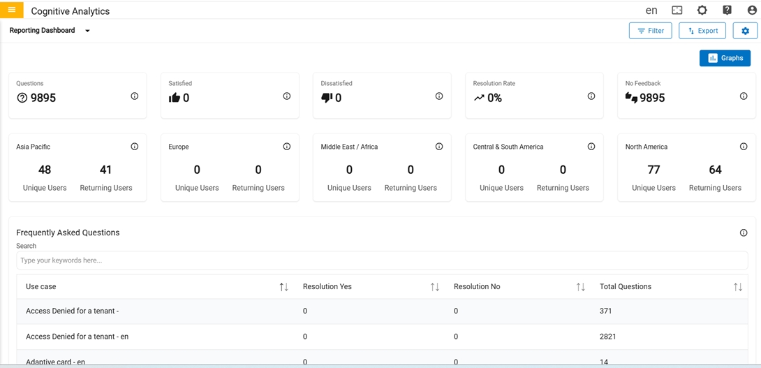
In the second row, there is only one card where the user can toggle to enable or disable the Utility page in dashboard.
Figure 21. Utility toggle