In this lesson, you customize the catalog entry list view by adding warranty information
as a new column for catalog entries.
About this task
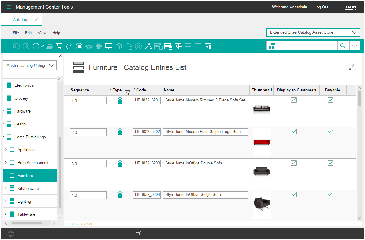
The following image shows the default Management Center catalog entries list view
before your customization.
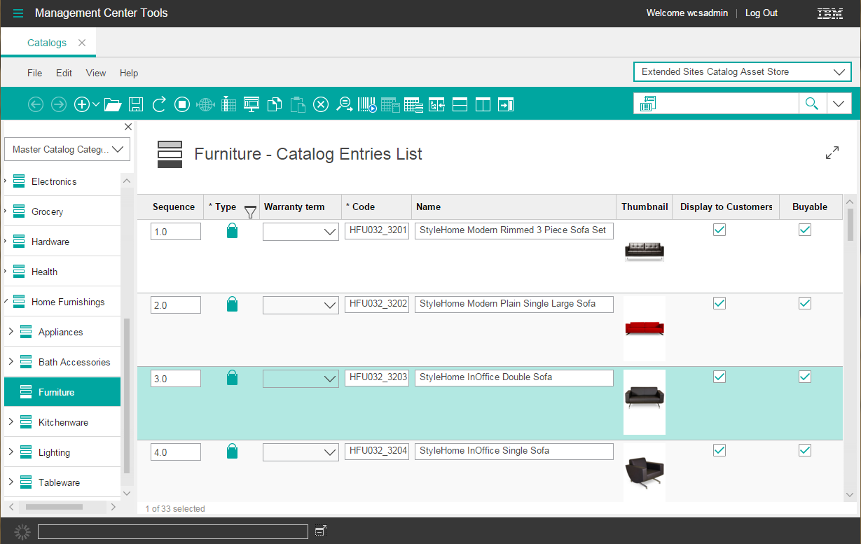
After you complete the following steps, a new warranty term column is added to the list view as
shown in the following image. The values that are to display within the column are defined in a
following lesson.
Procedure
-
In the Enterprise Explorer view, expand
-
Open the CatalogEntryGrid.xml file for editing.
-
Add a column to the list view definition for the warranty term information. The list view
columns are defined in the
CatalogEntryBrowseGrid definition.
-
In the file, search for the
"cmc/catalog/CatalogEntryBrowseGrid"
definition
<ObjectGrid definitionName="cmc/catalog/CatalogEntryBrowseGrid" preferenceKey="catCatalogEntryBrowseGrid">
  <dependency localName="catalogResources" moduleName="cmc/catalog/CatalogResources"/>
  <GridNumeric editable="true" name="sequence" numDecimalPlaces="1" propertyName="sequence" required="false"
   text="${catalogResources.displaySequence}" visible="true" width="130"/>
  <GridText editable="false" name="catentryId" objectPath="CatalogEntry" propertyName="catentryId"
   text="${catalogResources.productUniqueId_ColumnHeader}" visible="false" width="90"/>
  <GridIconTypeImage enableFilter="true" name="typeIcon" propertyName="null" required="true"
   text="${catalogResources.productType_ColumnHeader}" visible="true" width="80"/>
  ...
</ObjectGrid>
-
Define the new column by using a
<GridText> element for simple text or a
<GridComboBox> element for a list of selectable options.
For example, the following code snippet includes the new column within a
<GridComboBox>
element:
<ObjectGrid definitionName="cmc/catalog/CatalogEntryBrowseGrid" preferenceKey="catCatalogEntryBrowseGrid">
  <dependency localName="catalogResources" moduleName="cmc/catalog/CatalogResources"/>
  <GridNumeric editable="true" name="sequence" numDecimalPlaces="1" propertyName="sequence" required="false"
   text="${catalogResources.displaySequence}" visible="true" width="130"/>
  <GridText editable="false" name="catentryId" objectPath="CatalogEntry" propertyName="catentryId"
   text="${catalogResources.productUniqueId_ColumnHeader}" visible="false" width="90"/>
  <GridIconTypeImage enableFilter="true" name="typeIcon" propertyName="null" required="true"
   text="${catalogResources.productType_ColumnHeader}" visible="true" width="80"/>
  <GridComboBox editable="true" name="WarrantyTerm" objectPath="CatalogEntry" propertyName="x_warterm"
   text="${ExtCatalogResources.productWarranty_ColumnHeader}" visible="true" width="90"/>
  ...
</ObjectGrid>
-
Add the dependency for your custom ExtCatalogResources resource bundle. By
adding this dependency, the catalog entry list view can retrieve and display the text that is
defined in your custom properties files.
Define the dependency with the format <dependency localName=""
moduleName=""/>
For example, the following code snippet shows the addition of a dependency for the
ExtCatalogResources resource
bundle.
<ObjectGrid definitionName="cmc/catalog/CatalogEntryBrowseGrid" preferenceKey="catCatalogEntryBrowseGrid">
  <dependency localName="catalogResources" moduleName="cmc/catalog/CatalogResources"/>
  <dependency localName="ExtCatalogResources" moduleName="cmc/catalog/ExtCatalogResources"/>
  <GridNumeric editable="true" name="sequence" numDecimalPlaces="1" propertyName="sequence" required="false"
   text="${catalogResources.displaySequence}" visible="true" width="130"/>
  ...
</ObjectGrid>
-
Save and close the file.