Containers
- ActionSet – Properties:
- Actions: It will contain array of action element to show. It is a required value. Allowed values are Action.Execute, Action.OpenUrl, Action.ShowCard, Action.Submit and Action.ToggleVisibility.
- Fallback: It will tell what to do when an unknown element is encountered or the requires of this or any children can't be met. It is not a required value.
- Height: It specifies the height of the element. It is not a required value. Allowed values are auto and stretch.
- Separator: It will draw a separating line at the top of the element. It is of type Boolean and is not a required value.
- Spacing: It controls the amount of spacing between the elements. It is not a required value. Allowed values are default, none, small, medium, large, extra-large, and padding.
- Example:
Figure 1. Figure 362 – Example Code (ActionSet) 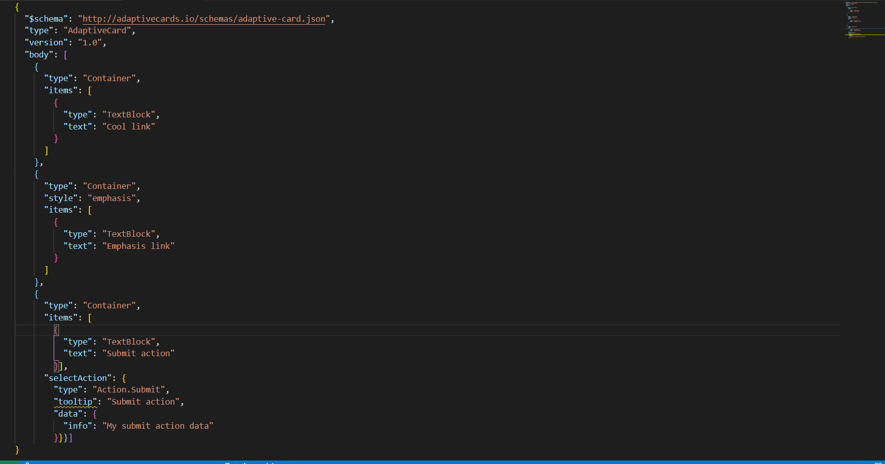
Figure 2. Figure 363 - – Example Code (ActionSet) (Cont.) 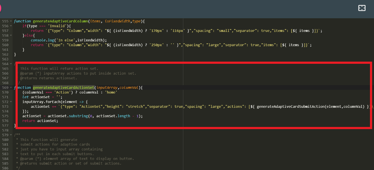
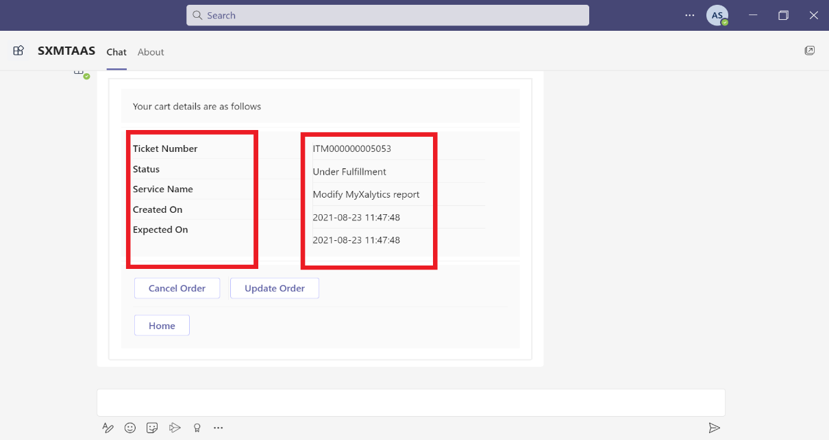
- Teams UI Action Set Example:
-
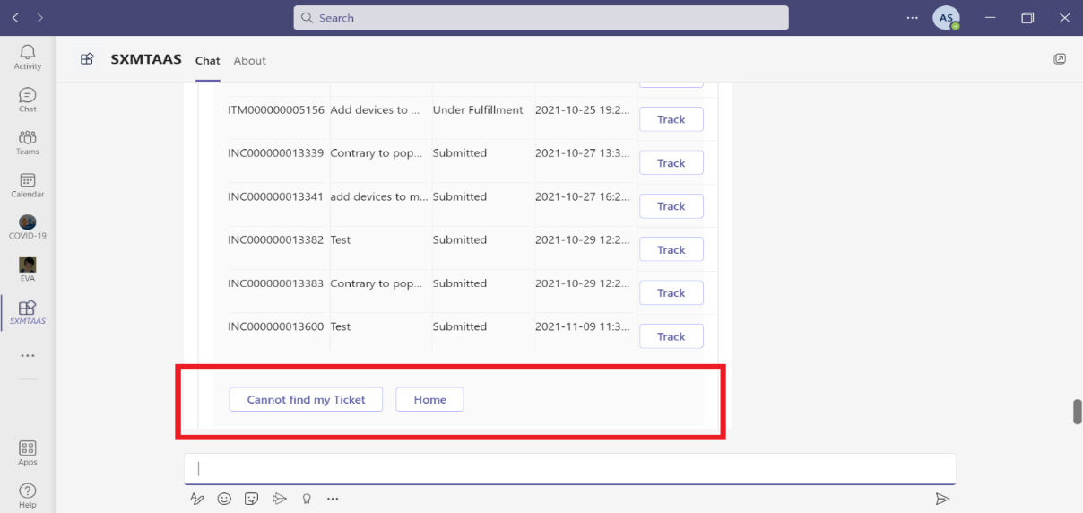
Figure 364 Teams UI Action Set Example
- Container – Properties:
- Items: These are the card elements to render inside the container. It is a required value. Allowed values are ActionSet, ColumnSet, Container, FactSet, Image, ImageSet, Input.ChoiceSet, Input.Date, Input.Number, Input.Text, Input.Time, Input.Toggle, Media, RichTextBlock, Table, and TextBlock.
- selectAction: This property will select an action when the container is tapped or selected. It does not support Action.ShowCard. It supports Action.Execute, Action.OpenUrl, Action.Submit and Action.ToggleVisibility
- Style: It will give style value for container. It is not a required property. Allowed values are default, emphasis, good, attention, warning, and accent.
- minHeight: It will specify the minimum height of the container in pixels. It is of type string and not a required property.
- Fallback: It will tell what to do when an unknown element is encountered or the requires of this or any children can't be met. It is not a required value. It is of type Element and Fallback Option. It is supported in version 4.2.
- Height: It specifies the height of the element. It is not a required value. Allowed values are auto and stretch.
- Separator: It will draw a separating line at the top of the element. It is of type Boolean and is not a required value.
- Spacing: It controls the amount of spacing between the elements. It is not a required value. Allowed values are default, none, small, medium, large, extra-large, and padding.
- Example:
Figure 3. Figure 365 – Example Code (Container) 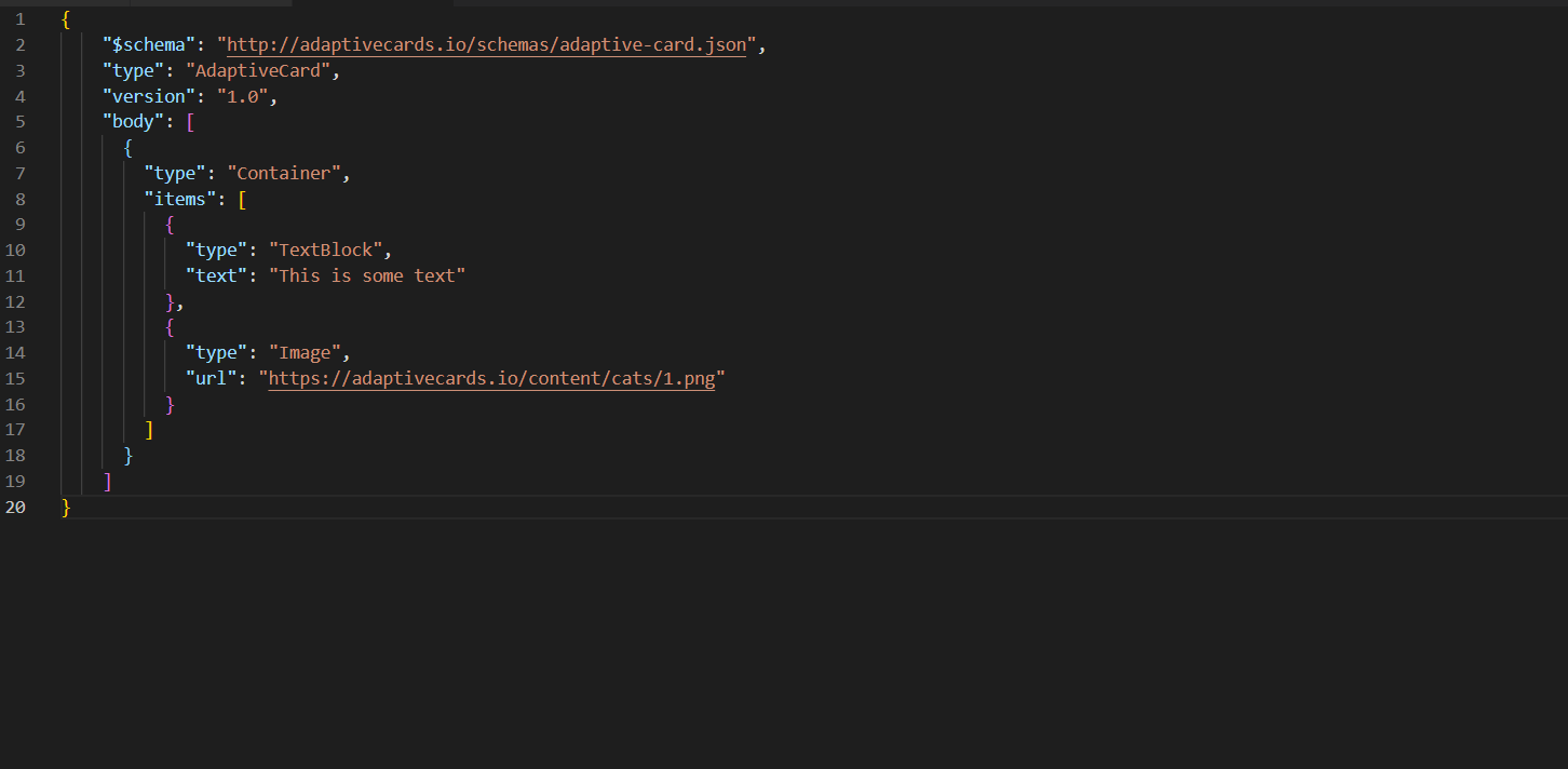
Figure 4. Figure 366 – Example Code (Container) (Cont.) 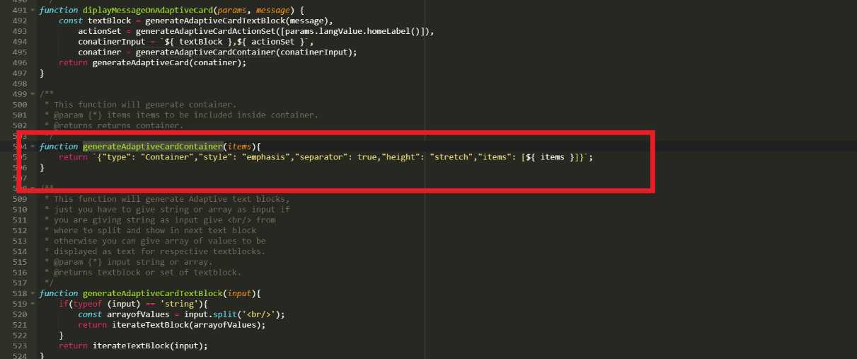
- Teams UI Container Example:
Figure 5. Figure 367 - Teams UI Container Example 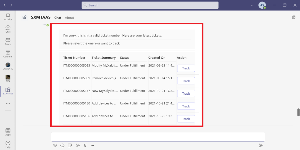
- ColumnSet – Properties:
- Columns: It will specify the array of columns to divide the region. It is of type Column[], not a required property and allowed values are Columns.
- selectAction: This property will select an action when the container is tapped or selected. It does not support Action.ShowCard. It supports Action.Execute, Action.OpenUrl, Action.Submit and Action.ToggleVisibility
- Style: It will give style value for container. It is not a required property. Allowed values are default, emphasis, good, attention, warning, and accent.
- minHeight: It will specify the minimum height of the container in pixels. It is of type string and not a required property.
- Fallback: It will tell what to do when an unknown element is encountered or the requires of this or any children can't be met. It is not a required value. It is of type Element and Fallback Option. It is supported in version 4.2.
- Height: It specifies the height of the element. It is not a required value. Allowed values are auto and stretch.
- Separator: It will draw a separating line at the top of the element. It is of type Boolean and is not a required value.
- Spacing: It controls the amount of spacing between the elements. It is not a required value. Allowed values are default, none, small, medium, large, extra-large, and padding.
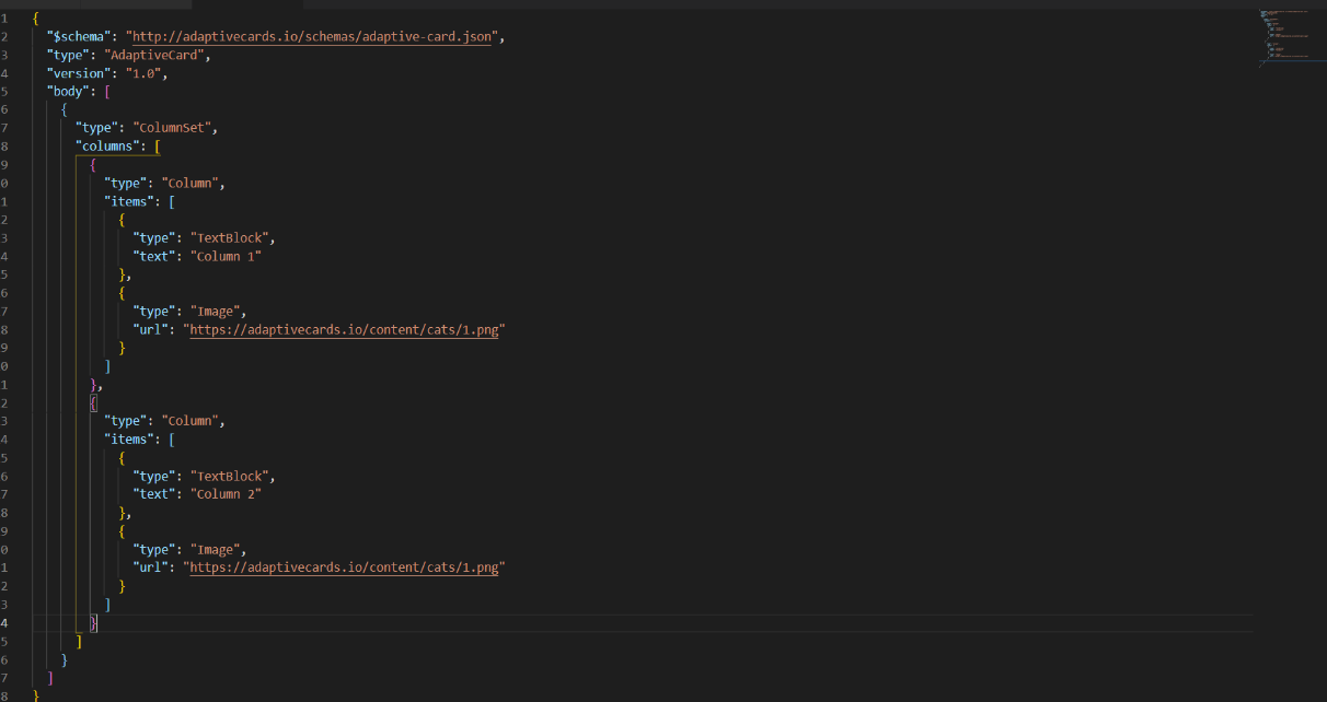
- Example: Code:
Figure 6. Figure 368 – Example Code (ColumnSet) 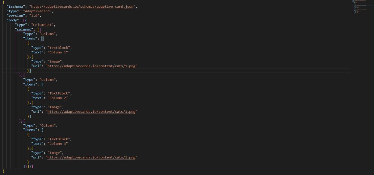
Figure 7. Figure 369 – Example Code (ColumnSet) (Cont.) 
- Teams UI Code Example:
Figure 8. Figure 370 – Teams UI ColumnSet Example 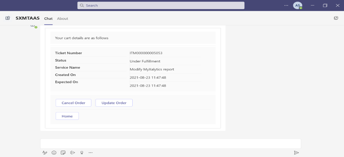
- Column – Properties:
- Items: These are the card elements to render inside the column. It is a required value. Allowed values are ActionSet, ColumnSet, Container, FactSet, Image, ImageSet, Input.ChoiceSet, Input.Date, Input.Number, Input.Text, Input.Time, Input.Toggle, Media, RichTextBlock, Table, and TextBlock.
- selectAction: This property will select an action when the container is tapped or selected. It does not support Action.ShowCard. It supports Action.Execute, Action.OpenUrl, Action.Submit and Action.ToggleVisibility
- Style: It will give style hint for column. It is not a required property. Allowed values are default, emphasis, good, attention, warning, and accent.
- minHeight: It will specify the minimum height of the container in pixels. It is of type string and not a required property. It is supported in version 1.2
- Fallback: It will tell what to do when an unknown element is encountered or the requires of this or any children can't be met. It is not a required value. It is of type Element and Fallback Option. It is supported in version 4.2. Allowed values are column and drop.
- Height: It specifies the height of the element. It is not a required value. Allowed values are auto and stretch.
- Separator: It will draw a separating line between this column and the previous column. It is of type Boolean and is not a required value.
- Spacing: It controls the amount of spacing between the elements. It is not a required value. Allowed values are default, none, small, medium, large, extra-large, and padding.
- backgroundImage: It will specify the background image. Accepted formats are PNG, JPEG and GIF. It is not a required property and allowed values are BackgroundImage and uri. It is supported in version 1.2.
- width: It will specify width of a column. It is not a required property. Can be of type string or number. Allowed values are auto and stretch.
- Example:
