
User Settings
Quick Links
To save time, improve navigation efficiency, and enhance the overall user experience by reducing the number of steps required to reach important areas.
Quick links will be visible to users bottom of menu section.
Example : A Quick Link to “Create Organization” takes the user directly to the organization section.
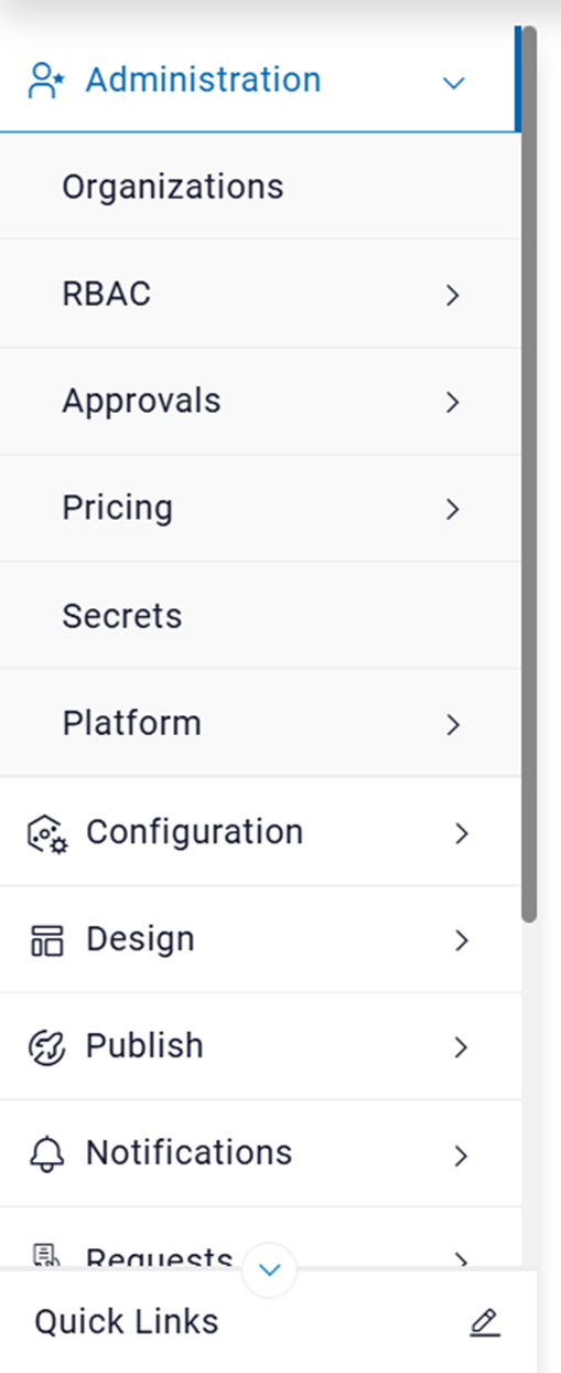
- Click on
a pop-up will appear on the screen:
Figure 2. Select Quick Link 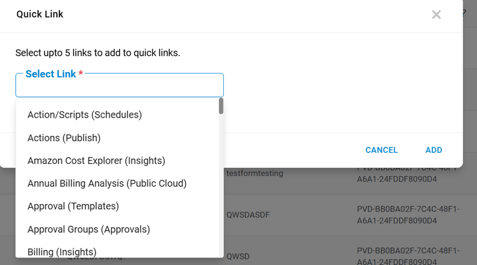
- On type on select link applicable menus to user will populate.
- User can add up to 5 links for easy to access in future.
- After adding links user can see menus links under Quick Links as mentioned
below.
Figure 3. Menus Link 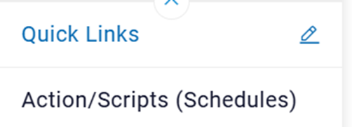
- After adding links for quick access menu for future use. if user click on
user can be able to update menu links by adding/removing links.
Figure 4. Update Quick Link 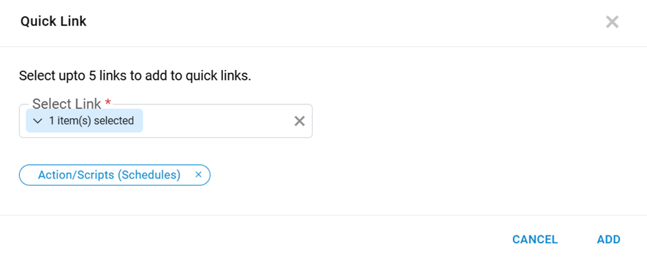
- After Clicking add button menus will update.
Figure 5. Success Message 
Search Menus
The Search Menus feature allows users to quickly locate menu items, sub-menus, and related functionalities within the system’s interface. This feature improves navigation efficiency by providing a unified search.

- Click on Search Menu text box and type 3 characters applicable menus for logged in users will populate.
- User can click on listed menu will navigate the user to respective page.
Figure 7. Listed Menu 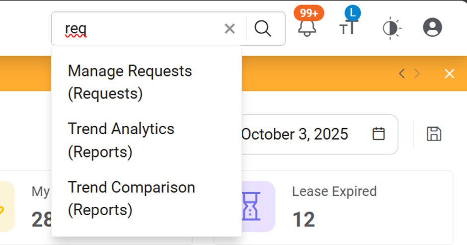
Notifications
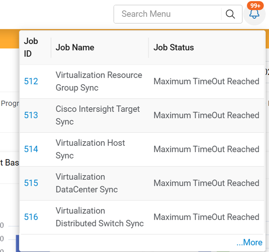
At the top of the page, icons will be displayed to indicate job failures. These
visual indicators help users quickly identify issues in real time and take immediate
corrective actions.
Click on icon user can go to job on clicking on jobId.
Font Size Adjustment
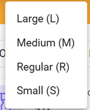
At the top of the page, an icon is available that allows users to adjust the font size
for better readability. This feature helps users customize the display according to
their preference or accessibility needs.
Theme Change (Light / Dark Mode)
At the top of the page, a theme toggle icon is provided to allow users to switch between
Light Mode and Dark Mode. This feature enhances user comfort and accessibility by
adapting the interface appearance to different lighting conditions or personal
preferences.
The theme changes icon gives users control over the visual appearance of the application. By offering both Light and Dark themes, the system ensures optimal visibility and usability across diverse environments.