Guiding Through Dashboard
This page explains the component and the features of the dashboard.
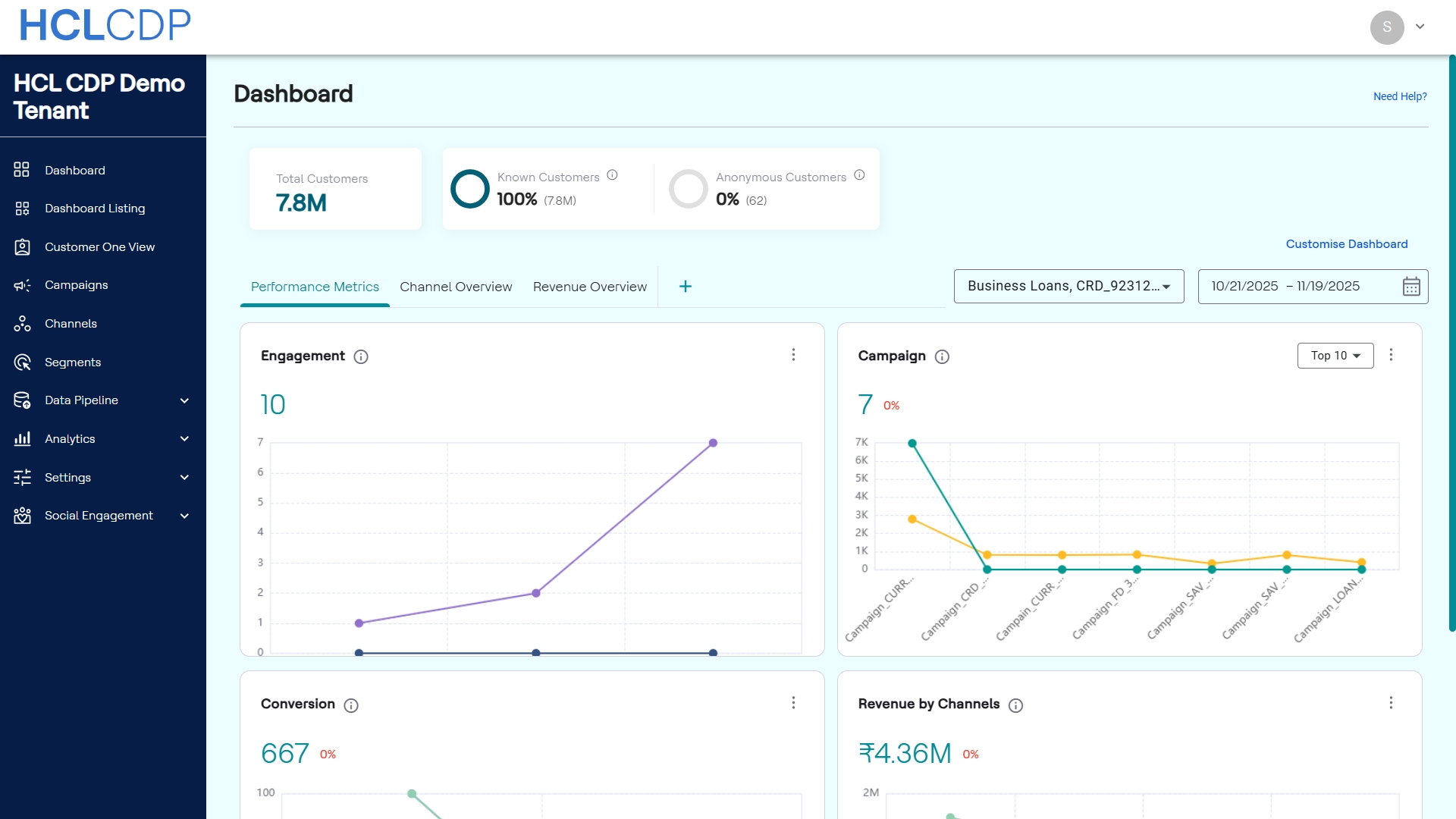
The HCL CDP Dashboard provides a consolidated, visual overview of key marketing performance indicators (KPIs) and campaign results across different channels and time periods. It allows users to monitor customer engagement, conversion rates, and revenue generation in real-time.
Dashboard Overview
The top section of the dashboard provides high-level customer statistics and filtering options that apply across all metric tabs:
| Metric | Description |
|---|---|
| Total Customers | The total volume of customer profiles tracked within the CDP. |
| Known Customers | The percentage and total count of profiles that are successfully identified and linked to known customer data. |
| Anonymous Customers | The percentage and total count of profiles tracked as anonymous users. |
Global Filters
You can refine the data displayed on the dashboard using the following global filters:
- Product Filter: A dropdown filter (e.g., Business Loans,...) to select a specific product for analysis.
- Date Range Selector: A calendar tool (e.g., 10/20/2025 – 11/18/2025) to define the period for which all dashboard data is calculated.
Widget Interaction and Actions
Every widget on the dashboard features a Context Menu, the three vertical dots, located in the top-right corner. This menu provides key options for viewing, exporting, and managing the individual widget data.
| Action | Description |
|---|---|
| Expand | Maximizes the widget display to full-screen mode for detailed
analysis of the specific chart or metric. In the Expanded view,
you can change date range, product filter, and chart type to
other chart like Line Chart, Bar Chart, Pie Chart, Area Chart,
Donut Chart, and Combined Chart. Note: The
changes you make in the expanded view are only saved within
that expanded view. |
| Export as PNG | Downloads the visual representation of the chart as a .png image file. |
| Export as CSV | Downloads the underlying numerical data used to generate the chart as a .csv file for offline reporting or analysis. |
| Remove | Hides the widget from the current dashboard view. You can restore the widget at any time using the Add/Edit Widgets modal. |
Create and Configure a Custom Tab
- On the Dashboard, locate the tab navigation bar.
- Click the Add new tab + icon to the right of the existing tabs.
- Enter the name of the custom tab. A new custom tab is added to the navigation bar.
- To add widgets to the new tab, click Add Cards in the main canvas area.
- In the Add/Edit Widgets modal that appears, select the desired widgets to include.
- Click Update to save the tab's configuration and display the selected widgets.
Remove a Custom Tab
You can remove any custom tab that is no longer required.
- Click Customise Dashboard.
- In the customization view, navigate to the tab you wish to remove.
- Click the Remove icon associated with the tab.
- Click Save Changes to apply the removal and update the dashboard layout.
Dashboard Tabs
The dashboard is organized into three primary tabs for targeted analysis: Performance Metrics, Channel Overview, and Revenue Overview.
Performance Metrics Tab
This tab focuses on general campaign effectiveness and user interaction.
| Widget | Description |
|---|---|
| Engagement | Tracks user activity over the selected time period. The line chart visualizes the trend of Active Users versus Active Users Targeted on a daily basis. |
| Campaign | Displays key performance indicators for the top campaigns. By default, it shows the Top 10 campaigns. |
| Conversion | Displays the total conversion count and the performance of key funnel metrics over time. |
| Revenue by Channels | A line graph illustrating the revenue contribution from each communication channel. This helps identify the most profitable channels. |
Channel Overview Tab
This tab provides a deep dive into the performance of individual communication channels.
| Widget | Description |
|---|---|
| Channel Insights | Provides detailed metrics for the selected channel (via a dropdown filter, e.g., PUSH). You can further segment the data by selecting a First Event and Last Event in the user journey. The chart displays the counts of users who completed the selected event journey on a specific date (e.g., 2025-11-07). Displays the total number of active users targeted, Response Rate, and CVR for the selected specific date range. |
Revenue Overview Tab
This tab aggregates and breaks down financial performance, focusing on revenue generated and costs incurred.
| Widget | Description |
|---|---|
| Total Revenue | A summary of the total revenue generated and the total expenditure for the selected date range. The donut chart visualizes the distribution between Revenue (Orange) and Spent (Red). |
| Top Performing Campaigns | A bar chart comparing core performance metrics for the top campaigns. |
| Highest & Lowest Performing Campaigns | A line chart that compares a leading campaign against a trailing campaign for key financial and performance metrics (Revenue and Conversions). |
Customizing the Dashboard
The dashboard is highly customizable. Clicking Manage Dashboard opens the Add/Edit Widgets modal, which allows you to enable, disable, and rearrange the widgets on the dashboard.
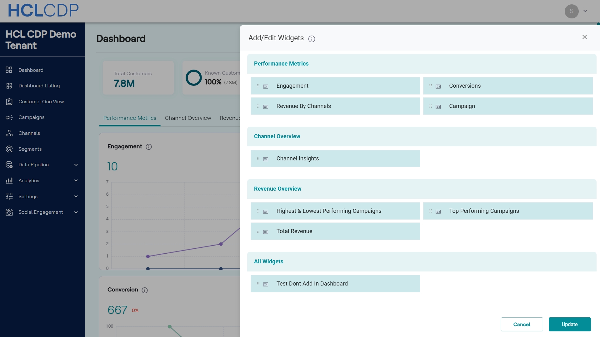
Add/Edit Widgets Modal
The Add/Edit Widgets modal organizes all available widgets into three categories that correspond to the main dashboard tabs. You can drag and drop the widgets within or across categories to reorder them.
| Category | Widget | Description |
|---|---|---|
| Performance Metrics | Engagement | Tracks user activity and active users over the defined time period. |
| Conversions | Summarizes conversion counts and performance trends for CTR, CVR, and Response Rate. | |
| Revenue By Channels | Displays the revenue contribution broken down by specific communication channels. | |
| Campaign | Visualizes high-level performance metrics (Users Targeted, Clicks) for selected campaigns. | |
| Channel Overview | Channel Insights | Provides detailed response, conversion, and targeting data for an individual channel (e.g., PUSH, SMS). |
| Revenue Overview | Highest & Lowest Performing Campaigns | Compares leading and trailing campaigns based on financial and performance metrics (Revenue, Conversions). |
| Top Performing Campaigns | Displays detailed performance metrics (Users Targeted, Clicks, Revenue, Conversion) for the best-performing campaigns in the period. | |
| Total Revenue | Provides the aggregate financial summary, including Total Revenue and Spent, visualized in a donut chart. | |
| All Widgets | Contains all other widgets that are not assigned in the existing tabs. |
Once you have arranged the widgets to your preference, click Update to save the changes and refresh the dashboard view. Click Cancel to discard any changes.