Components of Search V2
The Search V2 UI is composed of web components called search components. This guide explains how to use the Search V2 UI search components. Follow along to learn about the different types of search components, their styling options, and extendable features.
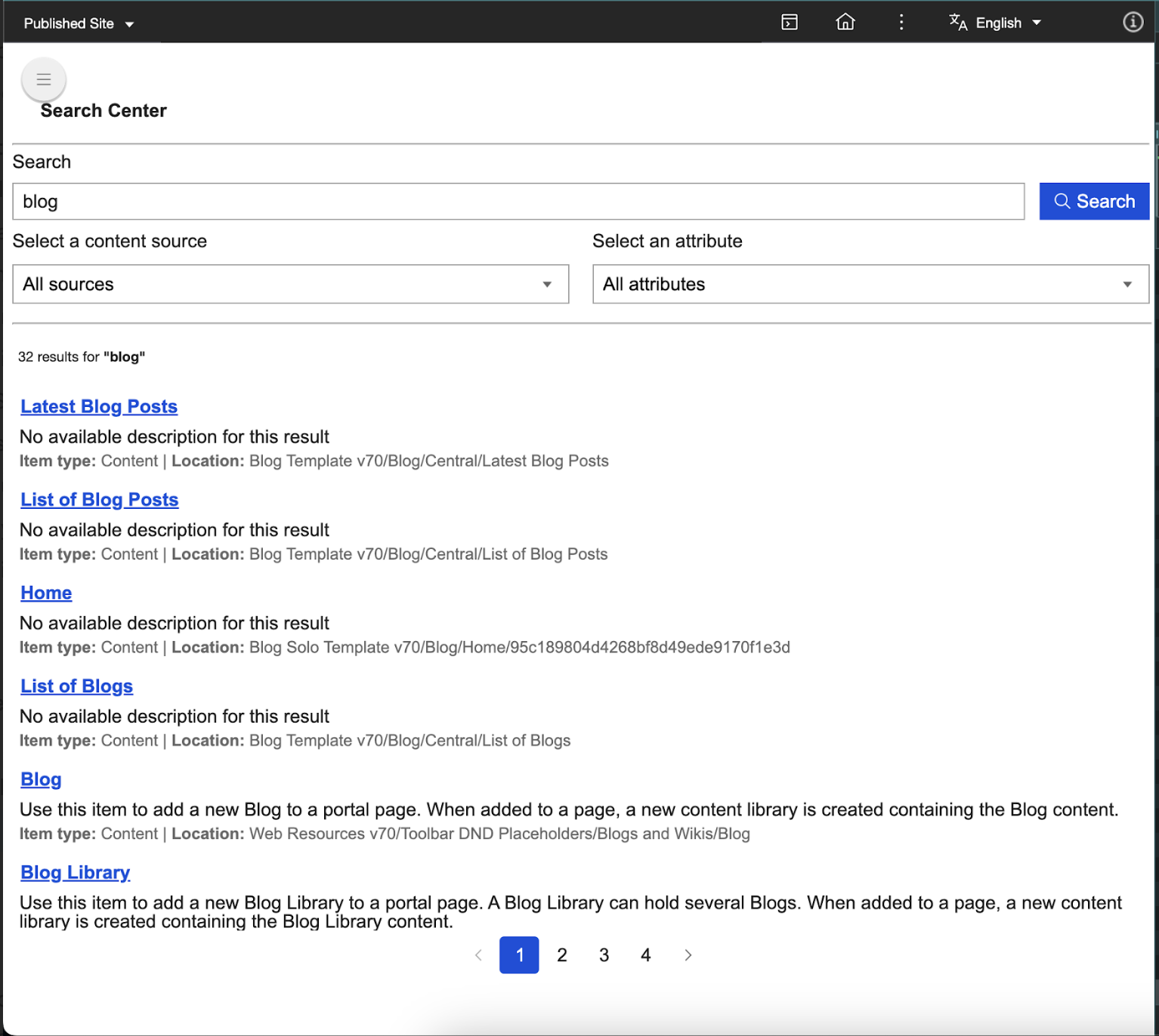
The default search component for Search V2 is designed to be user-friendly, customizable, and extendable. It offers intuitive search interactions, allows user-defined styling and extensions, and can be integrated anywhere in your application. See an example of the search component below.
Search component features and benefits
Search V2 components provide the following benefits:
- Encapsulation: Styles and functionality are isolated from the rest of your application using Shadow DOM.
- Reusability: Build once and reuse across different parts of your application.
- Customizability: Use attributes, properties, and part selectors to customize components without altering their core code.
Search components overview
Search V2 components has two distinct types: Atomic Components (AC) and Functional Composite Components (FCC).
Atomic Components
Atomic Components (AC) are the smallest possible building blocks of the search functionality. These components include buttons, input fields, and chips, and are built using Web Components standards such as Shadow DOM for encapsulation and reusability. Refer to the table below each component for the list of compatible properties associated with them.
-
dx-ac-base-element: This class creates a foundational element for developing custom web components. It supports internationalization and localization, and uses the Shadow DOM to encapsulate its internal structure, ensuring high reusability.
Properties type Description Default id String A unique identifier for the component instance. This property is automatically assigned using a UUID generator when the component is instantiated. Generated UUID value -
dx-button: This customizable button component comes with internationalization support, conditional icon and text rendering, and isolated styling using Shadow DOM and CSS parts.
Properties type Description Default disabled Boolean Indicates whether the button is disabled. false imgurl String The URL of the image to be displayed as the icon of a button. undefined buttontext String Displays text on a button. undefined endicon Boolean Determines whether the image is displayed as an end icon instead of a start icon. false focused Boolean Indicates whether the button currently has focus. This property is managed internally. false variant String Specifies the button's visual style. Possible values are contained,text, andoutlined.'contained' withPadding Boolean Indicates whether the button should have padding. false The following CSS part attributes are responsible for determining the appropriate CSS for the
dx-buttoncomponent and its elements based on the component's state and properties.Part Description button Represents the main button element. It is the default part for the button and is styled based on the button's state (such as disabledandfocused) andvariant(such ascontained,outlined, ortext).button-disabled Represents the button in a disabled state when the disabledproperty is set totrue.button-outlined Represents the button with an outlined style when the variantproperty is set tooutlined.button-outlined-focused Represents the outlinedbutton in a focused state when thefocusedproperty is set totrueand thevariantproperty is set tooutlined.button-outlined-disabled Represents the outlinedbutton in a disabled state when thedisabledproperty is set totrueand thevariantproperty is set tooutlined.button-start-icon Represents the start icon of the button when the starticonproperty is set totrue.button-start-icon-with-padding Represents the start icon of the button with padding when the button does not have text ( buttontextis set to"") but has thewithPaddingproperty set totrue.button-end-icon Represents the end icon of the button when the endiconproperty is set totrue.button-start-icon-no-margin Represents the start icon of the button without margin when the button does not have text ( buttontextis set to"") and thewithPaddingproperty is set tofalse.button-start-icon-rtl-margin Represents the start icon of the button with right-to-left (RTL) margin when the text direction is set to RTL.button-text Represents the text content of the button when the button has text ( buttontextis not an empty string).button-contained Represents the button with a contained style when the variantproperty is set tocontained.button-contained-disabled Represents the contained button in a disabled state when the disabledproperty is set totrueand thevariantproperty is set tocontained.button-contained-focused Represents the contained button in a focused state when the focusedproperty is set totrueand thevariantproperty is set tocontained.button-enchanted-text Represents the button with an enchanted text style when the variantproperty is set totext.button-enchanted-text-disabled Represents the enchanted text button in a disabled state when the disabledproperty is set totrueand thevariantproperty is set totext.button-enchanted-text-focused Represents the enchanted text button in a focused state when the focusedproperty is set totrueand thevariantproperty is set totext.button-enchanted-outlined Represents the button with an enchanted outlined style when the variantproperty is set tooutlined.button-enchanted-outlined-disabled Represents the enchanted outlined button in a disabled state when the disabledproperty is set totrueand thevariantproperty is set tooutlined.button-enchanted-outlined-focused Represents the enchanted outlined button in a focused state when the focusedproperty is set totrueand thevariantproperty is set tooutlined. -
dx-input-select: This flexible, accessible, and customizable component can handle a variety of user interactions and scenarios.
Properties type Description Default label String The label displayed for the dropdown. Defaults to a context-based message if not provided. '' disabled Boolean Indicates whether the dx-input-selectcomponent is disabled.false selectedValue String The currently selected value. undefined selectedId String The id of the currently selected option. undefined options String, String[], OptionData[] List of options to display in the dropdown. The options can be a JSON string, an array of strings, or an array of objects with id and name properties. [] field DxSearchInputFieldType, String The type of the input field used to determine default labels or handle specific behaviors. You can use DxSearchInputFieldTypestrings such ascontentSourceordocumentObjectTypeor leave it blank.'' toggleDropDown Boolean Indicates whether the dropdown is open or closed. false listItems HTMLElement[], undefined A list of HTMLElement items in the dropdown. undefined currentFocusedItem HTMLElement, undefined The item currently focused in the dropdown. undefined The following CSS part attributes are responsible for determining the appropriate CSS for the
dx-input-selectcomponent and its elements based on the component's state and properties.Part Description div Represents the outermost container <div>of thedx-input-selectcomponent. This part can be styled to control the overall layout and appearance of the component.label Represents the <label>element of thedx-input-selectcomponent. This part can be styled to control the appearance of the label text displayed above or beside the dropdown.BUTTON_PARTS Represents the parts of the <dx-button>element used in the component. Theexportpartsattribute allows the button's internal parts to be styled externally and ensures all button parts are exported for external styling.unordered-list Represents the <dx-list>element that contains the dropdown options. This part can be styled to control the appearance of the dropdown list.LIST_ITEM_PARTS Represents the parts of each <dx-list-item>element within the dropdown list. Theexportpartsattribute allows the list item's internal parts to be styled externally and ensures all list item parts are exported for external styling. -
dx-list: This component wraps an unordered list (
<ul>) and uses a slot to insert content such as list items into the component. Thepart="unordered-list"attribute allows external styling of the<ul>.Properties type Description Default role String Specifies the ARIA role for the <ul>element. It is used for accessibility purposes.'' The following CSS part attribute is responsible for determining the appropriate CSS for the
dx-listcomponent and its elements based on the component's state and properties.Part Description unordered-list Represents the <ul>element rendered by thedx-listcomponent. It is the main container for the list items. -
dx-switch: This fully accessible and customizable custom component separates behavior (toggle state and events) from appearance (CSS styling through the dynamic part attribute). This component is currently not in use.
Properties type Description Default isChecked Boolean Indicates whether the switch is toggled on (true) or off (false). false isDisabled Boolean Indicates whether the switch is disabled. false The following CSS part attributes are responsible for determining the appropriate CSS for the
dx-switchcomponent and its elements based on the component's state and properties.Part Description switch-label Represents the label element of the switch component. It is the container for the input and slider elements. switch-label-disabled Represents the label element of the switch component if the isDisabledproperty is set totrue.switch-input Represents the input element of the switch, which is a checkbox. It handles the toggle functionality of the switch. switch-slider Represents the slider element of the switch, which visually indicates whether the switch is on or off. switch-slider-checked Represents the slider element of the switch if the isCheckedproperty is set totrue.switch-slider-disabled Represents the slider element of the switch if the isDisabledproperty is set totruebut theisCheckedproperty is set tofalse.switch-slider-checked-disabled Represents the slider element of the switch if the isDisabledandisCheckedproperties are set totrue. -
dx-anchor: This versatile anchor component supports pagination and custom actions, and is designed for navigation menus and paginated lists.
Properties type Description Default url String Specifies the URL the anchor element navigates to. '' weight Number Represents a custom weight value for the anchor. Ensure to use case-specific values. 0 title String Specifies the title attribute, providing additional information about the link. '' name String The text content or label of the anchor element. '' rel String Specifies the relationship between the current document and the linked document. Sample values include noopenerornofollow.'' disabled Boolean Indicates if the anchor element is disabled. false selected Boolean Indicates if the anchor is currently selected and is typically used in scenarios such as pagination. false value Number Represents a custom numeric value associated with the anchor. Ensure to use case-specific values. 0 mode String Specifies the mode of the anchor, controlling its behavior and styling. You can use the mode values paginationorresult-title, or leave it blank.'' imgurl String Specifies the URL of an image to be displayed inside the anchor if no text label is provided. '' target String Specifies where to open the linked document. Sample values include _blankor_self.undefined The following CSS part attributes are responsible for determining the appropriate CSS for the
dx-anchorcomponent and its elements based on the component's state and properties.Part Description result-title Used when the anchor tag represents a result title. It applies specific styles or behaviors for result titles in the UI. pagination-index-disabled Used when the anchor tag is part of a pagination component and the disabledproperty is set totrue. It applies styles or behaviors indicating that the pagination link is not clickable.pagination-index-selected Used when the anchor tag is part of a pagination component and the selectedproperty is set totrue. It applies styles or behaviors indicating that the pagination link is currently active or selected.pagination-index-default Used when the anchor tag is part of a pagination component and is in its default state ( disabledandselectedare both set tofalse). It applies the default styles or behaviors for pagination links. -
dx-chip: This component allows you to display a "chip" or "tag" with a numerical count, such as notification counters, tag lists, or pill-style labels. It also comes with built-in localization support.
Properties type Description Default name String Specifies the name or label of the chip. '' count Number Represents a numeric count associated with the chip. 0 showChipCount Boolean Determines whether countshould be displayed alongside the chip name.false showAvatar Boolean Determines whether an avatar should be displayed in the chip. false The following CSS part attributes are responsible for determining the appropriate CSS for the
dx-chipcomponent and its elements based on the component's state and properties.Part Description chip-div Represents the main container <div>for thedx-chipcomponent. It serves as the root element for styling and interaction.chip-name Represents the <span>element that displays the name of the chip. It is used to style the text content of the chip's name.chip-count Represents the <span>element that displays the count of the chip when the locale is left-to-right (LTR). It is used to style the count value in LTR layouts.chip-count-rtl Represents the <span>element that displays the count of the chip when the locale is right-to-left (RTL). It is used to style the count value in RTL layouts. -
dx-input-textfield: This component allows you to create rich input fields with enhanced user experience such as search bars or forms. You can also use it for fields where text input with optional icons and labels is required.
Properties type Description Default value String The current value of the textfield. '' type String Specifies the input type. Sample values include text,password, oremail.'text' label String, undefined The label displayed above the textfield. undefined placeholder String The placeholder text displayed inside the textfield. '' disabled Boolean Indicates whether the textfield is disabled. false iconStartUrl String, undefined URL of the icon displayed at the start of the textfield. undefined iconEndUrl String, undefined URL of the icon displayed at the end of the textfield. undefined field DxSearchInputFieldType, String A field identifier for the input that is useful in custom events or associating the input with specific data. You can use the DxSearchInputFieldTypestringqueryStringor provide your own field name.'' usecase String Represents the use case for the input field, such as authoring or end-user. '' clearFocus Boolean Tracks whether the input field should regain focus after being cleared. false tempValueHolder String Temporarily holds the value of the input field to restore it under certain conditions, such as when the user clears the field but does not confirm the change. '' The following CSS part attributes are responsible for determining the appropriate CSS for the
dx-input-textfieldcomponent and its elements based on the component's state and properties.Part Description div Represents the outermost container of the textfield component. label Represents the label element for the input field. It is used when the labelproperty is provided.icon-start Represents the starting icon of the input field. It is used when the iconStartUrlproperty is provided.icon-start-with-label Represents the starting icon of the input field when a label is also present. It is applied in addition to the icon-startpart.input Represents the input field. It is the default part for the input element. input-disabled Represents the input field when the disabledproperty is set totrue. It is applied in addition to theinputpart.input-icon-start Represents the input field when there is a starting icon ( iconStartUrlis provided). It is applied in addition to theinputpart.input-icon-end Represents the input field when there is an ending icon ( iconEndUrlis provided). It is applied in addition to theinputpart.input-icon-both Represents the input field when both starting and ending icons are present ( iconStartUrlandiconEndUrlare provided). It is applied in addition to theinputpart.icon-end Represents the ending icon of the input field. It is used when the iconEndUrlproperty is provided.icon-end-with-label Represents the ending icon of the input field when a label is also present. It is applied in addition to the icon-endpart. -
dx-search-center-layout: This customizable web component provides a structured layout for a search interface. It includes slots for adding content, such as a header, search input, and search output.
The following CSS part attributes are responsible for determining the appropriate CSS for the
dx-search-center-layoutcomponent and its elements based on the component's state and properties.Part Description header-container Represents the container for the header section of the layout. header Represents the header content itself, which is populated through the dx-headerslot.pagination-container Represents the container for the pagination section. pagination Represents the pagination content, which is populated through the dx-paginationslot.main Represents the main content area of the layout. search-input-container Represents the container for the search input section, which is populated through the search-input-containerslot.hr-part Represents the horizontal rule (divider) between the search input and the search results. search-result-container Represents the container for the search results section. -
dx-toggle-button: This component supports customizable icons for each button and adjusts its style based on the selection and outlined setting. It includes separate styles for selected and unselected buttons and allows easy integration into other UI components.
Properties type Description Default disabled Boolean Determines if the button is disabled. false outlined Boolean Indicates whether the button should be rendered with an outlined style. false selectedValue String The currently selected value of the toggle button. '' iconUrls String[] Array of URLs for the icons displayed on the buttons. [] values String[] Array of values corresponding to each button's selection state. [] The following CSS part attributes are responsible for determining the appropriate CSS for the
dx-toggle-buttoncomponent and its elements based on the component's state and properties.Part Description toggle-button-div Represents the outer container <div>of the toggle button component.toggle-button-div-outlined Represents the outer container <div>of the toggle button component if theoutlinedproperty is set totrue.first-button Represents the first <button>element in the toggle button.toggle-button-selected Represents the first or second <button>element in the toggle button if theselectedValuematches the first value in thevaluesarray.toggle-button Represents the first or second <button>element in the toggle button if theselectedValuedoes not match the first value in thevaluesarray.second-button Represents the second <button>element in the toggle button.toggle-button-icon Represents the <img>elements inside the buttons, which display the icons for the toggle button options. This part remains constant and does not change. -
dx-avatar: This component allows you to customize your avatar's appearance and uses placeholder assets if you have not provided specific URLs. The
renderAvatarContentmethod dynamically decides what to render based on the variant. This component is currently not in use.Properties type Description Default variant String Defines the avatar's visual variant. Sample values include avatar-letter,avatar-icon, oravatar-img.undefined imgUrl String The URL of the image to be displayed as the avatar when the variantis set toavatar-img.undefined iconUrl String The URL of the icon to be displayed as the avatar when the variantis set toavatar-icon.undefined avatarText String The text to be displayed in the avatar when the variantis set toavatar-letter.undefined type String Determines the shape of the avatar. Possible values are avatar-roundedoravatar-circular.undefined The following CSS part attributes are responsible for determining the appropriate CSS for the
dx-avatarcomponent and its elements based on the component's state and properties.Part Description avatar-div Represents the part attribute for the outer div element when the typeproperty is set toavatar-rounded. It is used to style the container of the rounded avatar.avatar-div-circular Represents the part attribute for the outer div element when the typeproperty is set toavatar-circular. It is used to style the container of the circular avatar.avatar-image-circular Represents the part attribute for an image element when the variantproperty is set toavatar-imgand thetypeproperty is set toavatar-circular. It is used to style the circular avatar displaying an image.avatar-image-rounded Represents the part attribute for an image element when the variantproperty is set toavatar-imgand thetypeproperty is set toavatar-rounded. It is used to style the rounded avatar displaying an image.avatar-icon-circular Represents the part attribute for an image element when the variantproperty is set toavatar-iconand thetypeproperty is set toavatar-circular. It is used to style the circular avatar displaying an icon.avatar-icon-rounded Represents the part attribute for an image element when the variantproperty is set toavatar-iconand thetypeproperty is set toavatar-rounded. It is used to style the rounded avatar displaying an icon.avatar-span-circular Represents the part attribute for a span element when the variantproperty is set toavatar-letterand thetypeproperty is set toavatar-circular. It is used to style the circular avatar displaying text.avatar-span-rounded Represents the part attribute for a span element when the variantproperty is set toavatar-letterand thetypeproperty is set toavatar-rounded. It is used to style the rounded avatar displaying text. -
dx-header: This component offers a flexible and responsive header solution with various customization options and localization support.
Properties type Description Default color String Sets the color for the header's text and other elements. 'rgba(0, 0, 0, .32)' title String The title displayed in the header. '' showBackIcon Boolean Determines whether the back icon is shown. false isSideNavOpen Boolean Indicates whether the side navigation is open. false disabled Boolean Determines whether certain components in the header are disabled. false variant String The predetermined structure and styling of the header according to its use case. You can use the value header-endUser.undefined The following CSS part attributes are responsible for determining the appropriate CSS for the
dx-headercomponent and its elements based on the component's state and properties.Part Description header Represents the main container of the header component. sub-header-start Represents the left side of the header, typically used for navigation or back buttons. header-spacing-start-hamburger Represents the spacing or container for the hamburger menu when the side navigation is open. header-spacing-start Represents the spacing or container for the left side of the header when the side navigation is closed. h6 Represents the container for the title or heading of the header. sub-header-end Represents the right side of the header, typically used for actions such as search, filters, or badges. header-spacing-end Represents the spacing or container for the right side of the header. input Represents the input text field used in the header, typically for search functionality. badge_dot Represents the badge element, often used to display notifications or indicators. hr-part Represents the horizontal rule (divider) at the bottom of the header. -
dx-list-item: This component allows you to mark items as selected and apply different styles accordingly. It also includes a slot element, allowing you to insert content into the item when the component is used.
Properties type Description Default key String A unique key for the list item that is typically used to identify it within a list. '' isSelected Boolean Used to track whether the list item is selected. false role String Specifies the ARIA role for the list item, such as menuitem.'' The following CSS part attributes are responsible for determining the appropriate CSS for the
dx-list-itemcomponent and its elements based on the component's state and properties.Part Description menu-item This part is applied when the roleproperty of the list item is set tomenuitem. It represents a menu item in a list.list-item-selected This part is applied when the isSelectedproperty is set totrue. It indicates that the list item is currently selected.list-item This part is applied when the roleproperty of the list item is set tomenuitem. It represents a menu item in a list. -
dx-svg-icon: This component allows you to display scalable vector icons with customizable colors and sizes. You can use this component for dynamic UIs where the icon might need to change based on context or state.
Properties type Description Default color String The color of the SVG icon. If useCurrentColoris set tofalse, this color will be applied directly to the SVG's fill.'' size String The size of the icon. Used for both width and height. '' useCurrentColor Boolean Determines whether the icon will inherit the color of the parent element's color property (using CSS currentColor). false icon TemplateResult The SVG icon content passed as a template to render the icon. undefined -
dx-authoring-item-type-avatar: This component allows you to display an avatar image based on the
itemTypeproperty that determines the type of item for which the avatar is rendered.Properties type Description Default itemType String Determines the type of item for which the avatar is rendered. '' -
dx-badge: This component is designed to display a badge with text.
Properties type Description Default badge String Holds the text content to be displayed inside the badge. '' The following CSS part attributes are responsible for determining the appropriate CSS for the
dx-badgecomponent and its elements based on the component's state and properties.Part Description badge_text Represents the badge text when the text direction is left-to-right (LTR). badge_text-rtl Represents the badge text when the text direction is right-to-left (RTL). -
dx-data-grid: This component is designed to provide a highly customizable and interactive data grid for displaying tabular data. Its features include sorting, selection, tooltips, and keyboard navigation.
Properties type Description Default isLoading String Indicates whether the data grid is in a loading state. 'false' colDef String Represents the column definitions for the data grid. '' hasMiddlewareError String Indicates if there is a middleware error. 'false' hasContentSourceAvailable String Indicates if content sources are available. 'false' checkboxSelection String Indicates if checkbox selection is enabled. 'false' useCase String Represents the use case for the data grid, such as authoring. '' tableHover String Indicates if table hover effects are enabled. 'false' invalidColDef Boolean Indicates if the column definition ( colDef) is invalid.false onHover Boolean Indicates if a header is being hovered over. true onRowHover Boolean Indicates if a row is being hovered over. false enchantedOutputContext EnchantedOutputContextType Context object for enchanted output, consumed from enchantedOutputContext.undefined currentHoverField String Indicates the field currently being hovered over in the header. '' currentHoverRow Number Indicates the index of the row currently being hovered over. NaN selectAll Boolean Indicates whether the "Select All" checkbox is checked. false programmaticClick Boolean Indicates if a programmatic click is being handled. It is used to avoid triggering hover events. false The following CSS part attributes are responsible for determining the appropriate CSS for the
dx-data-gridcomponent and its elements based on the component's state and properties.Part Description table-row-header-container Represents the container for the table header row. table-select-all-checkbox Represents the checkbox for selecting all rows in the header row. table-header-container Represents the container for each table header cell. table-header-container-child Represents the child container inside a table header cell. table-header-text-parent Represents the parent container for the header text. table-header-text Represents the text content of the table header. table-sort-button-container Represents the container for the sort buttons in the header. table-header-icon-button Represents the sort icon button in the header. table-header-asc-sort-button-hidden Represents the hidden state of the ascending sort button. table-header-desc-sort-button-hidden Represents the hidden state of the descending sort button. table-header-sort-button Represents the visible state of the sort button. table-column-separator Represents the separator between table columns. table-column-separator-hr Represents the horizontal rule (divider) used as a column separator. table-body-container Represents the container for the table body. table-loading-text Represents the loading text displayed when data is being loaded. table-result-label Represents the label for the result message, such as "No results found." table--result-description Represents the description for the result message. table-row-body-container Represents the container for each row in the table body. table-select-checkbox-container Represents the container for the checkbox in each row. table-select-checkbox Represents the checkbox for selecting a specific row. table-cell-container Represents the container for each table cell. table-cell-text Represents the text content of a table cell. table-cell-icon-button Represents the icon button inside a table cell. table-action-icon-button Represents the action button for a row, such as an edit button for modifying an item or an overflow menu for displaying additional actions in a menu list. table-header-menu-item Represents a menu item in the overflow menu. table-container Represents the main container for the entire table. table-column-authoring-{index} Represents the authoring-specific styling for a column. table-column-authoring-{index}-div Represents the authoring-specific container for a column. table-column-authoring-{index}-div-0 Represents the first child container in the authoring column. table-column-authoring-{index}-div-1 Represents the second child container in the authoring column. table-column-authoring-{index}-div-2 Represents the third child container in the authoring column. table-column-authoring-{index}-div-3 Represents the fourth child container in the authoring column. table-column-authoring-{index}-div-4 Represents the fifth child container in the authoring column. -
dx-dialog: This component is designed to represent a reusable dialog or modal element with customizable content, title, and actions.
Properties type Description Default open Boolean Determines whether the dialog is visible or hidden. This property is reflected to the DOM, so any changes to it are also reflected in the corresponding HTML attribute. false title String Sets the title of the dialog. If overrideTitleproperty is set totrue, this property is ignored, and a custom title can be provided through a slot.A localized string for the generic label overrideTitle Boolean Determines whether the default title is overridden by custom content provided through a slot. false The following CSS part attributes are responsible for determining the appropriate CSS for the
dx-dialogcomponent and its elements based on the component's state and properties.Part Description dialog-root Represents the root container of the dialog component. It wraps the entire dialog structure. backdrop Represents the backdrop layer behind the dialog. It is used to block interaction with the rest of the page and provides a visual overlay. container Represents the container that holds the dialog content. It ensures proper layout and positioning of the dialog. paper Represents the main dialog paper or card-like structure that contains the title, content, and actions. title Represents the title section of the dialog. This part is conditionally applied based on the overrideTitleproperty.title-root Represents the root container for the title text. It is used when overrideTitleproperty is set tofalse.title-text Represents the text element of the dialog title. It displays the title string. icon-root Represents the container for the close icon. It is used to position and style the close button. icon-close Represents the close icon. It is used to trigger the dialog close action. content Represents the content section of the dialog. It wraps the main content of the dialog. content-root Represents the root container for the dialog content. It ensures proper layout and styling of the content. action Represents the action section of the dialog. It contains the buttons or actions available in the dialog. -
dx-header-layout: This component serves as a layout template for a header section in a web application, allowing developers to define and organize content into specific slots. These slots include
header-start,header-start-label,header-middle, andheader-end.The following CSS part attributes are responsible for determining the appropriate CSS for the
dx-header-layoutcomponent and its elements based on the component's state and properties.Part Description main-header Represents the main container for the header layout. It acts as the root wrapper for all header sections. header-start-container Represents the container for the start section of the header. This section is typically used for elements such as logos or navigation menus. header-start Represents the specific slot within the start section of the header. This slot allows users to insert custom content into the start section. header-start-container-label Represents the container for the label associated with the start section of the header. This is likely used for additional descriptive content. header-start-label Represents the specific slot for the label in the start section. This slot allows users to insert custom label content. header-middle-container Represents the container for the middle section of the header. This section is typically used for elements such as search bars or titles. header-middle Represents the specific slot within the middle section of the header. This slot allows users to insert custom content into the middle section. header-end-container Represents the container for the end section of the header. This section is typically used for elements such as user profile icons or action buttons. header-end Represents the specific slot within the end section of the header. This slot allows users to insert custom content into the end section. -
dx-icon-button: This component is designed to render a
dx-buttonbutton that can display an icon or image. Its padding and size can be customized. You need to add anaria-labelto this component to prevent the screen reader from reading itsalttext.Properties type Description Default size String Specifies the size of the icon button. 'small' withPadding Boolean Determines whether the button should have padding. false imgurl String Specifies the URL of the image to be used in the button. '' The following CSS part attribute is responsible for determining the appropriate CSS for the
dx-icon-buttoncomponent and its elements based on the component's state and properties.Part Description BUTTON_PARTS Exposes the internal parts of the dx-buttoncomponent so they can be styled externally. It accepts a comma-separated list of part names. -
dx-menu: This component is designed to represent a dropdown menu that can be anchored to a target element and toggled open or closed.
Properties type Description Default open Boolean Indicates whether the menu is open or closed. false menuDelay Number Specifies the delay (in milliseconds) before the menu opens or closes. false componentId String A unique identifier for the component generated using UUID. 300 openMenu Boolean Tracks the current state of the menu (open or closed). false The following CSS part attributes are responsible for determining the appropriate CSS for the
dx-menucomponent and its elements based on the component's state and properties.Part Description menu-root Represents the root container of the menu. It is the main wrapper for the menu content. backdrop Represents the backdrop element behind the menu. It is used to detect clicks outside the menu to trigger the menu to close. paper-root Represents the container for the menu content. It holds the actual menu items and is styled to appear as the menu. LIST_PARTS Represents the parts of the dx-listcomponent used inside the menu. These parts are exported through thedx-listcomponent to allow for the styling of the list and its items.BUTTON_PARTS Represents the parts of the dx-buttonelement that triggers the menu. These parts are exported through the target anchor to allow for the styling of the trigger element. -
dx-menu-item: This component is designed to represent a single menu item in a menu list and enables interaction and accessibility.
Properties type Description Default text String Represents the text content of the menu item. '' value String Represents the value associated with the menu item. '' The following CSS part attributes are responsible for determining the appropriate CSS for the
dx-menu-itemcomponent and its elements based on the component's state and properties.Part Description text-root This part is applied to the root container of the text within the menu item. It is used to wrap the text and handle mouse events like mouseenterfor tooltips.text This part is applied to the actual text content of the menu item. It represents the visible text displayed to the user. LIST_ITEM_PARTS (Exported through the exportpartsattribute)This is a collection of parts exported from the dx-list-itemcomponent. These parts are made available for external styling and customization. -
dx-table-pagination: This component is designed to provide a reusable and interactive pagination interface for tabular data. It allows users to navigate through pages of data, adjust the number of rows displayed per page, and view information about the current page and total data.
Properties type Description Default disabled Boolean Indicates whether the pagination component is disabled. false currentPage Number Indicates the current page number. 1 totalCount Number Indicates the total number of items in the dataset. 0 rowSize Number Indicates the number of rows displayed per page. undefined pagesCount Number Indicates the total number of pages. 0 currentPageState Number Indicates the current page number used internally by the component. 1 rowSizeState Number Indicates the number of rows per page used internally by the component. 50 rowMessage String Describes the current range of rows being displayed, such as "1-10 of 100". '' hasPreviousPage Boolean Indicates whether there is a previous page available. true hasNextPage Boolean Indicates whether there is a next page available. true The following CSS part attributes are responsible for determining the appropriate CSS for the
dx-table-paginationcomponent and its elements based on the component's state and properties.Part Description container Represents the container for the entire pagination component. rows-section Represents the section of the pagination component that handles row-related controls, such as selecting the number of rows per page. rows-description Represents the part that displays the description of the current rows being shown, such as "1-10 of 100". pages-section Represents the section of the pagination component that handles page navigation controls, such as the buttons for first, previous, next, and last pages. pages-nav-button Represents the navigation buttons for page controls, such as the first page, previous page, next page, and last page. pages-description Represents the part that displays the total number of pages, such as "/ 10".
Functional Composite Components
Functional Composite Components (FCC) combine ACs to deliver higher-level functionality, such as displaying search results or managing pagination. Refer to the table below each component for the list of compatible properties associated with them.
-
dx-circular-progress: This component is a customizable radial progress bar that uses SVG graphics and CSS animations to display a loading state. It supports various styling options such as size, stroke width, and color, and can be integrated into any web application to visually indicate progress.
Properties type Description Default size Number The diameter of the circular progress element. 100 strokewidth Number The width of the circle's stroke. 4 trailcolor String The color of the inactive portion (trail) of the circle. #D6D6D6 valuecolor String The color of the active portion of the circle. #0550DC -
dx-search-input-query: This component allows you to customize a set of properties related to search input such as disabling the input and defining placeholder and label text. It also checks the URL for existing query parameters on load, making it ideal for dynamic search-driven applications.
Properties type Description Default field String The field name for the search input. '' queryString String The query string value for the search input. '' disabled Boolean Indicates whether the input field is disabled. false label String The label for the input field. '' placeholder String The placeholder text for the input field. '' -
dx-search-output-item-attribute: This component is a flexible and reusable element that you can use to display specific attributes of search results. By consuming the
outputContext, it dynamically renders different types of information, such as links, document types, and descriptions based on the attribute specified. This allows the component to be integrated into larger search result display systems with different content sources and attributes.Properties type Description Default attribute String The attribute to fetch from the search result item. '' index String The index of the search item in the result list. '' outputContext OutputContextType Consumed from context and contains the search result data. This property is internally managed by the component and should not be used. undefined -
dx-fcc-base-element: This is a base class in the FCC framework that integrates the Broadcast Channel API for component communication and ensures no shadow DOM is used. It also cleans up resources when components are disconnected.
-
dx-search-input-scope: This LitElement-based component allows you to manage and display a list of content sources for a search input. It fetches data from an external service, allows you to select a content source, and updates the search scope dynamically. You can use it as part of a larger search interface to provide filtering options based on available content sources.
Properties type Description Default field String The field associated with the input. '' contentSources DxSearchGetContentSource[] List of content sources fetched from the service. This property is internally managed by the component and should not be used. To be converted to internal state in the next release. [] scope String[] The current selected scope or content source. This property is internally managed by the component and should not be used. To be converted to internal state in the next release. ['All Sources'] disabled Boolean Indicates whether the input is disabled. false label String The label for the input field. '' placeholder String The placeholder text for the input field. '' -
dx-search-output-pagination: This flexible pagination component supports multiple pagination types, including infinite scroll and numbered pagination, and can handle different languages and locales. It also allows debouncing scroll events and a clean separation of concerns, making it efficient and maintainable.
Properties type Description Default outputConfig Object Contains the search configuration, including the current page, page size, total number of items, and a function to load a new page ( loadPage). It is injected from theoutputContext. This property is internally managed by the component and should not be used.{} type SEARCH_PAGINATION_TYPE_ENUM Defines the type of pagination. Sample values include numbered-pagination,show-more-button, orinfinite-scroll.'' -
dx-search-input-button: This customizable search button component uses the Broadcast Channel to trigger search actions on click. It supports properties to disable the button and change its text. Debouncing is also used to optimize search requests, making it a reusable UI element for web applications.
Properties type Description Default disabled Boolean Indicates whether the button is disabled. false buttontext String Custom text to display on the button. Reverts to default localized text if not provided. '' -
dx-search-input-type: This dynamic dropdown component allows you to select document types in a search interface. Built with LitElement for efficient rendering and reactivity, it fetches searchable fields from a backend service, updates the selected document type, and communicates changes using
searchChannelto update search parameters.Properties type Description Default field String The field name for the search input. '' documentObjectType String The selected document object type. '' disabled Boolean Indicates whether the search input is disabled. false label String The label text for the search input. '' placeholder String The placeholder text for the search input. '' options OptionData[] The list of options for the input select dropdown. This property is internally managed by the component and should not be used. [] -
dx-search-output: This search result display component integrates with backend search services. It manages various search states such as loading, results, no results, or error, and updates the UI dynamically based on search parameters. It is designed for applications that require real-time search with pagination, filtering, and error handling.
Properties type Description Default templateItemId String The ID of the template element used to render individual search results. '' templatePaginationId String The ID of the pagination template element used for paginated search results. '' searchValue String The current search query or keyword entered by the user. '' documentObjectType String The attribute in the document object being searched. '' scope String[] A list of content source IDs that limit the search query. [] searchResults DxSearchResults Contains the search results, including hit count, individual hits, and scores. { hits: { total: { value: NaN, relation: 'eq' }, max_score: 0, hits: [] } } isLoading Boolean A flag that indicates whether search results are being loaded. false
Theme modules
Search components are provided using theme modules, allowing users to create custom stylesheets for all components. This flexibility is ideal for adapting the search functionality to match your application's design. For more information about themes and skins in DX, refer to Developing themes and skins.
Getting the default theme modules
You can use the default theme modules (CSS and JS files) provided to you as-is, or customize it to suit your needs. Follow these steps to get the provided theme modules for the Search V2 UI on your own DX deployment instance.
-
Log in to your HCL DX 9.5 platform then select Themes from the Practitioner Studio homepage or side navigation panel.

-
In the side navigation panel, go to Analyzer then click Examine modules.

-
Click Examine all modules.

-
Double-click the Practitioner Studio Theme module.

-
Expand the System Modules folder then locate and click the
dx_search_cssfile.
-
On the right-side panel that appears, scroll down and click Contributions.

-
Click the Location URL to view the CSS file.

-
Right click on the Location URL then click Save Link As... and name the file
default.css.
-
Go back to the System Modules folder then locate and click the
dx_search_jsfile.
-
On the right-side panel, scroll down and click Contributions again.

-
Click the Location URL to view the JS file.

-
Right click on the Location URL then click Save Link As... and name the file
index.js.
-
Open the
default.cssfile in a code editor such as Visual Studio Code then open the Command Palette. You can open the Command Palette by pressing Cmd + Shift + P for Mac, or Ctrl + Shift + P for Windows. -
In the Command Palette, enter
> Format Documentto format the CSS file in a more structured view. This allows you to read and inspect the code more easily so you can override the styles to your liking. For more information, refer to Styling the search components.
See the sample view of the formatted
default.cssfile.
Communication between components using the Broadcast Channel API
Search V2 utilizes the Broadcast Channel API for its components. The Broadcast Channel API provides real-time synchronization, updating search search results when a new query is entered. It has a decoupled design that allows FCC components to work independently and communicate without direct references.
This API also enables seamless communication between different FCC components, even when they are placed in separate areas of your application such as themes, JSPs, portlets, or WCM. This functionality is already present in the provided JS theme module.