Responsive layout templates
All layout templates in the Commerce Composer library are responsive, arranging slots based on the screen size. A selected template does not have a fixed width, allowing for optimal viewing between devices.
The default layout templates demonstrate best
practices in responsive web design and contain the following features:
- They are constructed by using the default fluid grid system, where most of the slots have percentage widths, adjusting to various screen resolutions.
- They contain three key breakpoints based on viewport width:
Commerce Composer responsive layout templates
provides the following responsive layout templates by default that you can use in the Commerce
Composer tool to create layouts for store pages:
| Layout template name | Number of slots | Wireframe |
|---|---|---|
| Any page, 8 slots, tabs | 8 | 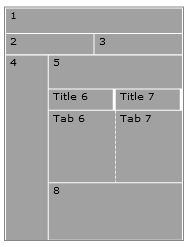 |
| Any page, 5 slots, right sidebar | 5 | 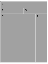 |
| Any page, single slot | 1 |  |
| Any page, 6 slots | 6 | 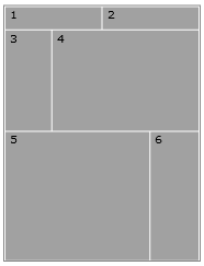 |
| Any page, 6 slots, left sidebar | 6 | 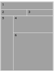 |
| Catalog entry page | 8 | 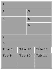 |
| Catalog entry page (2) | 7 | 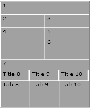 |
| Department page | 8 | 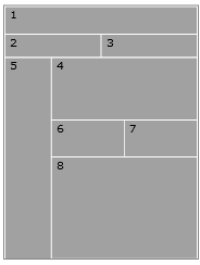 |
| Home page | 8 | 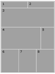 |