Category level features
Category level pages in the Aurora starter store are designed to assist customers in narrowing the product selection to find the preferred item.
Search facets allow customers to customize their experience
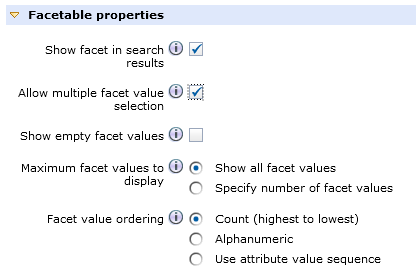
Search Facets enable customers to customize their browsing and search experience by controlling the amount of information presented to them at the category level.When enabled, Search Facets are found on category pages in the Apparel section of the Aurora starter store. This feature enables customers to filter results by definition or descriptive attributes enabled in Management Center. By default, a price facet is enabled with links to predefined ranges and minimum and maximum price fields.


Facet functionality is customizable, and can be ordered by item count, alphanumeric or a user-defined sequence. Settings for facets are controlled by Management Center Attribute Dictionary.
Comprehensive category list view
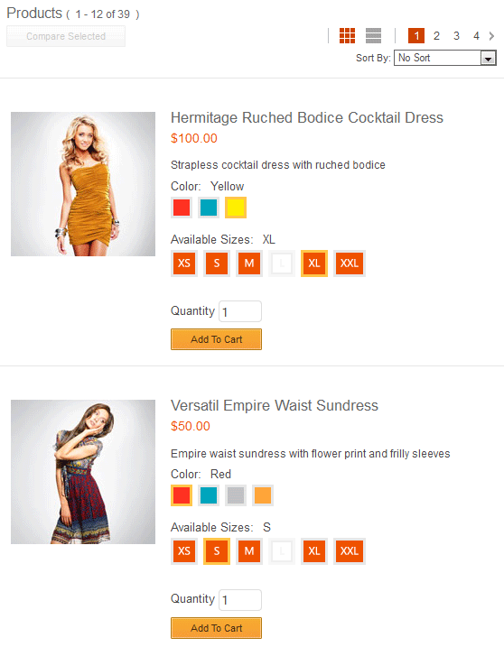
Offering multiple views in the storefront caters to the online shopping experience. Some customers prefer to scan the category for a particular item or attribute, while others prefer to browse an entire category. The Aurora starter store showcases a comprehensive list view on all category pages by including additional details and features to enhance the usability and information richness.
Paging controls on category pages follow design best practices. Examples include, controls to switch between grid and list view, page number links as a range between first and last page, and paging controls repeated at the top and bottom of the page.
Item comparison eases purchasing decisions
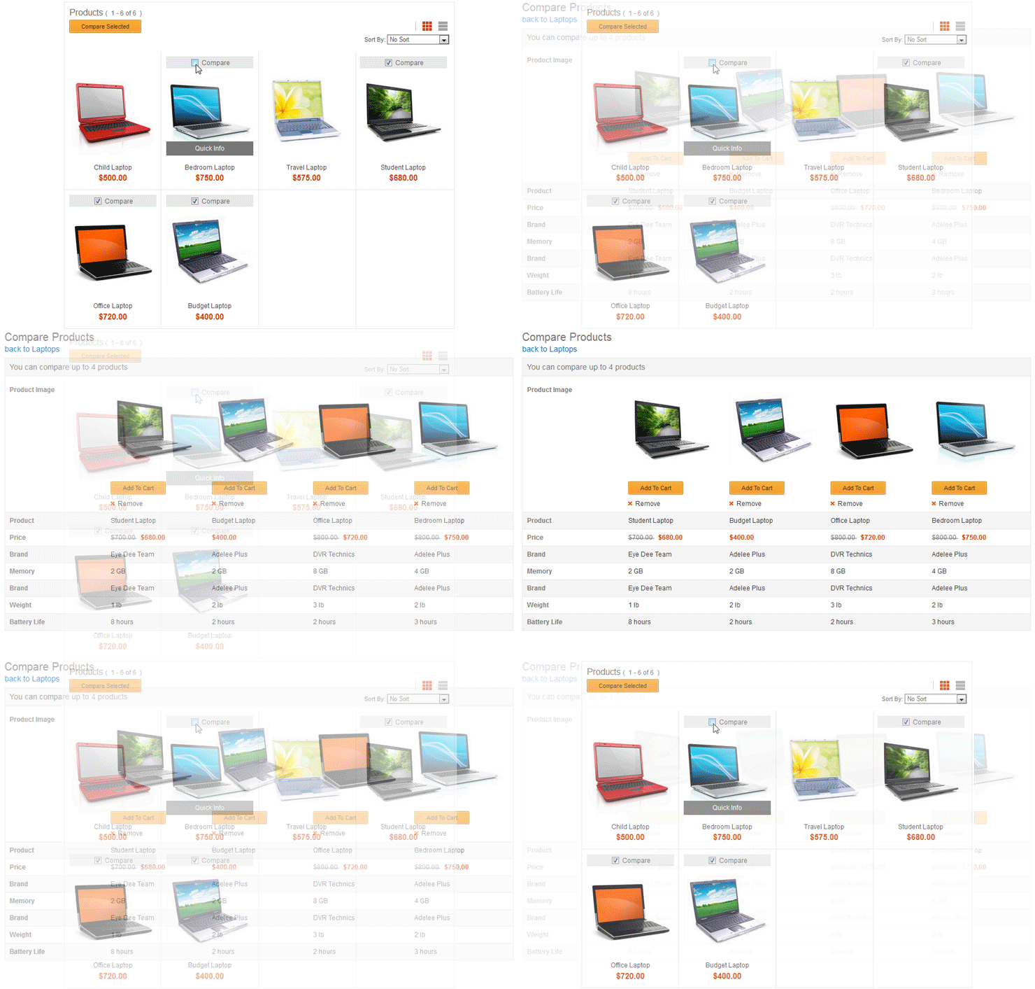
Allowing customers to compare items improves decision making and increases the chance of items added to their cart. The compare feature in Aurora is available on the category page for up to four products in the same category.Comparison results reflect actual data pulled in real time from defining and descriptive attributes in the catalog. The compare feature is a means for the store to expose these attributes to the user in an organized fashion.

When more than four products are selected, the customer is informed of the limit to prevent cluttered compare results. If the customer navigates away from the category, selected products for comparison are automatically cleared.